Gravit Designer User Guide
Ver .04 - RAW version
Refers to Gravit Designer 3.5.6

Table of contents
Download & Install desktop versions 17
Working with files/Documents 22
Selecting child elements in a group 38
Select objects with the same fill color 38
Select text with the same font 39
Moving, transforming and arranging objects 41
Compound shapes / Boolean operations 73
Transform and Copy Objects 104
Colors, Gradients, Textures 119
Radial (Elliptical) gradient 126
Selecting elements within the Group 181
Instance properties in Inspector 192
Using Paste Inside Selection 199
Removing parts of the image 214
Create a color palette from an image 227
Anchor Panel and Responsive Design 281
Horizontal anchors in action 284
Vertical Anchors in Action 291
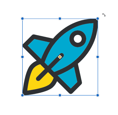
Select an Object with the Pointer Tool 296
Select Multiple Objects with the Pointer Tool 297
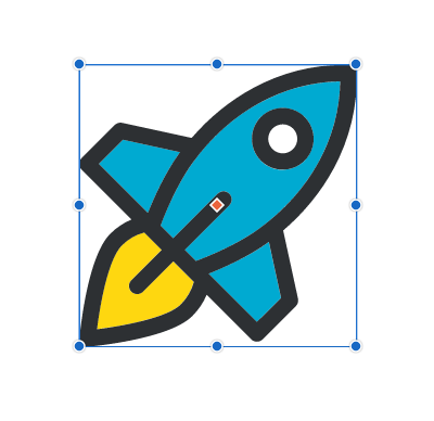
Move with the Pointer Tool 300
Copy an Object with the Pointer Tool 302
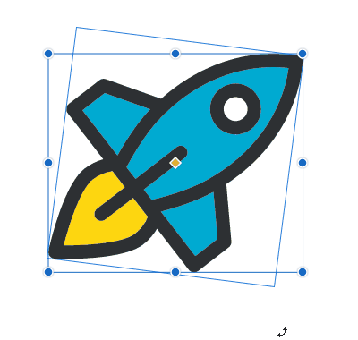
Rotate an Object With the Pointer Tool 303
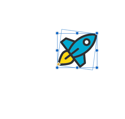
Scale an object with the Pointer Tool 305
Select Anchor Points with Subselect Tool 307
Select Multiple Anchor Points with the Subselect Tool 309
Edit Anchor Points with the Subselect Tool 311
Adding New Points to the Path with the Subselect Tool 313
Subtracting from raster images 331
Exporting selected objects 369
Mass exporting: assets and slices 370
Arrange, Align, and Distribute submenus 393
Grouping, Clipping, Masking menu items 400
What are minimum and recommended System requirements to run Gravit Designer? 420
Minimum system requirements: 420
Supported operating system: 420
Recommended System specifications: 420
A temporary switch to the Zoom tool 429
Right mouse button drag to change the corner radius 429
Introduction
Welcome to the official Gravit Designer User Guide. Here you can find everything you need to know about the principles, functionality, and advanced techniques used in Gravit Designer. You will be able to start using Gravit Designer quickly and master every aspect of this powerful tool in no time. So let's begin!
Note: this guide is still a work in progress and will be upgraded frequently.
What is Gravit Designer?
Gravit Designer is a powerful and easy to use vector design application. In addition to its professional-level vector design capabilities, Gravit Designer also provides some basic pixel related functionalities. All this is provided in an elegant and flexible user interface that works on all major desktop platforms as well as in modern browsers.
Gravit Designer can help you in a variety of design areas, and in many cases, it will be the only application that you need to complete your design project. That includes areas such as:
- User Interface design
- Illustrations
- Light print projects
- Web and social media graphics
- Icons
- Web page mockups
- Infographics
Key features
- Multiplatform - works on Mac, Windows, Linux, Chrome OS and on the Web
- Access from anywhere - use online and offline
- A wide range of supported industry standard formats - SVG, pdf, eps, ai, sketch, jpeg, png
- Easy to learn, but powerful and context-sensitive user interface
- Professional-grade vector editing capabilities
- Many predefined vector primitives with advanced editing controls - rectangle, ellipse, polygon, star
- Live nested boolean operations (non-destructive)
- State of the art path tool
- Working with embedded and linked raster images
- Real-time (live) and non-destructive editing
- Live gradients with on-canvas editing
- Multiple fills, borders, and effects per object
- Opacity and blending modes
- Precision editing
- RGB, HSB & CMYK color
- Powerful text editing
- Access to Web (Google) and System fonts
- Upload your own custom fonts
- Line and block text
- A wide range of Character and Paragraph properties
- Attach text to path
- Multilevel design organization
- Pages
- Layer groups
- Groups & Frames
- Arrange, hide and lock objects
- Reuse elements and assets
- Symbols
- Styles - text and graphics
- Swatches
- Master pages
- Multiple design aids
- Rectangle & Isometric grid
- Rulers and guidelines
- Smart snapping options
- Live dimensions
- Powerful free version. Even more powerful Pro version
Quickstart
How to use
You can start using Gravit Designer right in your browser or download appropriate desktop version.
To use Gravit Designer online point your browser to https://designer.gravit.io and start designing. Use the latest Google Chrome, Mozilla Firefox or Safari for the best experience.
Download & Install desktop versions
You can always download the latest version of Gravit Designer from our site https://designer.io.

Just chose your operating system and click on the appropriate icon. Once the installer is downloaded just start it and follow the instruction on screen.
Note: For Windows OS we have an alternative Portable version and for Linux, we provide a Snap package as well.
Windows portable version features:
- single executable file, no installation needed
- works from a USB stick
- runs without needing admin permissions to install (good for locked-down corporate computers)
You can also install the Chrome extension on every platform.
In order to start using Gravit Designer, you must first create a free account.
You will start a trial of the PRO version of Gravit Designer. After the trial period is over you can continue using the Free version as long as you want. Some features aimed at professional designers will be disabled,
For more information about PRO version and up to date comparison between Free and PRO version go here.
Auto Update
Once installed the built-in auto-update mechanism will prompt you to update every time we release a new version. So you will be always with the latest and greatest version of Gravit. You can manually check if you are using the latest version from Help>Check for Updates.
You can check System requirements in our FAQ section.
Basics
User interface
Gravit Designer interface consists of 4 main parts: Toolbar, Canvas, Inspector panel, and Left Sidebar. We are working hard to keep the interface as simple as possible, but allow the power users to work fast and efficient while accessing many advanced features.

Canvas (1)
Canvas (A) is located at the center of the Gravit interface and in this area your design lives. Initially, the Canvas looks like a white piece of paper with a slight shadow. All the objects you create in this area will be exported in the final output. Everything outside the canvas (an area sometimes referred to as “pasteboard”) (B) will not be exported and can be used for temporal placement of objects and partially hidden parts of the design.
Note: If you created a document with an Infinite canvas there will be no canvas border
You can change the Canvas color in the Inspector panel (3). Deselect everything (CTRL+SHIFT+A or click on empty space on the Canvas). Click on the color picker at the top left corner of the Inspector panel and select a new color. You can learn more about working with color here.
Toolbar (2)
The toolbar is located at the top of Gravit Designer window. It contains buttons for all Gravit tools as well as some commonly used commands. See more on tools here.
Inspector panel (3)
Inspector panel is located in the right sidebar. All the properties of selected objects on canvas is presented here. This is the unified control panel for managing selection properties. It is contextual, so it adapts itself to what you do or the tool you have selected. For example, if you select vector shape on canvas Inspector will show you controls for changing shapes coordinates, size, fills, borders, effects and so on. Every object in Gravit Designer has different properties and Inspector panel adapts its content accordingly.
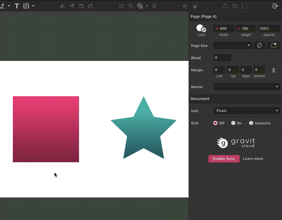
If nothing is selected Inspector panel will show the current page (canvas) properties as well as some document properties.
You can toggle the visibility of the Inspector panel in View > Show Inspector panel.
Layers panel (4)
On the left sidebar, there are 4 panels. Pages, Layers, Library, and Symbols.
Pages panel represent a list of all the pages in the document. Here you can add, rename, delete and rearrange pages. By default, there is only one page. If you want to see all the pages at once you can switch to the Multipage mode by pressing the toggle button in the Pages panel header.
To learn more about pages in Gravit Designer visit Pages chapter in the design organization section.
Layers panel lists all the objects (including Groups, Layer Groups, Symbols, Frames) placed on the current page in a hierarchical view. Here you can select, hide, lock, delete objects, as well as group, rename and rearrange (stack) them on top of each other.
To learn more about the Layers panel visit Layers chapter in the design organization section.
You can toggle the visibility of the Inspector panel in View > Show Layers panel.
Libraries panel - Searchable collection of design assets that can be used in your design for free. Libraries include Shapes, Illustrations, Icons, Emojis, Stickers, Frames, and Lines. Use the search bar at the top to find assets and then drag them directly on the canvas.
You can toggle the visibility of the Inspector panel in View > Show Libraries panel.
Symbols panel - this is a list of all the symbols used in the current document arranged in chronological order. You can drag the symbol thumbnail to the canvas. Learn more about symbols
You can toggle the visibility of the Inspector panel in View > Show Symbols panel.
There is a Full-Screen mode which hides all the Gravit Designer interface except Canvas. To activate it use ALT + ENTER. You can switch back with use ALT + ENTER again.
Working with files/Documents
Gravit Designer uses gvdesign file format for internal operations. It can contain multiple pages. It is a highly recommended to use this file format for saving all edits and full fidelity.
New
You can create a new file from 2 places. Welcome screen and File menu.
In the New Design tab of the Welcome screen, you can choose from various predefined canvas/page sizes or choose your own custom document size.
Popular print and screen sizes are represented in several categories for you to kickstart your creations. We constantly update these presets in order to always have the latest and most used page and device sizes used in our industry.
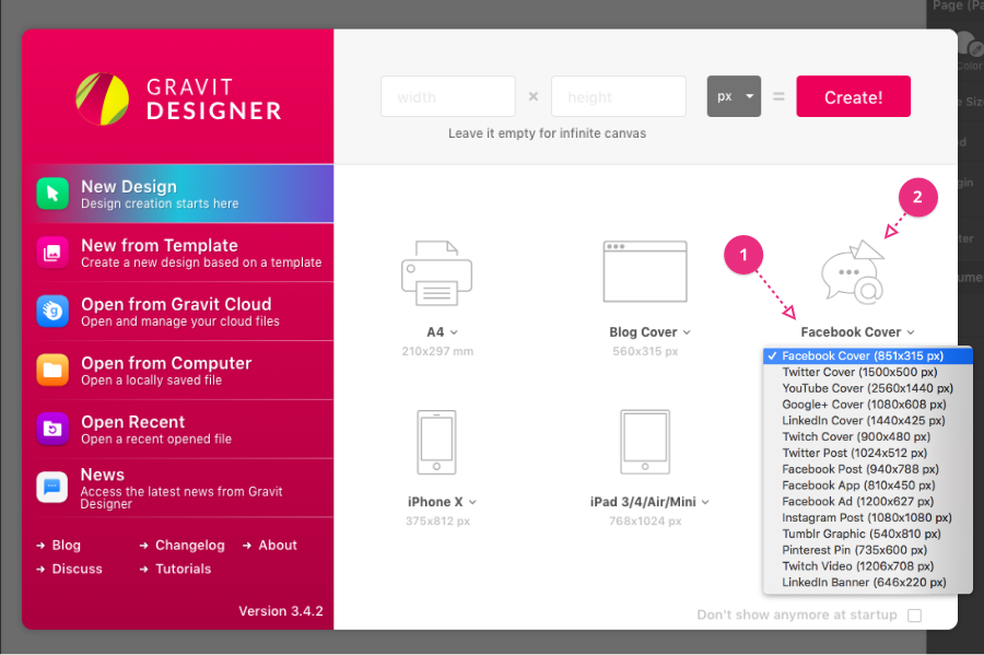
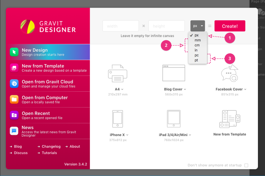
On the "New Design" page, each choice has a drop-down menu with many alternative sizes.
For example, click the words "Facebook Cover" (1). You will see a menu of other preset sizes for different social media requirements.
If you click on the image above the words (2), a new project will be started using the currently displayed size.
Note: For your convenience print presets are created with physical units in mind (millimeters, inches), while the screen related presets are created in pixels.
- Print size - Standard print page sizes like to A4, Letter, etc.
- Desktop/Website sizes - Commonly used desktop screen resolutions like 1440x900 (Mac, WXGA+), 1920x1080 (Full HD), 1366x768 (Business laptops), etc..
- Social media related sizes - Sizes used in popular social networks such as Facebook, Twitter, Youtube, Dribble
- Mobile phone screens - Most popular and latest iOS and Android device screen dimensions
- Tablet screens - Most popular and latest tablet screen dimensions
To create a document with your own custom dimensions type width & height in the in the fields next to Create! Button. If you leave these fields blank Gravit Designer will make a new document with infinite dimensions (infinite canvas). You can change document unit here too and then hit Create! button to make a new document.
You can always change the dimensions and units of the document later in the Inspector panel.
Documents in Gravit Designer can contain several pages with different sizes, but only one unit per document.
Document units
Gravit Designer can use several units suitable for print as well as screen design.
The general recommendation is: If you designing for a screen - use pixels (px). If you design print content, use real-world units e.g. millimeters (mm), centimeters (cm) or inches (in). Users who need to use a special typography unit such as point (pt) or pica (pc) will probably know what they're doing. Learn more about points and picas here.
New from template
Gravit Designer provides many professionally designed templates in various categories to help you start fast. These design templates contain existing content and can be easily edited.
You can access them in New from Template tab (1) in welcome screen or from File > New Design from Template menu.
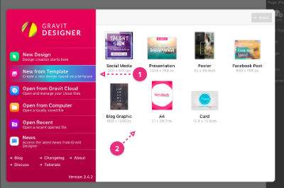
Click any category to see a range of different template choices (2). For example, click on Presentation. You will see a range of preset presentation slide templates.
Chose a preset template to modify (3), or use the Back button (4) to return to the list of categories.
You can use the Large preview switch (5) for a larger preview of the available templates.

Select one of the preset templates with a single click. You can then modify or replace (or delete) content to customize the project. This includes the text, colors, images, and effects.
Note: You have to be online to see these templates.
Note: All the templates can be used for commercial purposes
Open
You can open files saved in your Gravit Cloud account as well as those saved on your local hard drive.
To open locally saved file use: File > Open file… or in the Welcome Screen “Open from computer” tab in the left sidebar (2).

To open files saved to the Gravit Cloud use: File > Open from the Cloud... or in the Welcome Screen “Open from Gravit Cloud” tab in the left sidebar (1).
Note: You have to be online in order to save files in the Gravit Cloud.
The convenient "Open Recent" (3) option lists recently edited project files. This includes files from both your local storage and from your cloud account.
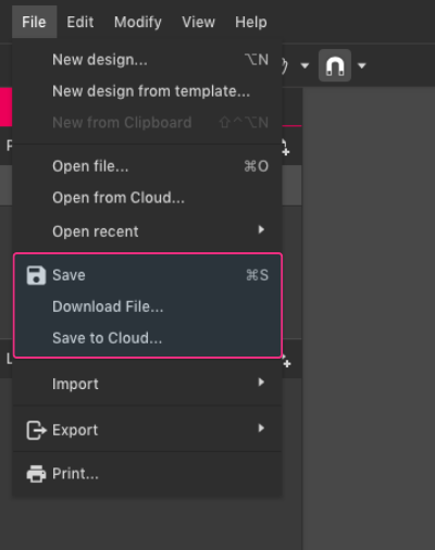
Save
To save your designs use File > Save or CTRL/CMD+S.

If your file isn’t already saved, the desktop version of Gravit Designer will ask you where you want to save your file. On your hard drive or in the cloud. If you use Gravit Designer in the browser file will be saved directly in your Cloud storage.
- If you save in the cloud, you can access your designs at any time from different devices (for example your Home and your Work computer).
- If you choose to use your computer storage, Gravit Designer will prompt you to choose a local folder where the file will be saved. The file will be saved as “File Name.gvdesign”.
Alternatively, you can use any of the following options under the File menu:
- Save to Cloud as…
- Save to system as… (desktop version)
- Download to system… (web browser version)
The official (native) file format of Gravit Designer is “.gvdesign”. Using it will ensure that full fidelity of your design is retained. Gravit Designer is the only application that will read this format. This format is also useful for sharing your editable file with other users of Gravit Designer.
If you want to use another file format that is supported in Gravit Designer you must use Export function.
Note: SVG export has a checkbox for Preserve editing capabilities for SVG files. This will embed Gravit Designer information so the file can be reopened and edited in Gravit Designer without loss of features, the same as a .gvdesign file.
Note: You have to be online in order to use files saved in the Gravit Cloud.
Tip: Saving to multiple files (myproject01, myproject02, etc) during the project is a wise idea. This enables: a backup copy in case a later version fails to save (hardware problems, battery failure or power outage, network outage, etc) and the ability to return to an earlier stage and make variations on a project.
Keep in mind that since version 3.5 Gravit Designer has a Version History which saves last 20 iterations in the Gravit Cloud. This is an exclusive Gravit Designer PRO feature.
If you have not made any changes to your project since the last save, the Save icon will not be active.

If you have made changes but not saved, you will see an asterisk [*] beside the filename in the project tabs (1) at the top of the window. This indicates unsaved changes.
If you have not saved your project at all, the tab will show as Untitled (2).
To save the current project to a different location or to a different file name, use the File > Save to file... (desktop apps), or File > Save to Cloud... (web app)...
Cloud files dialog
Move, delete files, make folders
Cloud dialog appears when you save or open files from the Cloud. Here you can save New files in the Cloud as well as manage other files and folders.

To save a new file - click on File > Save to Cloud… In the Cloud dialog, you can type a new Filename and choose a folder where the file will be saved.
To make a new folder click on the New Folder button on top of the Cloud dialog and type a name.
To move files between Folders - Select a file, use Cut button from the top toolbar (or from the kebab menu next to the file thumbnail). Go to different folder and use Paste button.
To delete a file from the Cloud - select file and use Delete button from the top toolbar (or from the kebab menu next to the file thumbnail)
To open the file - select the file and double click on it (or from the kebab menu next to the file thumbnail)
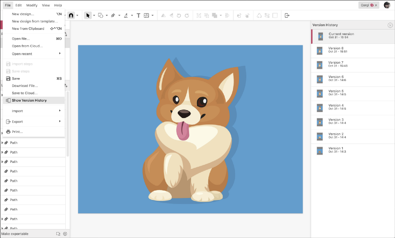
Version History
You can access up to 20 past versions of your designs saved on the Gravit Cloud. Continue working from a different point, restore a critical element or see how your design evolved. It can be accessed from File > Show Version History.
A new version is created every time you save your file.
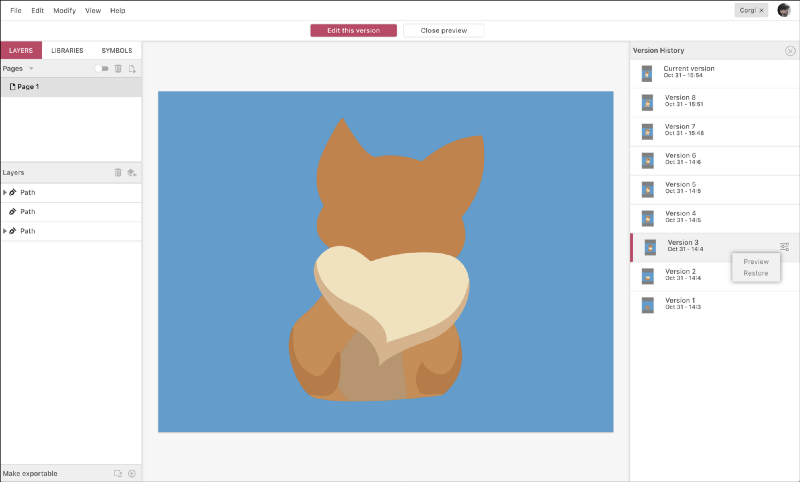
After accessing Show Version History, you are presented with a list of all available versions of the current design in the right panel. Clicking on a version shows it on the canvas for you to inspect — with a double-click you can edit it.
To give you an extra indication that you are previewing a particular version, the menu bar is replaced with two buttons: Edit this version and Close preview. Both functions (Preview and Restore) are also available from the context menu of each version in the list. Even when you have reverted to an older version, all future versions are still accessible in the list — also when saving after that.
Version History is an exclusive Gravit Designer PRO feature.
Creating basic shapes
Click - Drag - Release
To create a basic shape on canvas:
- Select one of the shape tools from the toolbar (Line, Rectangle, Ellipse, Polygon, Triangle or Star)
- Click and drag your mouse (while still holding your left mouse button) somewhere on the canvas.
- There will be an outline preview of the shape. Once you are satisfied with the placement and size of the new shape - release mouse button.
If you hold SHIFT while dragging the Rectangle or Ellipse tool the result will be perfect square or circle. For the Polygon, Triangle or Star tools SHIFT will constrain rotation to 15° for more predictable results.
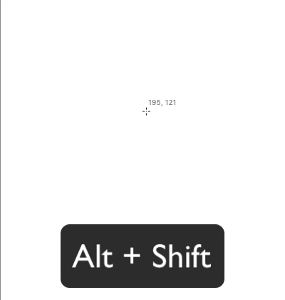
If you hold ALT while dragging the resulting shape will be created from the center out instead of from the top left corner.

Pro tips: If you want to move the shape while creating it, you can temporarily press the SPACEBAR and move the mouse pointer to the desired position.
Pro tip: By default, after drawing any preset shape, Gravit Designer will revert to the Pointer tool to allow you to modify (resize, rotate, move) the shape after you have drawn it. If you want to draw multiple shapes one after another, hold down the shortcut key for that shape.
Selecting objects
To select one object make sure that the Pointer tool (V) is active and click on it once. Alternatively, you can click on the object name in the Layers panel.
To select multiple objects on canvas click and drag around objects you want to select (Pointer tool should be active in the toolbar). The objects will be highlighted. Release the mouse button to finish selection. All the object will be framed with the blue outline with 9 transform handles.
Holding SHIFT while clicking or dragging around objects will add them to the existing selection or remove them if they are already selected.
Alternatively, in the Layers panel you can:
- CTRL + click on the object name to select/deselect multiple objects one by one
- SHIFT + click on the object name to start and finish continuous selection
By default, all objects that are touched by the marquee will be selected. In some cases, you may want to select only objects that are completely contained inside the markee boundaries. In such case use ALT modifier key while dragging.
Selecting objects that are one above the another can be tricky sometimes. Gravit Designer allows you to cycle through stacked objects using CTRL modifier key. Hold down CTRL and click once to select to topmost object, click again to select next object below and so on. Selected object will be highlighted.
Alternatively, you can overlapping objects in the context menu (point and right mouse click). At the very bottom, there is a Select option which lists every object under the cursor.
Pro tip: With the Select submenu in context menu you could select even locked objects. This makes it very easy to manipulate locked objects without the need to unlock them first.
Selecting child elements in a group
If the object is a group object (Group, symbol or a compound shape), the first click will select the group. Click a second time to select the object within the group. To skip first click you can tick the “Click-through this element” checkbox in Inspector panel when a group is selected.
Alternatively, for an object in a group, you can hold Ctrl/Cmd to directly select any individual object in the group(s).
Select objects with the same fill color
You can select all objects that have the same solid color fill on the current page and change that color at once. Go to used colors tab in color picker interface. Hold ALT + click on a color swatch. All the object that has this fill color and are placed in current page will briefly flash on the canvas. Now you can change the color and it will be replaced on all objects that it is used.

Note: This trick works only for solid fill color on shapes in the current page, excluding text, borders, effects, gradients fills and compound shapes,
Select text with the same font
You can select all the textboxes in the document that contain the same Font Family. Select text box. Right-click to show the context menu and choose Select by Font Type option. All the text boxes that contain currently selected Font Family will be selected across all pages. You can now change the font in the Inspector panel. Al the weights will be preserved if possible. For example, if you have several text boxes in Open Sans font with different weights (bold, italics) if the new font has them they will be used appropriately.
This trick works on all pages, groups, symbols and compound shapes.
Moving, transforming and arranging objects
Moving objects
To move one or more objects on the canvas you have to select them first. Once they are selected click and drag selection to a new place. You will see the outline of the objects following your mouse pointer. Release the mouse button when you are happy with the new placement.
Note: Make sure that you are using Pointer tool when moving objects and use Subselect tool to move points.

If multiple objects are selected, drag directly on one of the selected objects, not on an empty area within the selection box.
Hold SHIFT key to constrain movement to vertical, horizontal, or 45 degrees directions.
If you hold ALT while you drag a copy of the object will be created and moved.
Alternatively, you can move the selection with Arrow keys (up, down, left, right) and if you hold SHIFT the movement will be 10 times bigger.
You can always type a new X & Y coordinates at the top of Inspector panel.
Rotating objects
Select object(s) with pointer tool. To rotate selected object(s), use the rotation handle on top of the bounding box rectangle.
Alternatively, move the cursor close to one of the corner handles of the selection box. Keep the cursor outside the selection rectangle. The cursor will change to show that the selection can be rotated.
Hold SHIFT key to constrain the rotation to 15-degree increments.
Alternatively, specific rotation values can be typed into the Inspector panel.
You can use toolbar buttons to quickly rotate objects at 90° left or right (clockwise or counterclockwise). In Modify > Transform menu you can find even more preset rotation options (45°, 90°, 180° in both directions)
Scale / Resize objects
Select object(s) with pointer tool. Drag a corner handle of the selection box to resize the selected object(s).
By default, you can resize freely in vertical and horizontal directions. This can cause distortion. To resize proportionally, hold the SHIFT key while dragging one of the selection handles. Proportional resizing keeps the same ratio of height to width (the same proportions), so there is no distortion when resizing. Alternatively, use the Inspector panel to link height and width (the Keep Ratio icon), and resizing will automatically remain proportional.
Hold ALT to resize from the center.
Hold SHIFT+ALT for both proportional and centered resizing.
Flipping objects
You can flip horizontally or vertically every selection from the toolbar buttons or menu Modify > Transform > Flip Horizontal (or Flip Vertical)
Flip commands will use the center of the object's bounding box as a mirror axis.
For more advanced mirror like transforms use Advanced transform panel.
Smart duplicate
If you duplicate object and than transform it in any way (rotate, scale, etc) pressing CTRL/CMD+D will repeat this transform again.
Tools (Toolbar)
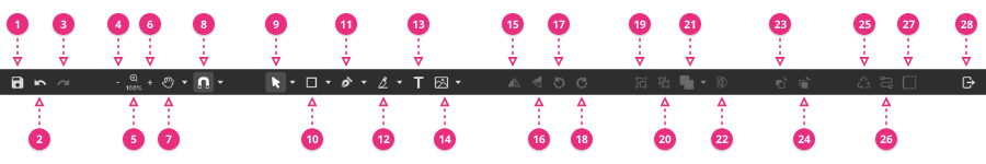
(1) Save - saves active file CTRL + S
(2) Undo - one step back in the history of actions. Negates the last operation. CTRL/CMD + Z
(3) Redo - go forward in the history of actions. SHIFT + CTRL/CMD + Z
(4) Decrease zoom level (to next preset) CTRL/CMD + minus sign
(5) Select a preset zoom level - 6-25 600% Also here is Fit All preset that fit view to all objects in the viewport (inside and outside of the canvas/page)
(6) Increase zoom level (to next preset) CTRL/CMD + plus sign,
(7) Pan tool (and Zoom tool in the menu) - Pan tool is used to move around the canvas, Zoom tool can be used to magnify the viewport to a custom region. This allows you to work on fine details with greater precision.
(8) Snap on/off and snapping options - computer-assisted alignment
(9) Selection tools
(10) Shape tools (preset shapes, primitives) here are all the tools that allow you to create basic preset shapes like Straight Lines, Rectangles and Rounded rectangles, Ellipses and Circles, Polygons, Triangles and Stars
(11) Drawing tools - allow you to make your own shapes: Path (can be referred to as Pen tool), Bezigon and Freehand tools
(12) Reshaping tools - cut and carve an existing path/shape
(13) Text tool - add a text box
(14) Place Image (and Link Image) - inserts or link images in the design
(15) Flip Horizontal - mirror selected objects over the horizontal axis
(16) Flip Vertical - mirror selected objects over the vertical axis
(17) Rotate 90° left (counterclockwise)
(18) Rotate 90° right (clockwise)
(19) Group - groups selected objects
(20) Ungroup - ungroup selected groups or compound shapes
(21) Create Compound Shape (Boolean operations) - make multiple shapes into one
(22) Clip - place all selected objects inside boundaries of one
(23) Bring Forward - move selected objects one step upper in stacking order (on top of other objects)
(24) Send Backward- move selected objects one step behind (on top of other objects)
(25) Create Symbol - converts selection into reusable master symbol
(26) Convert to Path
(27) Vectorize Border - convert a border of the selection into a filled shape
(28) Export - opens the export dialog
To learn more about every tool please visit our Tools Section
Objects
Objects in Gravit Designer behave similar to a physical object - you can grab them, move, resize rearrange, bring them on top of each other, You can manipulate their properties, group and combine them in various ways. An object is every item that is placed on the canvas. All objects have a representation in the layers panel.
Although it can edit bitmap (or raster) images to some extent, almost all of the objects in Gravit Designer are vectors.
Vector graphics are based on mathematical formulas which give us huge advantage and flexibility in the editing process:
- keeping a file size small
- unprecedented precision in editing down to a fraction of a pixel
- zoom in/out without losing fidelity up to 25 600%
- objects can be edited at any time after they are created. Including their shape, size, colors, and effects
- export final result in multiple resolutions without worrying about loss of quality
- advanced manipulation of multiple objects at once through shared styles, symbols, smart alignment and other magic features :)
Bounding box
Every object has a “bounding box” when you select it. The outline with 9 transform handles. This bounding box is used of for lots of calculations to reduce uncertainty.

The height of the dog object is its bounding box.
Note: Centered/Outside borders and some effects (such as shadows, glow) don’t affect bounding box as they are rendered outside of the bounding box
Shapes & Paths
Preset/Basic Shapes
Gravit Designer allows you to make several geometric shapes to kickstart your creations. Often such shapes are referred to as “primitives”. While those shape might seem simple they have a hidden powers built-in - for example, you can add extra arms to a star or round the corners of a rectangle. Basic shapes include rectangles, ellipses, and polygons (and polygon variations such as triangles and stars).

Rectangle (R)
To create a rectangle click + drag somewhere on canvas. Release the mouse button when ready. You can make a perfect square if you hold SHIFT while dragging. By default, the rectangle will be drawn from top left corner to bottom right corner but you create rectangles from the center if you hold ALT key while dragging.
Pro tip: If you want to move the rectangle while you are creating it - hold SPACE key and move to the desired position.
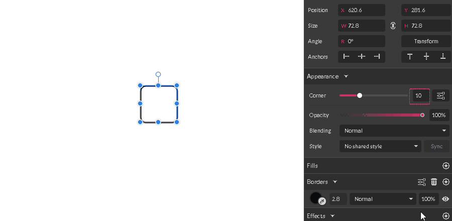
Rectangles in Gravit Designer has hidden properties which can be controlled with subselect tool - corners. You can control how the corners of the rectangle look. Select the rectangle and hit ENTER key. You are now in edit mode where you can manipulate the corner radius. Select one of the red control points and drag it toward the center of the rectangle. All the corners are now rounded. Alternatively, you can change the radius of the corners in the Appearance section of the Inspector panel by moving Corner slider or by typing a value in the text field next to the slider.

By default, all four corners of the rectangle are using the same radius values but you can unlock and control them individually. Click on Advanced settings icon next to the radius slider and uncheck the Uniform Corners checkbox.
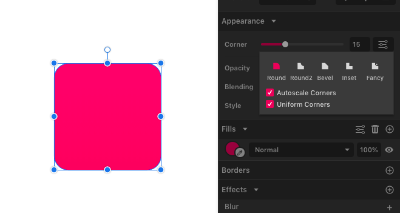
In Advanced settings, you can change how the corners behave while you scale the rectangle. If Autoscale Corners in checked corners will scale with the shape when it is resized, otherwise the corners will stay the same even if you change the size of the shape. Autoscale is appropriate when creating an illustration or an icon for example. But you probably should turn Autoscale off if you making some sort of User Interface. Autoscale corners is turned on by default for every new rectangle.
Ellipse (E)
To create an Ellipse click + drag somewhere on canvas. Release the mouse button when ready. You can make a perfect circle if you hold SHIFT while dragging. By default, the Ellipse will be drawn from top left corner to bottom right corner but you create Ellipse from the center if you hold ALT key while dragging.
Pro tip: If you want to move the ellipse while you are creating it - hold SPACE key and move to the desired position.
Ellipse tool allows you to draw fully closed ellipses or circles, as well as truncated ellipses (2), arcs and pie shapes (3).
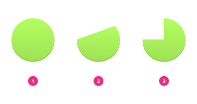
If you hit ENTER key (or Double click on an ellipse or select a Subselect tool) you can see the 2 red control points which allow you to modify open part of the ellipse contour. Alternatively, you can use Angles fields in Inspector panel to make more precise editing.
Once the ellipse is open you can use the Shape buttons in Inspector panel to choose how the gap will behave. There are 3 options: Open, Closed and Pie.
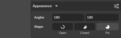
Note: you can see the difference between the open and closed only if the ellipse has a border.
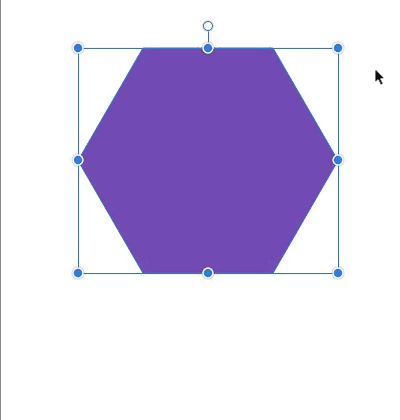
Polygon
To create a polygon click + drag somewhere on canvas. Release the mouse button when ready. Hold SHIFT to constrain drawing to 15 degrees.
A polygon is always drawn from the center outwards.
Pro tip: If you want to move the polygon while you are creating it - hold SPACE key and move to the desired position.
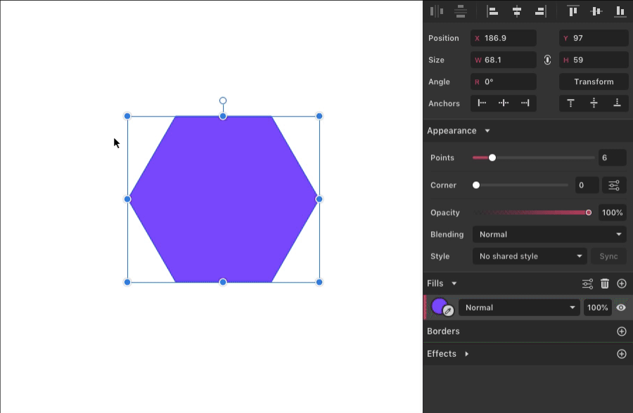
By default, Gravit Designer creates a polygon with 6 sides (hexagon). Once you create the shape you can change the number of sides in the Inspector panel.
Polygons have hidden anchor points in the center of each side. To see these anchor points you have to be in edit mode (Click ENTER key or Double click on object or use Subselect tool), You can move these points with the Subselect tool to change the shape. Hold SHIFT to keep movement symmetrically aligned.
There are many controls related to the polygons in the Inspector panel:
You can change the number of polygon sides with Points slider. It can have values from 3 (triangle) to 25, but you can type any number in the text field next to slider if you need more slides.
You can change the radius of the corners with the Corner slider, If the hidden side anchor points have been moved off the straight edge, they will also be affected by the Corner settings. The corner appearance will be inverted.
The real power is hidden in the Advanced setting panel. Here are placed all the controls which give you the power to construct polygons with unlimited possibilities.
If you untick the Plain Edges checkbox the Size slider will be shown. This moves the middle side points in (and out) from the center of the polygon. This is the same as dragging on a hidden point with SHIFT held down. This allows you to make star-like shapes.
It is best to experiment with the setting in Advanced settings to see what every control can do to your shape. The possibilities are endless.
Triangle & Star
These tools are a convenience presets of a Polygon tool. They have the same controls but give you instant triangle or star without the need of tweaking the settings first.
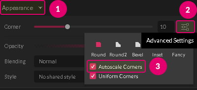
Advanced corner settings
Advanced corner settings can be used in several cases. Rectangles, Polygons (including Triangles and Stars) and on any Straight point from a path.
By default, the Corner slider for these objects controls corner roundness. However, if you click the Advanced Settings icon beside the Corner slider, the slider can control different settings:
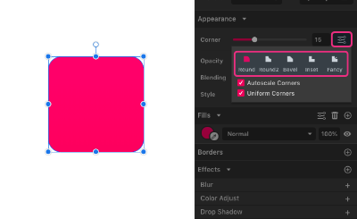
Round - the default rounded corner.

Round2 - a curved indent cuts into the corner

Bevel - corner points are truncated (cut off, or beveled)

Inset - an angled indent cuts into each corner
Fancy - an angular “loop” is created at each corner (think of a W shape with a looped center peak)

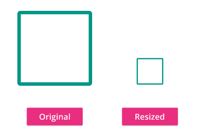
Paths and preset shapes with sharp corners have an option to Autoscale Corners. You can change how the corners behave while you scale the shapes. If Autoscale Corners in checked corners will scale with the shape when it is resized, otherwise the corners will stay the same even if you change the size of the shape. Autoscale is appropriate when creating an illustration or an icon for example. But you probably should turn Autoscale off if you making some sort of User Interface. Autoscale corners is turned on by default.
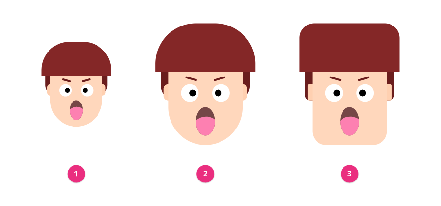
- Original object
- Resized, using rectangles with rounded corners and Autoscale Corners on (the default) for the hair and face (chin)
- Resized, rectangles with Autoscale Corners off
Line
Lines are essential design elements that have a distinct start and end points. Every line segment can be straight or curved. From a vector point of view: lines are opened paths. In Gravit Designer, you can create a line with several tools: Line tool (L), Path tool (P), Bezigon tool (B) and Freehand tool.
Line tool (L)
To make a line click + drag in the direction you want. You will see a preview of a line. Release the mouse button when you are happy with the result. If you hold ALT key while dragging the resulting line will be symmetrically drawn from the center. If you want to constrain line in 45-degree variations (vertical, horizontal, or at 45 degrees) you can hold the SHIFT key while drawing.
Vector anatomy

Vector shapes must have one or more of this properties:
- fills (1) - can be multiple, layered on top of each other
- borders (2) - can be multiple, layered on top of each other
- effects (3) - can be multiple, layered on top of each other
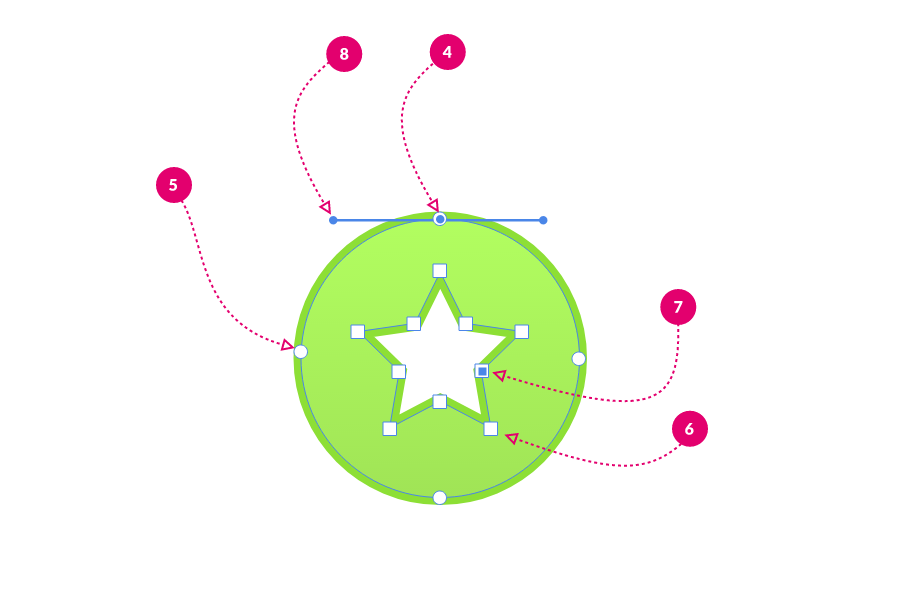
Every path has 2 or more Anchor points (4,5,6,7) which construct the vector shape. Anchor point (sometimes referred to as nodes) can be straight (6 - not selected, 7 - selected ) or curved (4 - selected, 5 - not selected). Curved points have Direction (or Bezier) Handles (8) that allow manipulating the curvature of a path contours.

Part of the path between 2 point is called segment (10). Some shapes can have several contours (9). The Shapes with several contours are called Compound paths.
Vector paths can be open (11) or closed (12)
All of these sub-elements can be edited with Subselect tool
Anchor points
Anchor points in Gravit Designer come in six variations or “joint” types.
Four of these are readily visible in the Appearance section of Inspector panel when you select one with the Subselect tool.


- Straight joint (shown as a small square). A “pointed” or “sharp” corner.
- By default it has no anchor point direction handles, but this can changed by dragging the nearby path directly with the Subselect tool.
- Drawn with a click of the Pen tool.
- Double-clicking on a Straight anchor point will convert it to an Asymmetric joint.

- Mirrored joint (shown as a small circle). Smooth, same (symmetrical) curvature on both sides of the point.
- Anchor point handles remain aligned and the same lengths.
- Drawn by dragging with the Pen tool and then change the joint type to Mirrored in Inspector panel
- Disconnected joint (shown as a small circle). Can have different curvature on either side of the point.
- Drawn by dragging with the Pen tool and then ALT click to change the path direction. Also can be drawn by clicking on the point while still using the pen tool (the mouse cursor will change to indicate that there will be change in the joint type)
- Anchor point handles can have different directions and different lengths.
- Double-clicking on a Disconnected anchor point will convert it to an Auto Asymmetric joint and double-clicking again will convert it back again.

- Asymmetric joint (shown as a small circle). Curved but not symmetric, can have different curvature on either side of the point.
- Anchor point handles remain aligned but can be different lengths.
- Drawn by dragging with the Pen tool

- Connector joint (shown as a small diamond). A “tangent” joint, continuing a straight segment. This type of joint ensures always smooth transition from straight line to curve
- Cannot be drawn directly with the Pen tool.
- To create: select an anchor point at the end of a straight segment, then use the drop-down list in the Inspector panel
- Auto joint (shown as small diamond) Auto-adjusts to changes around it to maintain the curvature settings. The “Bezigon point”. To create: convert a joint to straight then Mirrored or Asymmetric. Cannot be drawn directly with the Pen tool, but an auto joint can be drawn by Alt-clicking with the Bezigon tool. Double-clicking on a Disconnected anchor point will convert it to an Auto Asymmetric joint and double-clicking again will convert it back again.
You can change position of the anchor point by changing its X & Y coordinates in Appearance section of Inspector panel when an Anchor is selected.
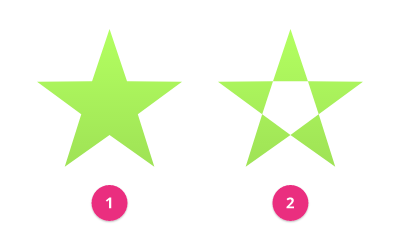
Compound shapes / Boolean operations
Two or more shapes that interact to produce a different shape. For example, it can be like sticking two shapes together (union) or using one shape as a "cookie cutter" to "bite" pieces out of another shape (subtraction). The new combined shape has a single fill and border.
The Compound shapes are a result of so-called Boolean operations. The result is fully editable at any time. All shapes will retain their special properties like round corners or sides. Compound shapes are also known as Boolean Groups.
Note: Not to be confused with “compound paths” which are paths with more than one closed contour for example “a donut shape”.
“Elements” within compound shapes have an icon displaying their effect on the other elements below them.
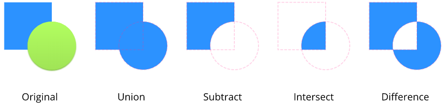
Union
"Glue" two or more objects together so they become a single combined shape with the sum of its areas
Subtract
Use the upper object as a "cookie cutter" to remove an area from the lower object.
Intersect
The result only shows the areas where the original objects overlap.
Difference
The result only shows the areas where the original objects do not overlap. Opposite of intersect.
To make a compound shape:
- Select 2 or more vector objects
- Use Modify > Create Compound Shape (Alternatively: Create Compound Shape button in the main toolbar or in the context menu)
- Choose from available boolean operations (Union, Union, Intersect or Difference)
You can at any time split Compound shape to its original parts using Ungroup command (CTRL/CMD+SHIFT+G). All properties of the original objects will be restored.
A Compound Shapes are non-destructive and can be changed to a different merge operation at a later time using:
Create Compound Shape dropdown on the toolbar, or Compound options in the Inspector panel.

Compound shapes are cumulative you can have multiple boolean operations (Union, Union, Intersect or Difference) in one Compound Shape.
Sometimes when you try to combine 2 or more Compound shapes the result can be different than expected. I such cases use Modify>Create Nested Compound or CTRL/CMD+ALT+M.

After you create the nested compound shape from the menu you can change the boolean operation type in the Compound section of the Inspector panel.
Note: Sometimes in a multiple or very complex boolean operations it is possible to achieve unpredictable results. There are 2 remedies for you to try: Convert shapes to path (CTRL/CMD+SHIFT+P) before the next boolean operation or try to change Fill rule (in the Inspector panel).

Modify paths
Break curve
Cuts the path at the selected anchor points.
- Select one or more anchor point
- Choose Modify > Path > Break curve
- The path is separated at the selected point(s)

Expand/Shrink
This command offsets path outline inside or outside of the shape depending on the inserted value in the text field. A positive value will outset the contour, a Negative value will inset the path contour.
Note: the path order influences how the offset direction works, so sometimes the opposite will be true: negative value - outset, positive value inset
Simplify path
Reduces the number of the anchor point in the path while trying to keep the overall look of the curve. Destructively smooths path by removing unnecessary points. Useful for reducing point produced with the freehand tool or after image vectorization operations.
Modify> Path> Simplify path
Convert to path & RAW path
If you want to edit Preset shapes (Rectangle, Ellipse, Polygon, Star, Triangle) the same way you edit any other path you should convert them to normal paths first. All the special properties of Preset shapes (for example Number of sides or Arcs angle) will be lost and the path anchor points will be exposed for editing with Subselect tool. Convert to path also works with Compound shapes and will turn them to a single vector object losing the opportunity to edit the subobjects. Note that this is destructive operation.
Convert to path will keep editable corners.
To convert selection to a path use Convert to Path command in the context menu, or go to Modify > Path > Convert to Path or use the button on the toolbar or use shortcut keys (CTRL/CMD+SHIFT+P)

Convert to Raw path does the same but it will not keep the editable corners and convert them to bezier curve points.
Here is an example with a Rectangle primitive where we can edit corner radius with its control points, but it is always in rectangular shape. When it is converted to a path the corner points become freely editable, but the corner rounding is kept. When the rectangle is converted to RAW path all the points become regular bezier anchors.
Convert to Outline
Convert to Outline command creates a new object representing only the outline of the original shape with defined “stroke” thickness. The outline is drawn around the center of the object's contour. The new object inherits the same appearance properties as original shape. It is similar to the Vectorize border but works on paths without borders as well.
To Convert path to Outline go to Modify>Path>Convert to Outline and in the dialog box type a number of the desired thickness of the outline.

Vectorize borders
Converts a border (a shape outline or an open path) into a filled vector shape.
Note: not all borders properties are converted. For example, dashed borders, arrowheads are omitted.

Connect path lines
You can join multiple selected lines (or any paths) using Modify > Path > Connect Paths Lines.
Note, however, that paths have a start point and an endpoint, and this operation always connects the end of one path with the start of the next.
If the lines are not drawn in the correct direction, unexpected connections might occur - note in each example how the end of the first vertical line is connected with the start of the next line in drawing sequence.
To “fix” this you can swap the start and end points of a path with Modify > Path > Reverse Order.
Property Panel
Introduction
The Property Panel (2) is located in the top of the Inspector Panel between the Align Panel (1) and Appearance Panel (3) .
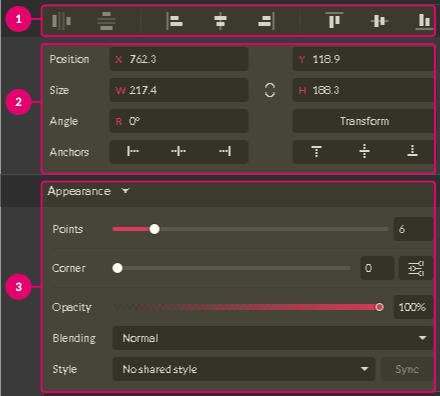
Interface
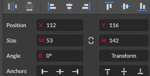
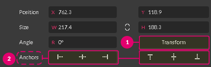
The Property Panel contains an information about essential properties of an object:
- Position (1)
- Size (2)
- Angle (3)
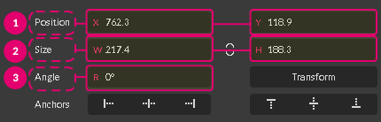
You can easily change a specific property by typing inside the text fields opposite to it.
It also contains the Transform Button (1) for more advanced object manipulations and set of the Anchor Panel (2) to create responsive designs.
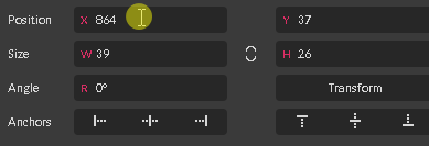
Object’s Position
The X and Y fields represent a position of an object according to the top-left corner of the canvas.

Type inside these fields to change the value of the position. Use the X field to move an object across the X-axis and the Y field to move across the Y-axis.
Object’s Size
W and H fields give you an information about the object's width and height respectively.

You can change them by typing inside the text fields.
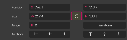
To keep the proportions between width and height select the Keep Ratio icon in between these fields.
Note: pixels are default units of measurement in Gravit Designer. You can select the units of measurement from the drop-down menu in the Start Screen Panel as well as in Document panel after the file is created.

Small Tip: use the Scroll mouse button or Up and Down keyboard arrows keys to change the values inside the text fields by step of 1 unit.
Object’s Angle
To rotate an object by a specific angle type inside the Angle text field.
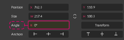
Use positive values to rotate an object clockwise and negative to rotate it counterclockwise.
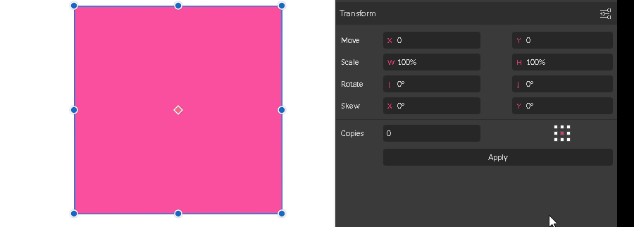
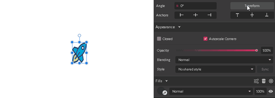
Transform Panel
Introduction
With Transform Panel in Gravit Designer you can move, rotate, scale, and skew objects.
To bring up the Transform Panel, head over to Inspector Panel and click on the button ”Transform” (1).
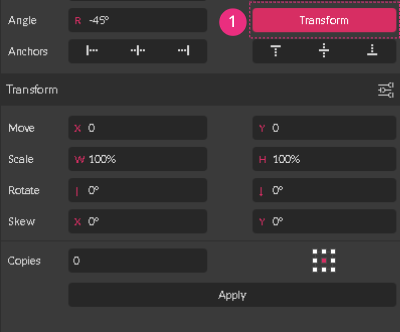
Structure
The structure of the Transform Panel is very straightforward - a pair of text fields opposite to the each of the four types of transformations:

- Move - to move objects horizontally or vertically by a specified number of pixels relative to their current location
- Scale - to adjust the width and/or height of objects
- Rotate / Reflect - to rotate or reflect objects by a specified number of degrees
- Skew - to skew (shear) objects by a specified number of degrees
Basic Workflow
To transform an object you need to type a numerical value in any of these fields and click the “Apply” button on the bottom of the panel.
In the example below I am rotating the square at the angle 6o0.
Moving Objects
Type a specific number in one of the Move fields:
Use the X field to move objects to the left (negative number) or right (positive number).
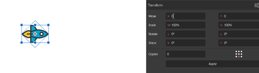
Use the Y field to move objects up and down. A positive value moves them down, a negative one moves them up.
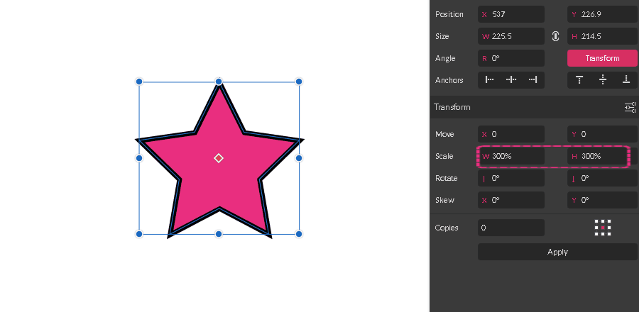
Scaling Objects
Scaling objects using the Transform Panel is a straightforward process:
- Select an object or a group of objects and bring up the Transform Panel
- Enter a new value in the width (W) or height (H) box, or both.
- Click Apply button.
Note: you can input only relative values inside the scale boxes, so the end result would be rendered in percentages to the initial size. To work with an actual size in pixels, please, use the Width and Height fields at the top of the Inspector Panel instead.
Rotating objects
You can rotate objects by a specific angle using the Transform Panel by following three simple steps:
- Select an object or a group of objects and bring up the Transform Panel
- Enter the rotation angle in the Rotate field.
- Enter a value inside the left text field to rotate.
- Use the right text field to set the angle of a reflect axis.
- Click Apply button to render transformation

Note: you are rotating the object around a specific point called a reference point. The default reference point is in the object’s center. Learn more about transform origin / reference point here

Skewing Objects
Use the Skew transformation to slant an object along one of the axes.

To skew (shear) objects by a specific number follow these steps:
- Select an object and bring up a Transform Panel
- Enter an angle value in the Skew text boxes:
- Use the left text box to skew along the horizontal axis
- Use the right text box to skew along the vertical axis
- Click Apply button to render the transformation
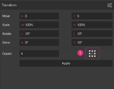
Transform and Copy Objects
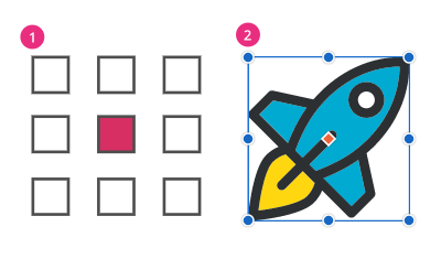
Use the Copies text box to produce a number of copies at the end of your transformation.
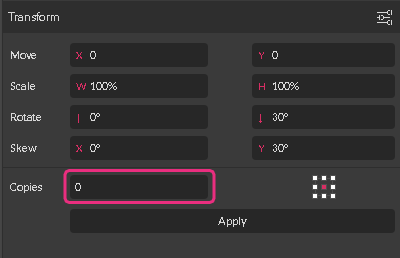
By default, the value of Copies text field is 0. By typing a positive value inside this field you change a behavior of the transformation:
- The original object (1) wouldn’t be transformed at all, because the value of the transform property for the original one is 0.
- The transformation would be sequential by nature, so the copies (2-5) would be produced one by one. Thus, the values for transform properties are calculated in relation to the previous copy, not to the original object.
Let me explain these rules by example.
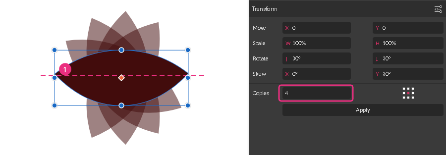
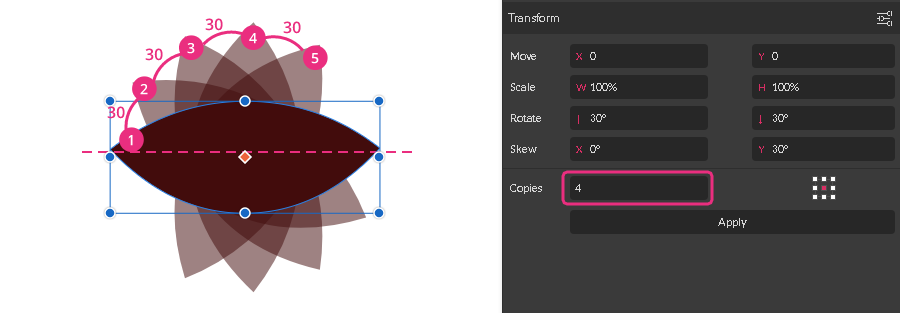
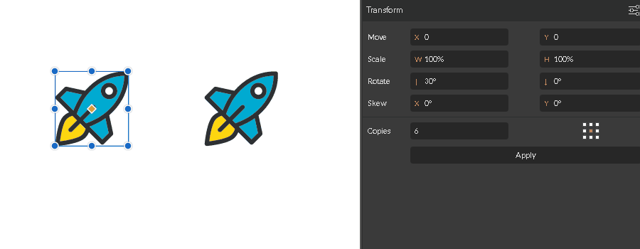
Let’s create 4 copies with a rotation angle of positive 300. Type 30 into the Rotate field (1) and 4 inside the Copies field (2). Click Apply button (3) to see the result.

The angle value for the original object is 0. The angle value for a Copy#1 is 300. The angle value for a Copy#2 in relation to the Copy#1 is also 300, but it turns to be 600 in relation to the original object. Therefore, Copy#3 has the angle value 900 and Copy#4 has the angle value of 1200 if we are taking the original object as the reference.

Reference Point
All transformations are carried out in relation to the Reference point, that specifies where transformation should start. The reference point is sometimes referred to as Transform origin point.
Reference point appears every time you bring up the Transform panel as a red ruby with a white outline.
By default, the Reference point is positioned in the center of an object.
To change its location manually follow these steps:
- Bring up the Transform panel to reveal the point
- Head over to the ruby point in the center of an object
- Hold the Left Mouse Button key and drag the point to the custom location
- Use the Pointer Tool to rotate the object around the custom reference point
Note: to transform an object by the specified value around the custom Reference point, you need to use Reference point map.
Reference point map
Another way to change the location of the Reference point is to use the Reference point map (1) (called also 9 point proxy) in the bottom right of the Transform panel.
Reference point map (1) represents a bounding box (2) of an object, so each square in the map is analog to the transform handle in the bounding box.
Each time you select one of the nine squares you move the reference point to one of the transform handles.
Reference point map works only within the Transform panel.
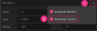
Autoscale Borders
Option “Autoscale Borders” (2) defines the border weight response when you size objects up and down. You can locate this option under the Advanced Settings (1) dropdown menu within the Transform panel.

Enable Autoscale Borders to keep the border weight scaling with an object.

Disable Autoscale Borders to maintain the same value of the border weight regardless of the size of an object.
Note: the same option (3) is hidden inside the Advanced Stroke Settings (2) dropdown menu within the Borders panel (1). This option works only when you are scaling objects manually with a Pointer Tool or Inspector panel

Autoscale Corner
Option “Autoscale Corners” (2) defines the corner radius response when you are sizing objects up and down. You can locate this option under the Advanced Settings (1) dropdown menu within the Transform panel.
Enable Autoscale Borders to keep the corner radius scaling with an object.

Disable Autoscale Borders to maintain the same value of the corner radius regardless of the size of an object.
Note: the same option (3) is hidden inside the Advanced Settings(2) dropdown menu within the Appearance panel (1). This option only works when you are scaling objects manually with the Pointer Tool or the Inspector panel
Colors, Gradients, Textures
Color (Gradients, Textures) in Gravit Designer can be applied to several object’s properties such as Fills, Borders, and Effects. Additionally, to the solid colors, Gravit Designer allows you to use several Gradient types as well as Textures and in some cases Noise as a fill. Here is a quick preview of what every fill looks like:

(1) Solid fill (2) Gradients - Linear, Radial, Angular (3) Texture fill (4) Noise fill (5) Background fill with applied blur effect
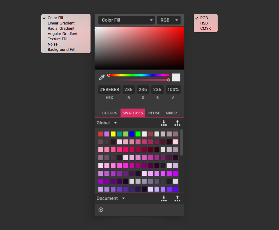
Gravit Designer can use RGB, HSB, and CMYK color models to represent colors. You can change the color modes in the Color picker popover. You can have different color models for every object in the same document.
Note: RGB and HSB are appropriate to Screen related designs while CMYK is used for Print materials.
Color picker & Fill Types
The main interface to choose and manage colors in Gravit Designer in color picker popover. It is available in the Inspector panel.
To change the color click on the colored circle next to a little pipette icon in the Inspector panel.
The Color Picker popover will show up. Here you can choose different fill options like colors, gradients, and textures.
Note: We will explain here different options for Fills, but the same principles apply to Borders and Effects as well.
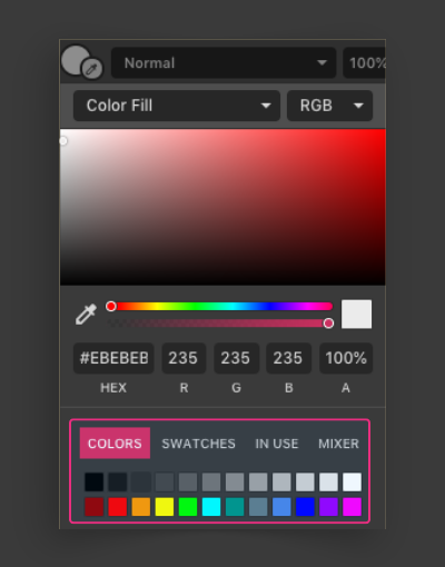
Solid Colors
Color fill is the default option. The object will be filled with a single Solid (flat) Color.

To pick a color first make sure that the selector (1) is set at Color Fill. Move the small dot (3) in the main pick area to choose the desired color. While dragging the color selector dot you can preview the color difference with the current color applied in the small color-swatch (6). You can change the hue of the main pick area with the hue slider (4). You can change how transparent the color will be with the Opacity slider (5).
Alternatively, you can change values directly in the fields (8) or choose predefined colors from pallets (9)
At any time you can sample a color from anywhere on the canvas by using eyedropper icon (7).
You can change the color mode to RGB, HSB or CMYK in the selector at the top right corner of the popover (2).
Linear gradients
You can use a simple gradient between two colors, or add in multiple color points for a rainbow-like multi-color effect.
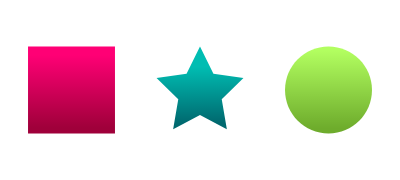
First, make sure the selector is set to Linear Gradient. To add a gradient stop point, click somewhere on the gradient bar at the top of the Color Picker popover. To move the color stop - drag it left/right. To delete a gradient stop point, click and drag it off the gradient bar. To change the color/opacity of a gradient stop point:
- click on the stop point to select it
- change the color/opacity as in a solid Color Fill

Change order of stops - reverses the gradient
Rotate the gradient left and Rotate gradient right (45 degrees). The default gradient is created horizontally. These controls change it to a 45-degree gradient in a single click and a vertical gradient in two clicks.
Alternatively, you can move the end handles of the gradient, and gradient color “stop points”, directly in the viewport. You can also rotate gradients directly at viewport. Hold SHIFT to constrain to 45 degrees angles.
.
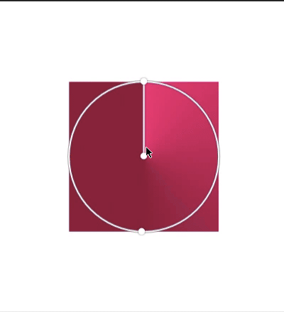
Radial (Elliptical) gradient

The Radial gradient in Gravit Designer is very powerful and when you master it you will be able to use it in some creative ways. Basically the Radial gradient is has a circle/ellipse shape.
You can add, remove, reverse, or change gradient stop points in the same manner as for Linear gradients (see above).
By default, the two gradient handles start from the center of the object and extend to its ends. At any point, there is only one active handle. It is white and all color stops are displayed on it. The other (inactive) handle will be represented as a thin blue line.
You can adjust handles directly on viewport to achieve different effects. You can move handles inside or outside the shape.
You can adjust the gradient center by moving inactive (blue) handle. This can produce some interesting dome effects. The center cannot move outside the ellipse indicated by the other handles.

Angular gradient

A circular sweeping gradient, similar to the colors on a DVD surface.
You can add, remove, reverse, or change gradient stop points in the same manner as for Linear gradients (see above).
Handle for gradient center - moves the center point for the angular sweep.
Handle for gradient start/end - changes the angle where the gradient starts/ends

Texture fill
Texture fill has many many advanced features, but the basics are simple. Often Images are used for textures, but Gravit Designer can use any object as a texture source.
First, make sure that Texture Fill is selected in the Fill type selector. You will be presented with the following interface:

(1) Image preview
(2) Choose an image - browse local computer storage
(3) Paste an image from the clipboard - good for copying from image viewer or website (as well as any object in Gravit)
(4) Stretch/tile- define how the image fits into the shape’s bounding box
- Fill - zoom to fill shape bounding box, crop off any parts that do not fit
- Fit - fit image within the shape bounding box, do not fill parts that are not covered by the image
- Stretch - fit image within the shape’s bounding box, distort to fit the whole image
- Tile - defined by the settings under the Advanced button (see below).
(5) Zoom image size: 10% minimum, 200% maximum. Only active when in Tile mode.
(6) Set as a transparency mask - use the alpha/transparency in the (PNG) texture image as a mask. Useful if you have used two or more layered fills for the shape.
Note: Not to be confused with standard grayscale matting where black is fully transparent and white is fully opaque
(7) Advanced: Closely resemble the CSS background model - which is wonderful if used for web development
(a) Repeat: Both, Horizontal, Vertical, None - define how the image repeats in a tiled effect
(b) Position: Auto, Top, Left, Center, Right, Bottom - define how the image is positioned in relation to the shape
(c) Size: Auto, Contain, Cover, Percent, Length - define how much of the shape is covered by the image
(d) Width, Height, Unit - resize the image by measurements rather than a size percentage
Presets:
- Fill: Repeat: None, Position: Center, Size: Cover.
- Fit: Repeat: None, Position: Center, Size: Contain.
- Stretch: Repeat: None, Position: Center, Size: Percentage, 100%, 100%.
- Tile: Repeat: Both, Position: Auto, Size: Auto.
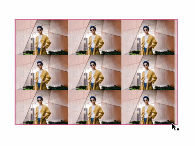
Texture fill with applied Tile preset. The texture will repeat horizontally and vertically. You can change the size of tiles in Color Picker popover.
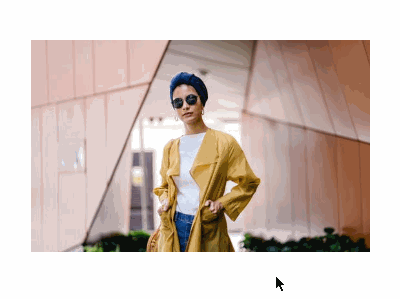
Texture fill with applied Fill preset. No matter the size of the object the texture will cover all of its area. Useful for Responsive UI design. Similar to CSS background-size: cover

Texture fill with applied Fit preset. No matter the size of the object the texture will fully fit inside the object and will be completely visible at all times. Similar to CSS background-size: contain.
Note: The pink added for clarity.

Texture fill with applied Stretch preset. The texture will stretch with the object. This can lead to distortion of the texture.
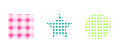
Noise fill
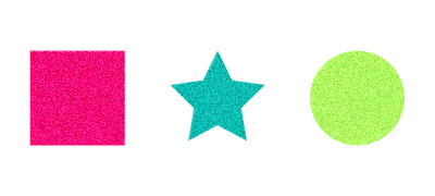
Noise fill ads random (black/white or color) pixels similar to grain texture to your object. (speckles, sand texture)
Noise fill has several types:
- Original (adds transparent pixels, so the objects or fills behind can be seen)
- Black (adds black pixels on white background)
- White (adds white pixels on black background)
- Color (adds random colored pixels)
Most appropriate is to use noise as a second fill layer and use transparency or blending to add subtle grain to your shape.
Here are some examples of a noise fill:

Background fill
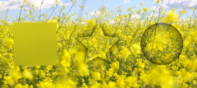
Shapes with a background fill are normally invisible but can be used as a selection area for effects. The effect is applied to the part(s) of any underlying object(s) covered by the shape with a background fill. Under normal circumstances, effects apply to whole objects. This is a unique Gravit Designer feature that can be very powerful and used in creative ways. It is nondestructive.
Some usage ideas:
- Quickly change the hue or contrast of the whole page: Make a rectangle above all other objects. Apply Background fill and add Color adjust effect to it.
- Dynamic Background blur: Make a rectangle with Background fill, add Blur effect and check the clip option. All that is underneath this rectangle will be blurred.
- Quickly hide sensitive information from screenshot - place a rectangle above the portion you want to hide and add a blur or hexagon effect
- Do it yourself Liquify - a circle with Bulge effect
- Color adjustments in part of the image
Color palettes
Color palettes are 4 tabs at the bottom of the Color picker popover. Here you can choose predefined colors to use as a solid color or as a part of a gradient.
Colors
Here are 24 default predefined colors. The first row is a simple grayscale palette (from black to white with 10 shades of grey) and the second row is commonly used colors.
Swatches
Swatch sets are user-created palettes. As well as plain colors they can also hold other fill types such as gradient fills and textures.
Each square in the Swatches area is a single “swatch”. Swatches are two types: Document swatches (Available and saved with the current document) and Global swatches (Available in all documents). Global swatches are saved on that specific computer (desktop apps) or
In your local browser storage (web app). If you use Gravit on a different computer or clear your traces in the browser you will lose all your saved swatches.
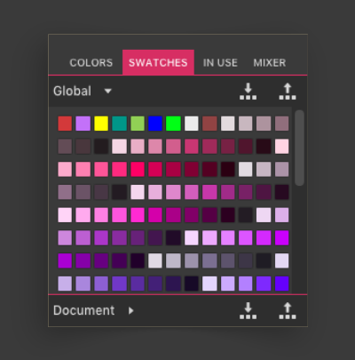
Each fill type will display its own global and document swatches. For example, the Color fill will display a different set of swatches to the Linear Gradient fill.
To add a new swatch to the Global or Document set, click the + icon. The current fill will be added to the swatches.
To remove a swatch from the swatch set, drag it off the Swatches area

You can Import and Export Swatches in order to share them with other designers or to use them on another computer. Gravit Designer uses its own Swatch format (.gvswatch), but you can use tools such as http://obtusity.net/gravit/ to convert other software swatches and import them in your designs.
To export swatches use icons at the top right of the swatches palette. The first option is import swatches. It will add new swatches from the .gvswatch file without removing existing ones.
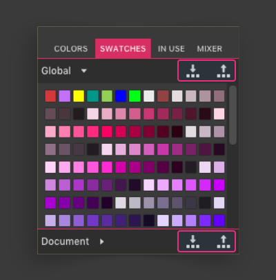
Note: If you want to remove all swatches at once - open the console (CTRL+SHIFT+I in the browser ot CTRL+SHIFT+F12 in the Desktop version), type "gContainer.setProperty('swatches', null);", hit Enter, then restart the app (or Refresh the TAB in the browser if you are using a web version).
In Use

This palette shows colors currently used as fills (also border fills) on vector objects in the document. This excludes text color as well as the colors used in effects or page backgrounds. The colors are sorted by usage - most used colors are first.
Mixer
The Mixer provides useful variations for monochromatic coloring (variations of the same color).
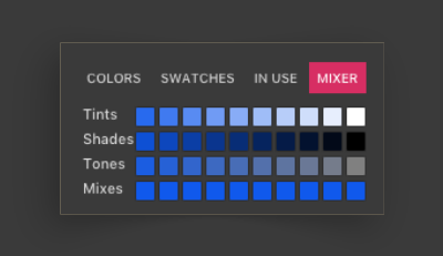
Tints: a gradient between the current color and white. Can be regarded as increasing brightness in the HSB color model.
Shades: a gradient between the current color and black. Can be regarded as decreasing brightness in the HSB color model.
Tones: a gradient between the current color and grey. Can be regarded as decreasing saturation in the HSB color models.
Mixes: Set an object color, use the eyedropper to pick a color off the canvas. This row will give you a gradient between the two colors.
Productivity tip: You can select all objects that have the same solid color fill on the current page and change that color at once. Go to used colors tab in color picker interface. Hold ALT + click on a color swatch. All the object that this fill color and are placed in current page will briefly flash on the canvas. Now you can change the color and it will be replaced on all objects that it is used.
Fills
Color modes (RGB, HSB, CMYK)
https://learnui.design/blog/the-hsb-color-system-practicioners-primer.html
Adding and changing fills

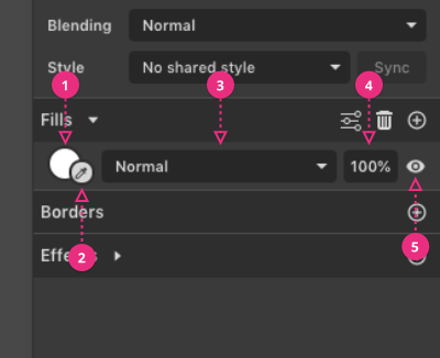
(1) Add a fill to a selected shape (shapes can have multiple, layered fills)
(2) Remove Selected Fill
(3) Advanced Fill Settings (for selected fill)

If you click on the empty area of the fill interface, you can select the fill. You can also drag fills to re-order them for shapes with multiple layered fills.
The clickable area is highlighted in lighter grey and pink
Fill controls
(1) Click once on the fill preview circle to change the fill type (solid color, gradients, etc...) and properties.
(2) Color picker eyedropper - Pick a color from anywhere on the canvas
(3) Blending mode - blending mode for this fill only.
(4) Opacity (percentage) for this fill only.
(5) Visibility (on/off). Hide/show this specific fill.
Here is a Color picker eyedropper in action:

Pro Tip: The fill preview circle can be dragged directly onto another shape into the viewport.
Pro tip: You can also drag from one color preview circle onto another. For example, copy a fill color onto a border color.

Advanced fill settings
Fill Rules
Fills have two (winding) fill rules which define how holes are calculated:
- Non-Zero (Fill Holes) - Internal enclosed areas are NOT regarded as holes
- Even-Odd (Keep Holes) - Internal enclosed areas ARE regarded as holes
Multiple Layered Fills
One very useful feature of Gravit Designer is that it enables you to add multiple fills to the same shape.
These fills can be layered and combined using opacity and blending modes. Here is an example of a single ellipse with multiple fills.
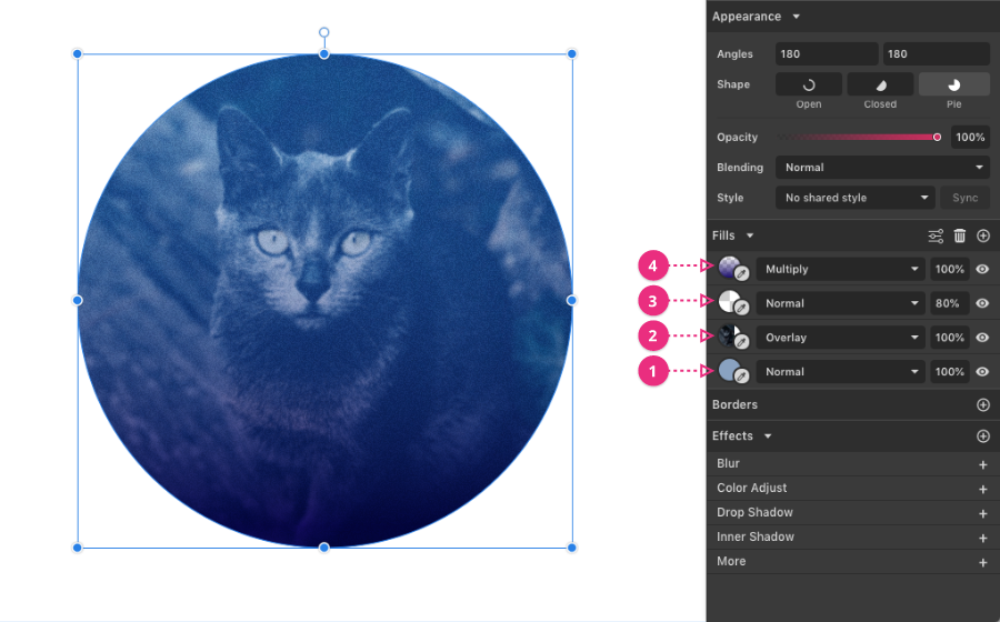
(1) Single color fill as a base
(2) Added an Image (Texture) fill, set to Overlay
(3) Added a Noise fill, with Opacity set to 80%
(4) Added a Gradient fill, set to Multiply
Color picker Eyedropper
Eyedropper tool allows you to change the color by picking a new one from the viewport:
- Click once on the small eyedropper icon next to the Color preview, and release. Alternatively, use the eyedropper icon available inside the Color Picker Dialog
- Move your cursor over the viewport
- When the selector square (in the middle of the magnified view) is over the color you want, click once to pick that color
- Use the Esc (Escape) key to cancel Eyedropper mode.

Borders
Borders are the outlines of your shapes. Sometimes referred to as strokes, outline or even brushes. In Gravit Designer, you can use multiple borders on one object, place them inside or outside of the object and have various fill and blend options applied to them.
Here are some examples of borders in GD:

(1) Black border
(2) No border
(3) A border on an open (not closed) path
(4) Layered (Multiple) borders
(5) Layered (Multiple) borders with blending mode
(6) Dashed Border
(7) A dashed border with end arrow
(8) A border with both start and end arrows
So let’s look at some of the options:

(1) Borders have all the options of Fills, except Noise. See the Fills section for more detail.
(2) Border width (thickness) Keep in mind that borders are always drawn on top of the object fills
(3) Blending mode (for current border). Borders can be layered on top of one another.
(4) Opacity - opacity for current border
(5) Visibility toggle - hide/show current border
Advanced stroke settings

To get the advanced stroke settings for a border:
Select the border in the Inspector panel. The clickable area highlighted in light grey in the screenshot. The end of the border selection will highlight to show it is selected (1). Click the Advanced stroke settings icon (2).
Border drawing properties
The Advanced stroke settings popover contains 3 border properties controls at the top.
Note: end options affect both ends of the border, even if you only have one endpoint selected.

(1) Ends - how the border behaves at the end of a path
(a) Butt - ends directly at the anchor point. Wide borders will show a square end.
(b) Round - end as if a circle was drawn around the anchor point, the same width as the border.
(c) Square (default) - end as if a square was drawn around the anchor point, the same width as the border.
(2) Joins - how the border behaves at sharp (straight) corners in a path
(a) Bevel - corners is truncated or beveled
(b) Miter (default) - corner forms a sharp peak
(c) Round - corners is rounded
(3) Position - how a border is shown in relation to a path (and interacts with any fill)
(a) Inside - the border is drawn inside the path, on top of any fill. (this option is disabled for open paths and lines)
(b) Center (default) - the border is drawn centered on the path, partly overlapping any fill.
(c) Outside - the border is drawn outside the path, not over any fill. (this option is disabled for open paths and lines)
Dashed borders
The Advanced stroke settings popover contains a dash array generator which allows you to make various dashed or dotted borders.
Note: To get predictable control of the pattern of your dashed borders: Set the border Ends to Butt and set the position to Center.
To make a simple dashed border use the first two boxes:
- use the first Dash box for the length of the dash
- use the first Gap box for the length of the gap (if left empty will use Dash value for the Gap as well)
- leave the last two boxes blank for a simple dashed (or dotted) pattern

To make a dotted line, first set the end type to round, and then set the dash value to 0. Now adjust the gap value to change the distance between dots.
You can also use the last two boxes to get a two-part pattern, for example, a dashed-dotted line.
Each Dash and Gap pair define half of the pattern.

Note: Dash/Gap values are not scaled with the resizing of the object even if the Autoscale borders is checked
Border Arrows (line ends)
You can add arrows to the ends of your Borders. This works for closed or open paths.

You can choose between these predefined arrowheads:
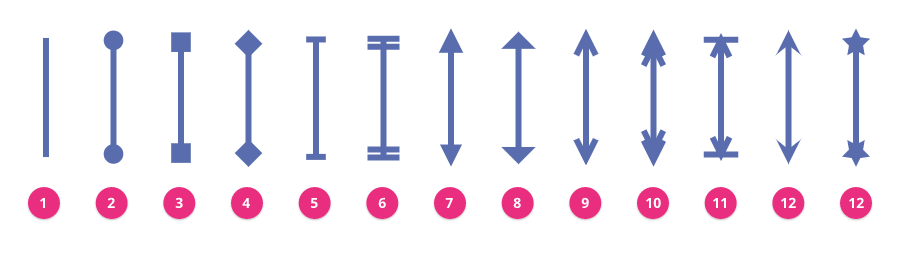
None (1), Circle (2), Bullet (3), Diamond (4), Line (5), Double Line (6), Arrow (7), Fat Arrow (8), Line Arrow (9), Double Line Arrow (10), Arrow Line Bar (11), Arrow Pointer (12), Custom (see below)
If provided presets are not enough, you can use any shape as a custom end arrows. Here is how:
- Create the arrow-tip shape pointing upwards.
Note: only the overall shape will be used, like a silhouette. No gradient fills, etc. - Select the shape and copy it to the clipboard.
- Select a border to customize.
- Use Paste icon in Advanced stroke settings
- Adjust the options as needed
Arrow options

(1) Size - the size of the arrow as a percentage of the original shape multiplied by the width of the border.
When the border width is 1 and the size is set to 100%, the arrow will be the same size as the original.
(2) Outline - use the custom shape outline rather than a filled shape. Uses the border width.
(3) Position - slider at halfway means the arrow shape is centered over the endpoint of the path. Either end of the slider moves the arrow along the path. The position is calculated using the bounding box of the arrow shape.
Autoscale Borders
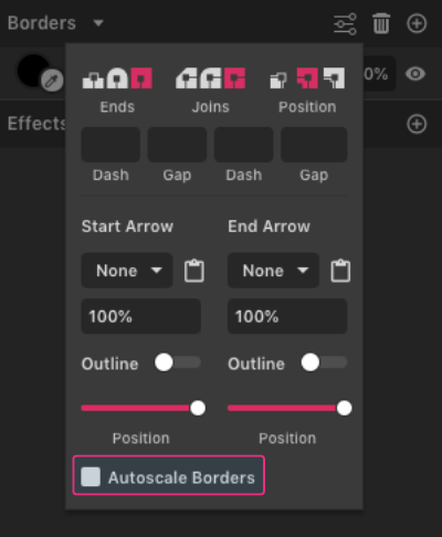
Autoscale Borders - change the width (thickness) of the borders appropriately if the shape is resized.
Without this option ticked, borders will remain the same width (thickness) when the shape is resized (This option is most commonly used in UI design)

With this option ticked, borders will change width (thickness) appropriately when the shape is resized
You can temporarily override this behavior in Transform panel settings.
Organizing your designs
Document
See here how to work with files/documents in Gravit Designer.
Pages
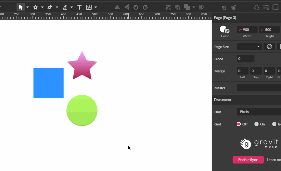
Pages are a way to define multiple canvas areas in the same document in order to organize your design in distinct chunks. You can export every page separately or even export in a multipage format such as PDF. You can use separate pages to represent different app screens, web pages, several social media graphics and of course page from a print document.
Usually, pages have specific dimensions for width and height, but there is one exception - infinite canvas page. It extends infinitely in both directions.
You can at any time change the page size in the Inspector panel by directly typing new Width and Height of the page or choose one of the predefined sizes from the Page Size drop-down menu.
Every Page can have its own background that can be a solid color, gradient or a texture. Opacity can be changed too.
Page properties
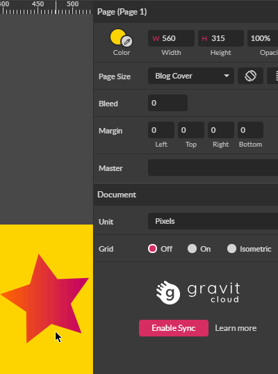
When nothing else is selected in a document Inspector panel shows properties for current page canvas. Here you can manage all the page properties.
Note: To deselect all objects, click on an empty area or use Deselect all command Edit > Deselect all (CTRL+SHIFT+A)
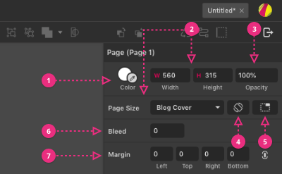
Color (1)
The background color of the page. You can also adjust opacity, use gradient fills or texture (image) fills
Size (2)
Here, you can modify the size of the page. Typed values in Width and Height fields are in document units. Also, you can use page size presets drop-down which gives you predefined commonly used document sizes such as Social media graphics, Device screen sizes, and Standard print sizes.
Note: If your page size uses real-world units for printing (inches, millimeters, or centimeters), you can use decimal values (for example, 7.5) as number values. (You can do the same for online output using pixels as the unit, but it is not very useful as output will only be displayed on a screen as full pixels, not partial pixels.)
If you want to re-use a project for both online display (pixels) or print, you can change the unit used, which will automatically change the values in the size fields above.
Note: If you change between a real-world unit and pixels 72 dpi will be used for conversion.
Opacity (3)
Here you can change how transparent the canvas will be.
Note: Setting the opacity to 0% is good for exporting objects with a transparent background. However, you can also select a transparent background at the export stage rather than setting it as a page property.
Orientation (4)
You can change the page orientation from portrait to landscape (or the reverse). This changes places of Width and Height values without rotating the content of the design.
Trim Canvas (5)
This very useful feature will trim the page size to fit the current content. If the content is larger than the canvas, the page will enlarge to fit the content. If the content is smaller than the canvas, the page will be trimmed to a rectangle that neatly fits the content with no extra space. This is particularly useful if you want to use an image as the base for your design.
Import the image, then use the Trim Canvas icon. Your design will now exactly match the image size.
Warning: the imported image may be scaled down on import if it is bigger than the current canvas size. Click on “original size” in inspector panel while the image is selected to restore its original dimensions
Bleed (6)
Define the bleed size in document units. For commercial print projects, pages are created at a larger-than-usual size. After binding, the slightly oversized rough page edges can be cut to size for perfect edge alignment. This extra space (that will be cut away) at the page edge is known as the bleed area, or just bleed. Bleed area is not visible in viewport.
Margins (7)
Margins are inset from the page size and form a visual part of the final output, while bleed adds an extra space around the output that will be cut from the final product. By default, margins are linked (changing one will change then all). To modify margins individually, click the link icon at the end to unlink them.
Page panel
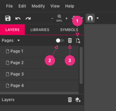
You can create a new page with the same properties as current (size, background, margin) by pressing Create New page button on the top of the pages panel (1).
To delete active page press Delete Active page button (3). All content and objects on the page will be deleted.
You can’t delete the page if there is only one in the document.
Pages can be displayed in two modes. Single mode (default, only one active page is shown) and Multiple Page mode (all the pages are shown in a grid side by side). At any point, you can switch between the Single and Multipage mode by pressing on the switch on top of the pages panel (2).
While in the multipage mode you can move and rearrange the pages by clicking and dragging on the page label.
Note: Moving a page in the viewport does not change the export order when exporting to a PDF or multiple images. To change the export order, you must move the pages (up and down) in the Pages panel.
Note: Documents, that contain a page with an infinite canvas (with no defined dimensions) can’t be switched to “Multipage mode.”
To duplicate page follow these steps:
- Switch to multipage mode on the top of the pages panel. All the pages present in the document will be shown on the screen side by side
- Select the page you want to duplicate by clicking on its name label on top of the page in the viewport
- Press CTRL/CMD + D or Edit > Duplicate.
- Alternatively, you can press ALT + drag page label to duplicate
To rename a page double click on its name in the pages panel (by default it says something like “Page 1”) and type the new name.
You can also lock/unlock all objects in a given page by clicking on lock icon next to the page name as well as hide a page by clicking on the eye icon next to the page name.
Note: To see lock and hide icons you should point your mouse over the page name.
Master pages
Setting a master page allows you to use another page content as a background of the currently selected page. Changes that you make in master page will be immediately visible on all other pages that use it.
For example, set up a master page with a standard letterhead or other decoration - headers, footers, side boxes, etc. or for UI: Create your base page, then on other pages, you can show additional overlay elements such as pop-up boxes and menus or elements states like mouse over, click, etc...
Note: Every page can be a master page, but master pages can’t be nested.
Quick presentation
Sometimes it can be useful to quickly present your ideas to the stakeholders. You can make a simple presentation using pages. Make each slide in a separate page. Order them in pages panel like you want them to appear in the presentation. Go to View > Play/Present…
The bare-bones presentation will start in fullscreen starting from a currently selected page in the document. You can move from slide to slide with arrow keys and exit with ESC key.
Layer groups
To bring some more clarity and structure in your design you can use Layer Groups (folders). You can organize your design in logical parts to manipulate them more efficiently.
Layer groups have their own special properties, including colors and wireframe mode. Layer groups show as a folder icon in the Layers panel.
Adding a layer group
Click on the New Layer icon (at the top of the Layers panel) to add a new layer group.

Objects can be added to a layer folder by dragging them above the layer in the Layers panel. The layer folder will highlight. Releasing the mouse button with the layer folder highlighted will move the object(s) into the layer folder.

If there is a selected object in the Layer group, adding any new shapes or paths will automatically add them within the same layer group.
Note: Bring to Front/Send to Back work inside the Layers group boundaries.
Frame mode
Frame mode is used for anchoring elements within the layer group.
You can set the layer group to frame mode by selecting the layer folder and ticking the Frame checkbox in the Inspector panel

If you set the anchoring for any element within a layer folder, it will switch to Frame mode automatically when you reselect the layer folder.
Frame mode will show/define a selection box enclosing the layer folder content when the layer folder is selected. This will use the Layer Group color.
This selection box also acts as a clipping object. Objects (or parts of objects) moved outside the selection box frame will become invisible (similar to a document Clip content). Note that properties outside of geometry bounding box such as outside borders or effects such shadows can be clipped. When activating Frame mode all containing child objects are anchored automatically to top left.

Layer group contents can be moved, resized, or rotated using the Layer tool (M) on the toolbar. Using this tool, click on any object in the working space to select and drag to move the layer group which contains that object. Alternatively, select the layer folder in the Layers panel.
Layer groups also have some extra properties that are not available to normal objects:
- Layer folders (and all their contents) can be set to wireframe view. This makes it easier to work on other content without hiding the layer folder content.
- Layer folders can be assigned a color. The layer folder color will define the colors of bounding boxes and anchor points on that layer.

Objects
Objects are all the elements that have representation in the Layers panel and on canvas (including groups, symbols, lines, and shapes). Sometimes referred to as Layers.
Object properties
Every single object in Gravit Designer can have these properties
- Fill
- Borders (Strokes)
- Effects
- Opacity (Transparency)
- Blending mode
- Coordinates
- Size
The main advantage of vector objects is that they can be scaled infinitely, without any loss of quality or fidelity while keeping the file size small. (See the more in-depth chapter about differences between vector and raster graphics here)
Objects in Gravit Designer
(1) Preset shapes (Primitives)
(2) Image (Bitmap, Raster)
(3) Path
(4) Compound shape
(4A) Compound shape subelements
(5) Text box
(6) Group and its containing elements
(7) Symbol - Master and Instance
(8) Layer group (Layer Folder)
Deleting objects
Backspace key or Delete key will delete a selected layer group or object. Alternatively, you can highlight the object or layer group and click the Delete Layer or Item icon.
Rename objects
To rename an object or layer group double click on its name in the Layers panel and type the new name. Hit ENTER key or click outside the text field to apply the new name.
Locking objects
Both objects and layer groups can be locked by clicking the small lock icon. Locked objects and layer folders cannot be selected, moved, or changed. Click the lock icon again to unlock.
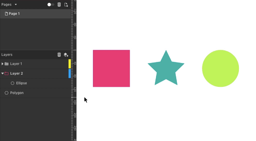
Both objects and layer folders can also be hidden by clicking the small eye icon. Hidden objects and layer folders cannot be selected, moved, or changed. Click the eye icon again to unhide.
Hiding objects
Both objects and layer groups can also be hidden by clicking the small eye icon. Hidden objects and layer folders cannot be selected, moved, or changed. Click the eye icon again to unhide.

Note: To see the lock and hide icons you should point your mouse over the object’s name.
Groups
Groups are sets of objects that are treated as a single object. Elements in the group retain all their properties like fills, borders, and effects. You can move, rotate, resize, change blending and opacity, as well as apply effects to a whole group.
To group selected objects use CTRL/CMD + G, menu Modify>Group Selection or use a Group button on the main toolbar.
To ungroup use Modify>Ungroup Selection, shortcut CTRL/CMD+SHIFT+G or Ungroup button on the main toolbar.
Group and Ungroup icons in the toolbar.

Note that Ungroup command will ungroup not only groups but also compound shapes and clipped (masked) content.
Alternatively, you can use the context menu to Group and Ungroup objects.
Selecting elements within the Group
When clicking on a group - the first click selects the whole group, the second click takes further in the hierarchy and selects object inside when the cursor is pointing

You can select elements inside the group in the layers panel like any other object. If the Group is collapsed click on the arrow next to the Group name to expand.
Groups have a checkbox for “Click-through this element” in the Inspector panel. Ticking this box allows a single click to select an element within the group for changes. This can be useful if you have to make multiple changes to elements of a group.

Frame mode
Using a drop-down in the Inspector panel, groups can change between:
- Group mode (default) - resizing the group stretches all its elements
- Frame mode - individual elements will resize or move depending on their anchoring properties. See the section on anchoring for more details. Note: when a group has been switched to frame mode, the group bounding box also acts as a clipping area. Frame mode can be very useful for making responsive UI elements.
If you set the anchoring properties for any element within a group, the group will automatically change to Frame mode.
Symbols
A special type of group that can be easily "cloned". Changes to the original can affect all the clones, or you can make custom changes to an individual clone.
Symbols can help you in maintain consistent design and make design changes at scale.
Every Symbol is made of “master” which is the original symbol and “instances” which are the clones.
To make a new symbol: select one or more objects and go to Modify>Symbol>Create Symbol, alternatively, you can use Create symbol command in the context menu or in the main toolbar . The dialog will appear allowing you to name your symbol. Type a name and press OK. The selection is now converted to a Master symbol.

Symbols can be created in the Symbol panel using the icon at the top.

By default, the symbol master will show a label with his name on the canvas. You can change this under the View menu > Canvas > Show Symbol Labels or inside the snap dropdown in the toolbar
Symbols show a purple bounding box on the canvas and show as purple text and icons in the layer menu.

Every copy of the symbol will become its “instance”. The instance will inherit all the properties of the original master symbol and will be updated instantly if the master is changed.
Overrides
The real power of symbols lies in ability of instances to have a set of different properties and selectively get updates from the Master symbol.
Once a property of a symbol instance is changed it loses the link to the master, but all other properties are synced as normal. That way you have a great flexibility to make variations of the symbol without losing connection to the master. In the following example, the text content and the background of the button symbol are changed in instances, but all other properties are still connected and synced.
You can at all times reset all overrides and set the symbol instance in its original state.
To reset instance use Context menu > Reset Instance or Menu > Modify > Symbol > Reset Instance. Alternatively, you can hover over the instance name in the Layers panel and click on reset icon .

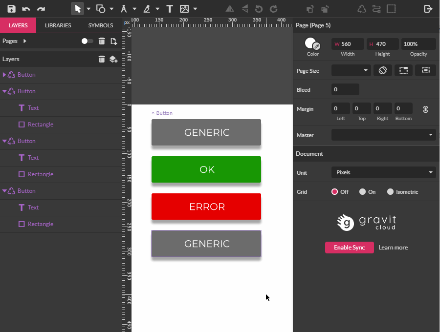
Symbols panel
Symbols panel is the last tab in the left sidebar. Here you can manage all your symbols.
To find the master symbol on canvas click on its thumbnail in the panel. Gravit will fit the symbol in the viewport.
Double-click on a symbol thumbnail will select the symbol master and all its instances.
Note: this will still zoom to the master symbol only, the same as a single click.
To make new symbol select objects on the canvas and press “plus” button.
Drag the thumbnail in the viewport to place an instance of the symbol somewhere on canvas.
To delete symbol first select its thumbnail (it will become highlighted in panel) and press “trash bin” button.
Warning: Once you delete the symbol it will delete all of its instances of that symbol inside the whole document.
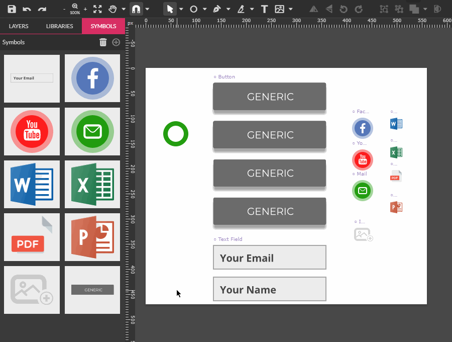
Instance properties in Inspector
Finding the master
With any instance selected, use the Instance drop-down in the Inspector panel to select (master). You will be zoomed into the master symbol, even if it is on another page.
Detach
Detaching symbol instance will break the link of that particular instance with its master and convert it to a regular group.
To detach the instance:
Select an instance and choose (Detaching symbol instance) from the Instance drop-down in the inspector panel.
Swap symbol
Here in the Instance drop-down, you can also swap one symbol instance with another symbol instance. The new symbol instance will be placed at the same coordinates as the original instance,

Pro tip: Make a habit to use a blank page to collect your master symbols and use only instances inside your actual designs. That way you can’t change the master unintentionally and all your repeating elements can be found in one place for further development
Transforming symbols
Rotation or movement of an entire master symbol will not affect the instances. Rotation or movement of elements within a master symbol will affect its instances. Scaling a symbol will scale its instances that are not already scaled.
Anchoring
All elements of the symbol can be anchored to the symbols bounding box. See more on the anchoring here
Deleting symbols
Deleting Master symbol will delete it from the canvas but the symbol will be still present in Symbols panel and can be inserted again.
While the Master symbol isn’t present on the canvas all of its instances will be temporally detached until (if) it is placed back on the canvas.
Clipping / Masking
Clipping / Masking is used to hide parts of one or several object(s) inside the boundaries of another object which is used as a mask (called Clipping object or Clipping path). Clipping is non-destructive action. You can move or in any other way edit the Clipped content at any time.
You can use any single vector object or text as a clipping path.
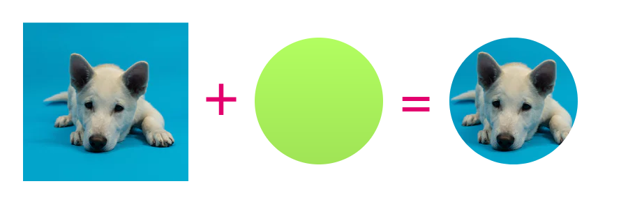
You can achieve clipping in several ways in GD:
Using Clip Selection
To clip one or several objects inside a Clipping path:
- Put the Clipping path below all objects you want to be clipped.
- Select objects to be clipped and Clipping path.
- Click on Clip button in menu or in the menu Modify > Clip Selection
- All the objects will be placed inside the bottommost one and any part that is outside of it will be hidden

Using Mask with shape
- Put the clipping path above objects that you want to clip
- Select objects to be clipped and Clipping path.
- Click on Mask with shape in the context menu (CTRL/CMD+SHIFT+M) or alternatively in the main menu Modify > Mask with Shape

Using Layers panel
- Drag the objects to be clipped on top of Clipping path in the Layers panel

Note: If the Clipped content doesn't fully cover Clipping path area the fill will be visible. The border of the clipping path will be visible above the Clipped content
Using Paste Inside Selection
- Copy objects to be clipped in the clipboard
- Select Clipping path
- Choose Edit>Paste> Paste Inside Selection
- The content of the clipboard will be placed on the top-left corner of the Clipping path
Pro tip: Using Drag on top of the Clipping path while holding CTRL/CMD key
- Select Object to be clipped
- Hold down the CTRL/CMD key and drag over the border of the Clipping path
- Once the Clipping path is highlighted release the mouse
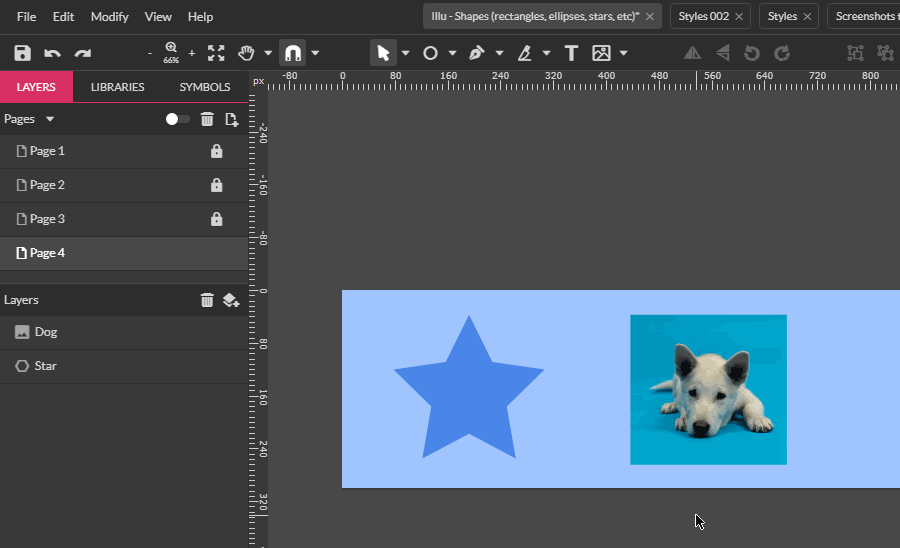
Shared Styles
Styles are sets of reusable object properties such as Fills, Birders, Effect and text properties that are saved for later use. They give a designer huge power in making design changes quickly. They help to keep the design language consistent throughout the design process.
If you change some of the properties of an object with applied shared style, the change(s) will be propagated to all other objects that share the same style. Gravit doesn’t sync styles automatically. Once you made the changes you can sync them with a click of a button.
To make a new shared style:
- Select one object
- Adjust its properties as desired
- Find the Style dropdown in the Appearance panel and click on Create New Shared Style opinion
- The Style Creator dialog will appear. Here you can give a name to the new style, as well as choose which properties will be saved (and later synced) with the style.
- Style - this includes the object’s Blending mode and Opacity,
- Fill - all applied fills with all their properties
- Border - all applied borders with all their properties
- Effects - all applied effects with all their properties
- Text - Character and Paragraph properties - Font Family (Typeface), Font style (Bold, Italic, etc.), Font Size, Color, Paragraph Alignment (Left, Center, Right and Justify), Letter Spacing (Tracking), Word Spacing, Line Height (Leading). Text properties are selected automatically is the text object is selected.
While most of the time the styles will contain all the object’s properties, fine granular control over what is synced can be very handy in certain situations when you want to keep only parts of design consistent (For example keeping effects in sync, but having different fills and borders).
To apply already created style to one or more objects:
- Select objects that you want the style to be applied
- Go to Style dropdown in Appearance panel and choose saved style
- The style will be applied to all selected objects
Note: The Sync button becomes active only if there are changes in the appearance of the object that are saved in the style. For example, if only effects are part of the current style, changing the object fill or border will not activate Sync button. The Sync button will be triggered only if changes in effects are made.
Note: Shared styles are synced only in a single document.
To manage created styles:
- Go to Style drop-down and select Organize Shared Style option.
- The Style Organizer dialog will appear
- Here you can rearrange, rename, delete styles, as well as edit which properties are synced.
- Once ready click finish to close the dialog and apply changes
Pro tip: If you want to copy a shared style to another document. Select an object with that style applied. Copy and Paste in the new document. The style will be transferred with the object. Now you can delete the pasted object
Swatches
Images
It’s possible to work with bitmap images on Gravit Designer. As an element, images interact similarly to a rectangle shape, but unlike vectors, you can only do basic editing like cropping, resizing and adding Effects.
Vector vs Bitmap
Bitmap images, or raster images, are composed of little blocks of color called pixels. Each pixel is assigned a color code and a location, and when mapped together, they form a picture. When you zoom in on a bitmap image, you can see the individual pixels, so there’s a loss of quality.
Vectors are based on geometrical formulas, instead of pixels, to represent images. Because of that, it’s possible to edit it resizing and changing colors without any loss of resolution.

Gravit is mostly a vector editing tool, but basic image editing is also possible.
Insert images
It’s possible to add images to your file with Place image and Link image, features available on the toolbar and also through File > Import > Place image and File > Import > Link image.

With Place image, you can import an image from your computer and insert it on the canvas. A copy of this image will be included as a part of the project, and this can result in a larger file size. If you open the file in another computer, the image will be still included.
Link image will place the image on your canvas with a link to the original one. The image is not included as a part of the project, and as a result, the file size will be smaller. If you open the file in another computer, the image will not be included. If you change the original linked image outside Gravit, on the next time you open the .gvdesign file, the modified image will be displayed.
You can also paste image from your clipboard with Paste (CTRL/CMD + V), Paste in place (CTRL/CMD + SHIFT + V), Paste Inside Selection (CTRL/CMD + SHIFT + ALT + V) or Paste here (Context menu)
Note: when you insert an image that has larger dimensions then the current canvas the image is shrunk to fit inside the canvas/page. You can reset it to its original dimensions by clicking on “Original size” button in Inspector panel.
Images toolbox
Resize / Crop
To resize an image, click on one of the blue transform handles and drag.

Hold the Alt key while dragging to resize from the center.

You can also resize by with input values directly on the Width and Height fields on the Inspector panel.
To crop the image, select it with the Subselect tool (D) or double-click it.
Click the blue corners or edges and drag to crop.

Click and drag the orange corner markers to make the corners round.
To move the image inside the frame, click it and move it.
To confirm and apply cropping and exit cropping mode, use any of the following:
- use the Esc (Escape) key
- use Modify > Confirm Cropping
- change to another tool e.g. the Pointer tool (V)
- while in cropping mode, right-click and select Confirm Cropping
If you resized, rotated or cropped an image and you want to reset this image to its original state, you can use the “Original size” option on the Inspector panel. If you want to reset only the Crop - use the “No crop” button on the Inspector panel.
You can replace the image with the “Replace” button, also on the Inspector panel. A dialog to browse for the image will open in order to select the new image. All the transformation and effects applied to the original image will be preserved.
Flatten
Available on Modify > Flatten.

With Flatten, it’s possible to convert selected elements to a single 72 dpi image. This operation works both for vectors and bitmaps. This is very useful to make the total file size smaller.
Vectorize image
Vectorize image will convert pixel color information into geometric shapes. In other words, it transforms a bitmap image into a vector shape. This feature is available on Modify > Path > Vectorize image.
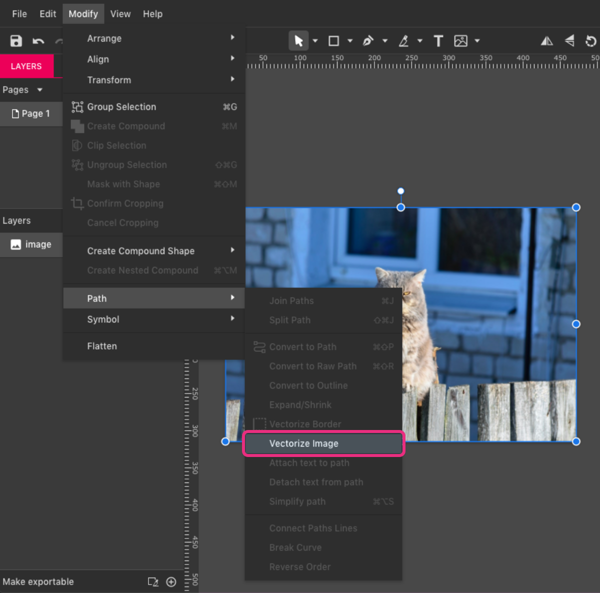
The original image will be deleted after vectorizing.
For more complex bitmap images, the result can be less accurate. Vectorising is a complex process and it is most appropriate for simple geometric graphics such as logos or icons.
Note: If you vectorize detailed image the result can be a very complex path, which can slow down Gravit Designer.
Note: If you have the possibility, always use original vector shapes instead of vectorized images.
Removing parts of the image
As Gravit is a vector tool, there isn’t some kind of eraser to remove some portions of an image, but that is still possible with other features, like Clip.
Create a shape with one of the drawing tools, outlining the portion of the image you wish to keep. In my example, I want to keep the leaf and remove the background.
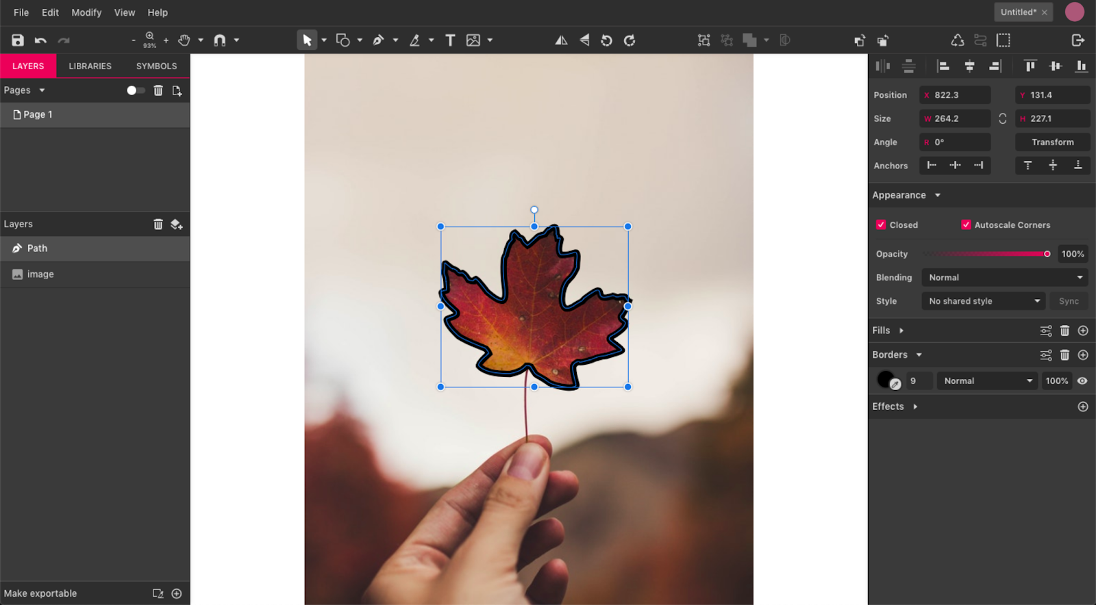
After that, clip the image with the shape, creating a Mask shape. If you want, toggle the border’s visibility.
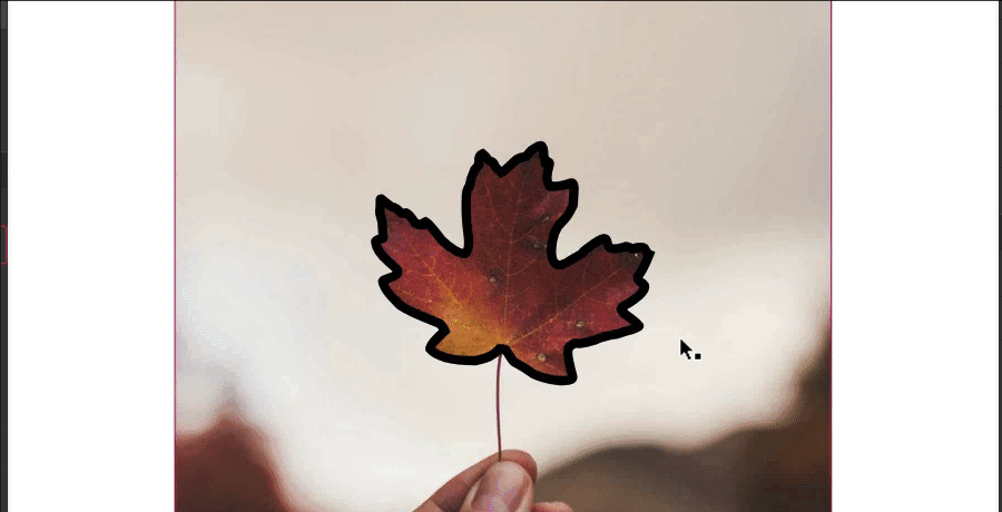
If you want the opposite effect, in this case removing the leaf and leaving the background, you will create a mask with a “hole”. Create a rectangle with the same size as the background and use the shape created with the drawing tool to create a Compound Shape, removing the shape from the rectangle.
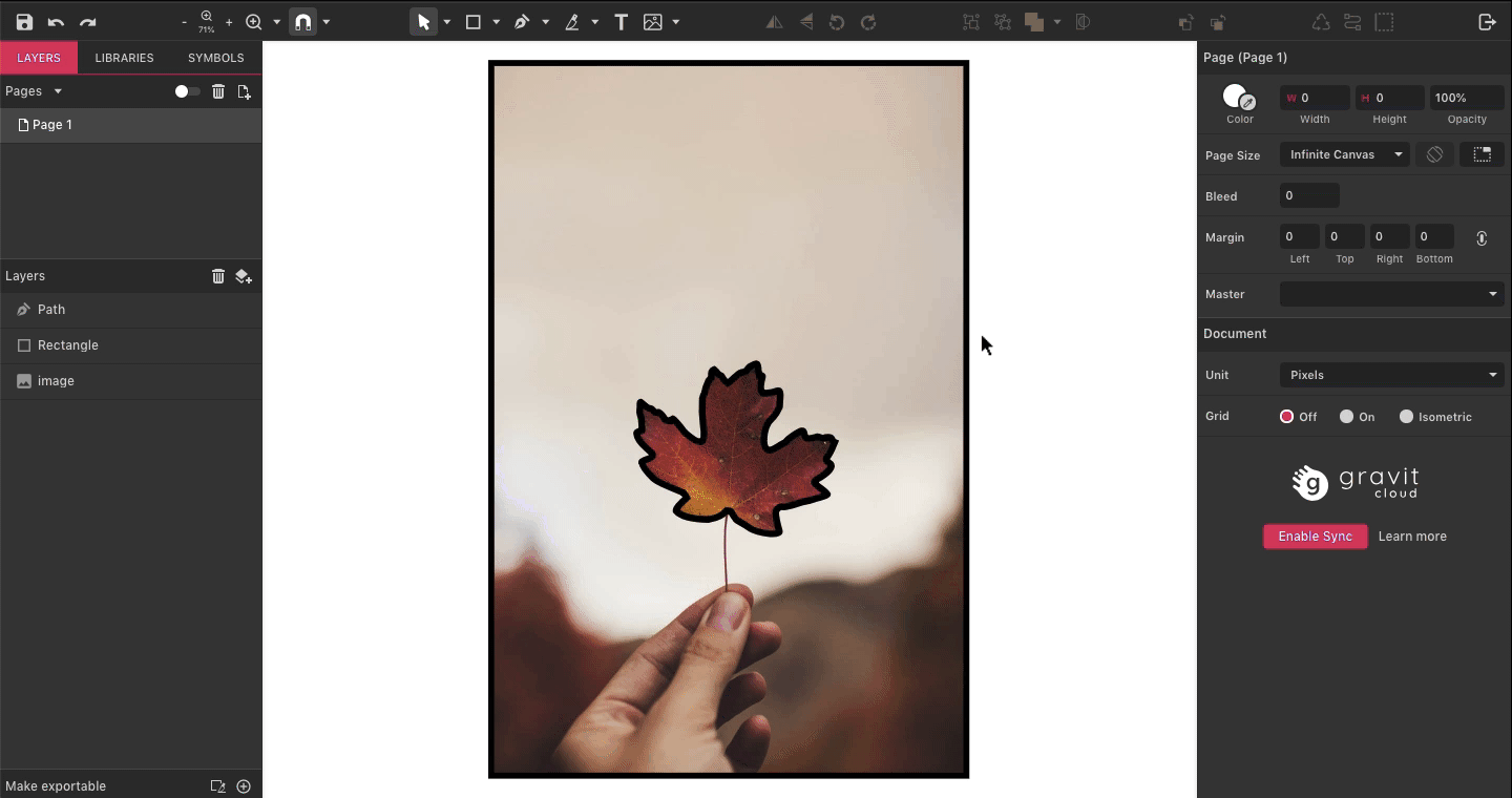
Then you need to convert the resulting Compound Shape to a Path (Modify > Path > Convert to Path or Ctrl/Cmd+Shift+P) because Compound Shapes can’t be clipped. After that, clip the image to your just-created mask with the hole in the middle. Toggle the border’s visibility if necessary.

Image manipulation
In Gravit, it’s possible to do basic image editing, mainly for colors and texture adjustments. These editions can be done with some of the Adjustment Effects.
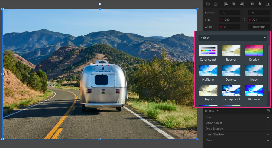
Color adjustments
Color adjustments can be done with Effects like Color Adjustment, Recolor, Overlay, Vibrance, and Bloom.
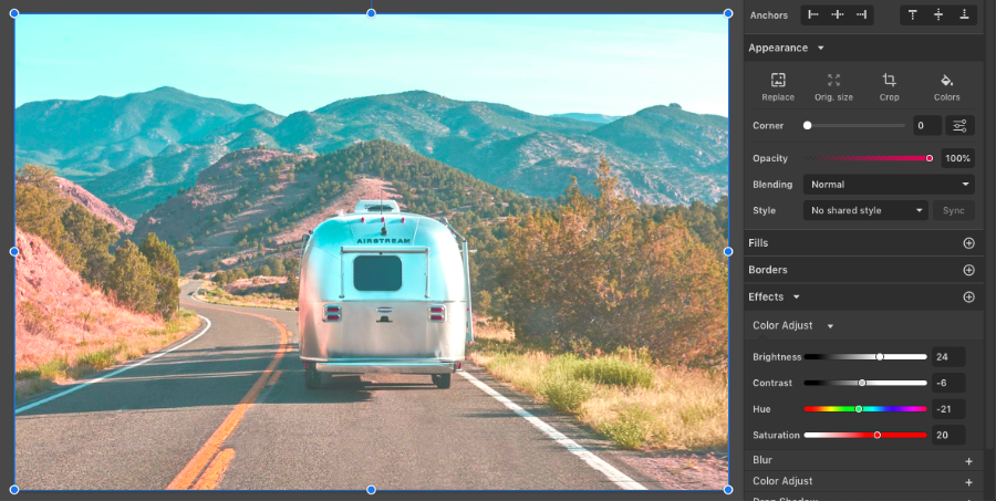
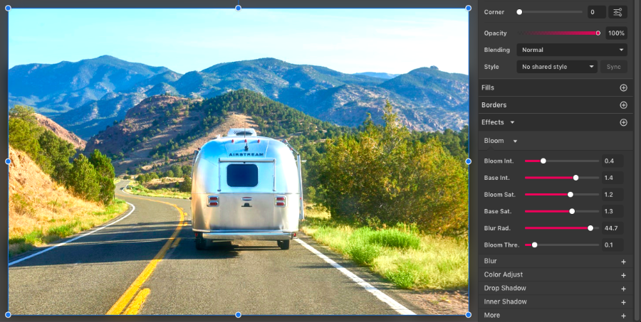
Filters
The Color Grading Effect has a list of some presets that work much like Instagram filters.
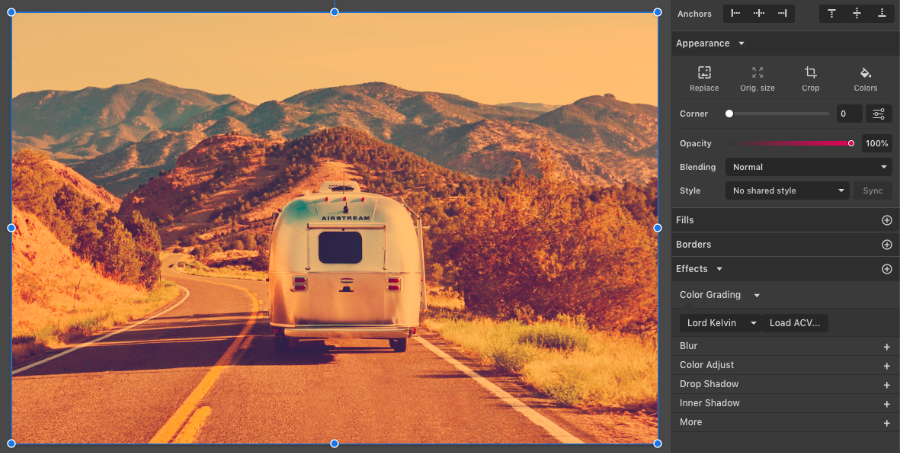
Texture
You can edit the image texture with effects like Sharpen and Noise.

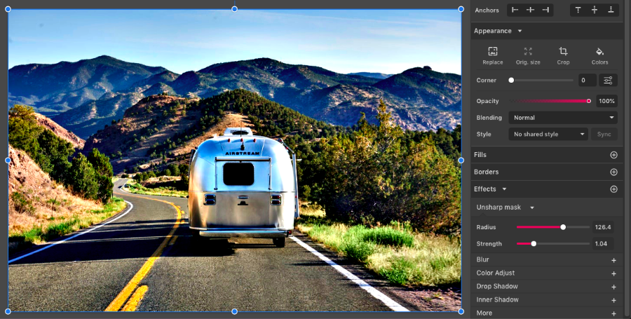
Faded image
To create the effect of the image fading with transparency, use the Overlay effect with the Blend option toggled.
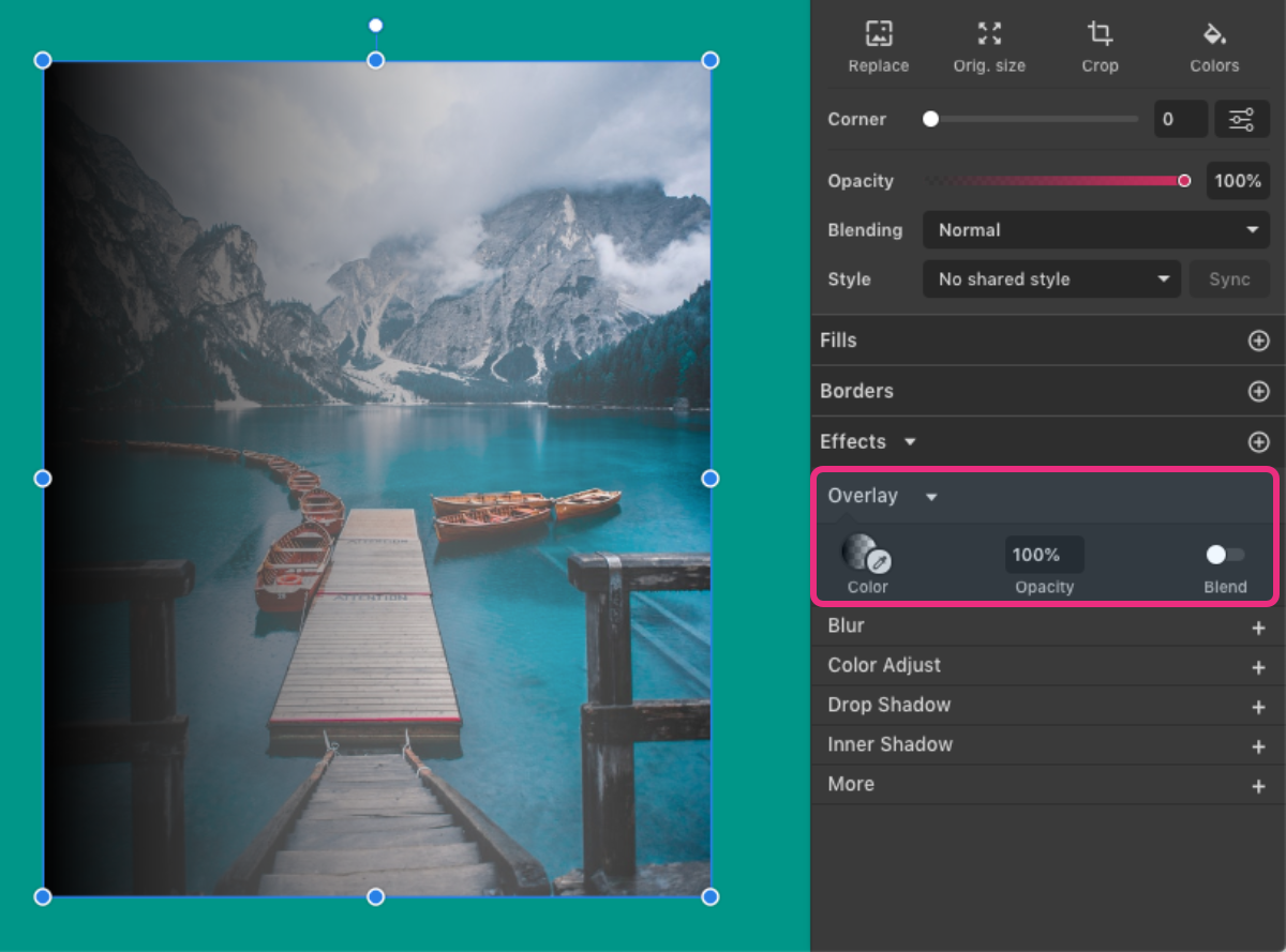
Toggle the Blend option, then click on the effect’s Color Picker to see the gradient handles. Adjust them to fit your design.

You can add one Overlay each side of the image to make it fade from all sides.

Create a color palette from an image
Creating a color palette from an image with Gravit is easy - just select the image and on the Inspector panel, under Appearance, click the Colors option.

A color palette based on the image will be created.
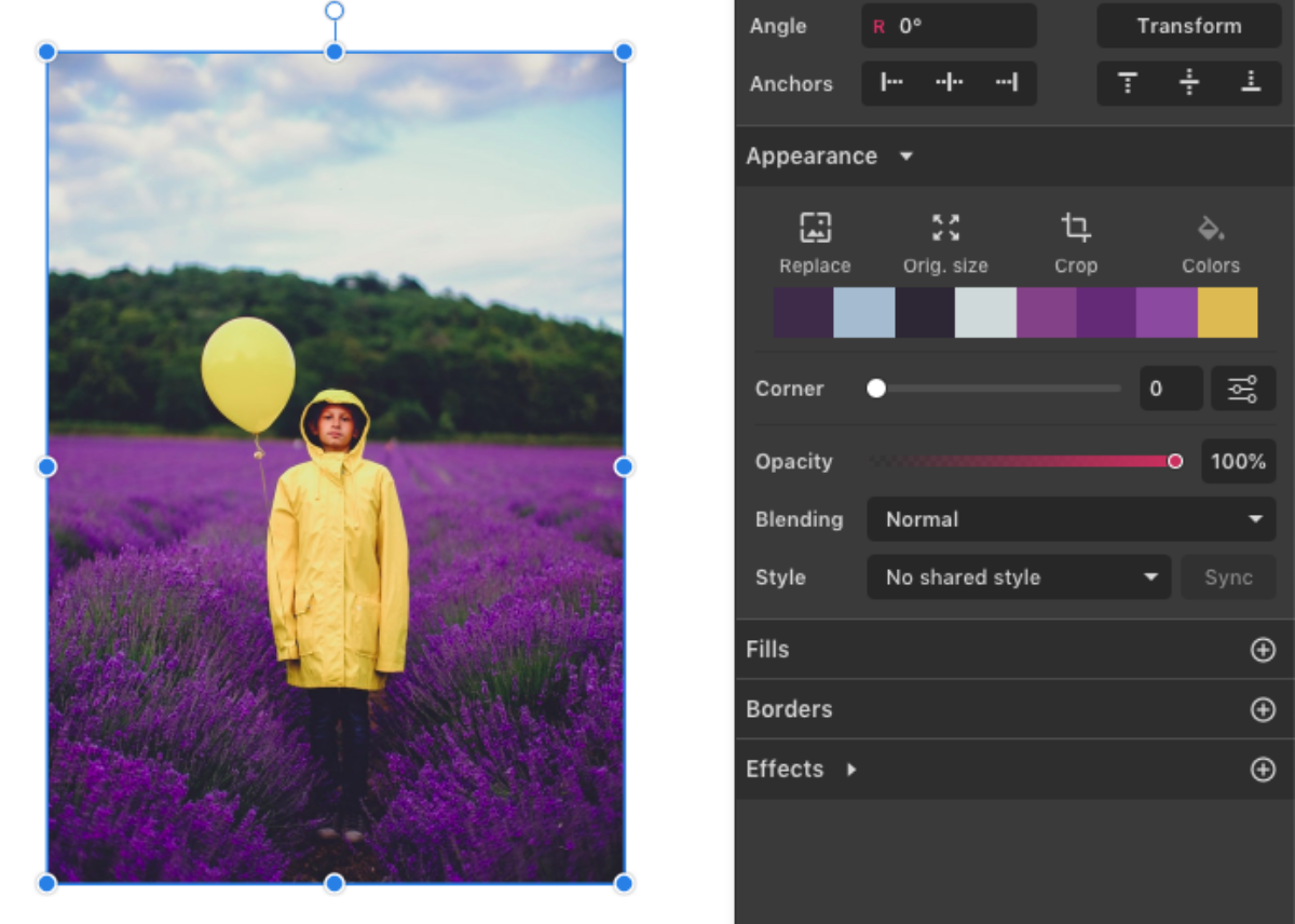
See the section on Effects for more details.
Text
Shortcut: T
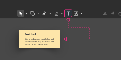
To insert text in your file, click once to create a single-line text box:

Or click and drag to create a text box with defined dimensions:
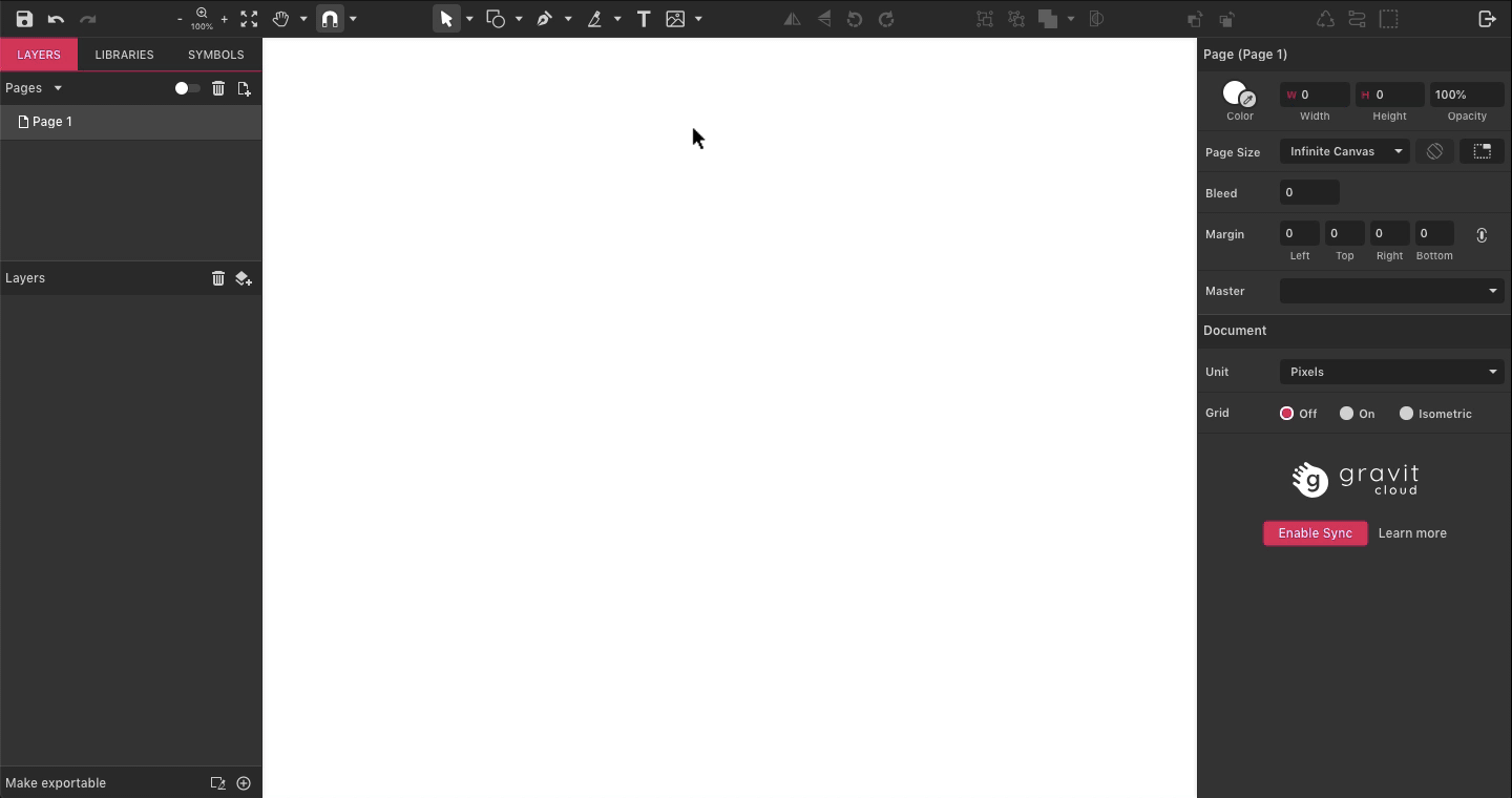
Text boxes have two modes - editing the text box itself or editing the text in the box.
A text box starts with the default words “Your text here” selected and ready to be overtyped. Immediately after creating the text box, simply start typing to enter your text. You can also paste in pre-existing text copied from other sources.
Clicking directly on an existing textbox with the Text tool allows you to edit the text.
Alternatively, double-clicking on a text box with the Pointer tool (V) also allows you to edit the text.
Pressing Enter while text object is selected will enter text edit mode and selects all the text in the box ready to be overtyped. This is particularly useful if you are starting with one of the many templates available in Gravit Designer or for small text objects if you don’t want to zoom.. You can quickly and easily overtype the sample text with your own text.
After typing your text, press Esc or click outside the text box to exit editing mode.
Pro tip: You can quickly fill the empty textbox with dummy “Lorem Ipsum” copy by typing in Lorem, followed by a space.
Many of the well-established shortcuts for text editing work in text boxes:
- Select All text - CTRL/CMD+A
- Underline selected text - CTRL/CMD+U
- Make selected text Bold (works only if the typeface has bold weight) - CTRL/CMD+B
- Make selected text italic (works only if the typeface has italic style) - CTRL/CMD+I
Resizing the text box with the transform handles does not resize the text by default. However, text in the box will reflow to fit the new size of the text box. You can scale the font size by dragging the red handle on the left-bottom side of the textbox.

If you tick the “Scale font on resizing” in the text properties panel, the text will be resized like any other vector object. Be careful when using the side handles, as this will resize the text non-proportionally, resulting in possibly unwanted distortion.
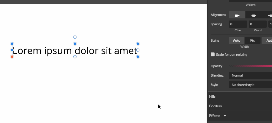
Textbox sizing
In Gravit Designer, you can have text boxes that are fixed in width/height or automatically resized to accommodate the amount of text inside the box.
When resizing the text box with transform handles the Auto Width/Height will switch to Fixed sizing.
When there is not enough room to fit the text on the horizontal direction (Fix width) the text will continue on a new row. When the text doesn’t fit in the vertical direction the text will be hidden (clipped) behind the text box bounding area.
If you set the height to Fixed, you can align text vertically inside the textbox.
Pro tip: To switch from Auto to Fixed width you can double click on right-center transform handle. In a similar fashion, you can toggle Auto/Fix height by double-clicking on the bottom-center handle.
Text properties
When a text object is selected the Appearance panel will show several character and paragraph properties.
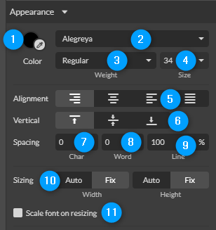
(1) Color - Here you can choose a solid color of the selected characters or the whole text box. Every letter in the text box can have a different color.
Note: You can also add Fills and Borders to the whole text box, the same as any object
(2) The font family (typeface) selector - Here you can choose the Font that will be used in the textbox or selected character(s). You can have multiple fonts inside one textbox. There are 3 font buckets:
Web tab includes all of the Google font library,
Imported tab includes all of the custom fonts that you imported manually inside GD
To import your fonts go to File > Import > Add Fonts and point to the font files on your computer. Compatible font formats are TTF, OTF, TTC, and DFont,
System tab shows all fonts installed on your OS. Note that this option is only available in the desktop version of GD.
(3) Weight and Style selector. Shows all the weight and styles available in the specific font style and weight (regular, bold, italic, and more). Not provided by all fonts.
(4) The font size. You can select preset sizes from the drop-down list or type in your own desired size.
(5) Alignment - left, center, right, and fully justified (words are spaced so left and right edges align with the edges of the text box).
(6) Vertical [alignment] - the block of text is aligned with the top, middle, or bottom of the text box. Only available if the Height option is set to Fix (the text box has a defined size).
(7) The spacing between characters. If only two letters are selected, adjusting the space between them is known as kerning. If multiple letters are selected, adjusting the space between them is known as tracking.
(8) The spacing between words.
(9) The spacing between lines. 200% spacing is usually known as double-spaced. Click on the % sign at the right of the box and it will change to px (pixels, absolute spacing)
(10) Sizing the text box to fit the text content. Changing the height or width to Auto instead of Fix resizes the text box to fit the text. Warning: this might resize the text box to extend off the page.
(11) Resizes the text as you resize the text box.
Reminder: With all input boxes, you can use the mouse wheel to change values in steps of 1. Hold Alt to change the value in steps of 0.1, Shift x10 - see the section on useful working shortcuts.
Text on path
Text can be applied to a path or preset shape, so that it can be curved and bended.
- Create a path or shape to which the text will be applied.
- Create your text in a standard text box.
- Select both text box and shape/path.
- Click on menu Modify > Path > Attach text to path
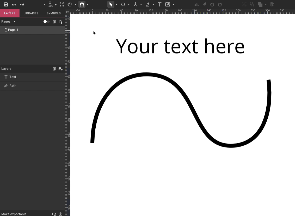
Another method is clicking on a path while text tool is selected. When hovering the path with the text tool, wait until you see the pink outline, and then click. The text will start from the point where you clicked:

You can drag the orange anchor to move the text along the path:


Text on a path has unique properties under the Appearance menu when selected:
- By default text is positioned on the outside of the path. The Outside switch changes it to the inside.
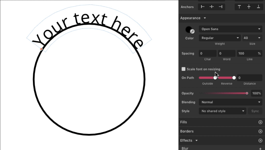
- The Reverse switch changes the direction of the attached path.

- Distance - the distance of the text from the path. Can be negative.
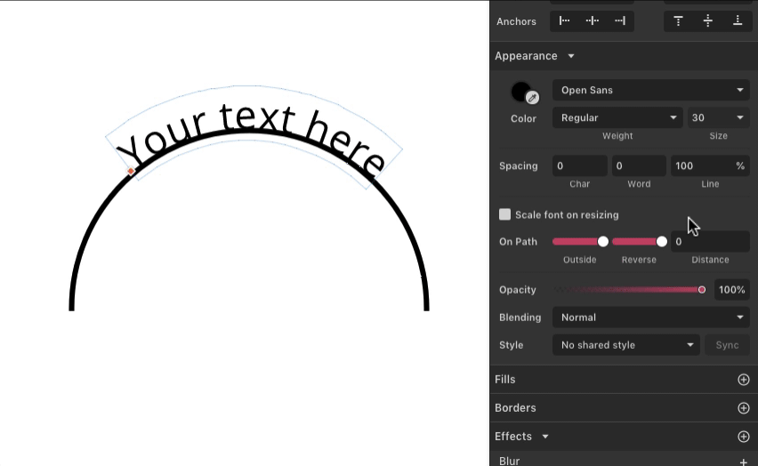
You can detach text from a path using Modify > Path > Detach text from path. Also accessible from context menu

Arrange objects
Align
Menu equivalents under Modify > Align
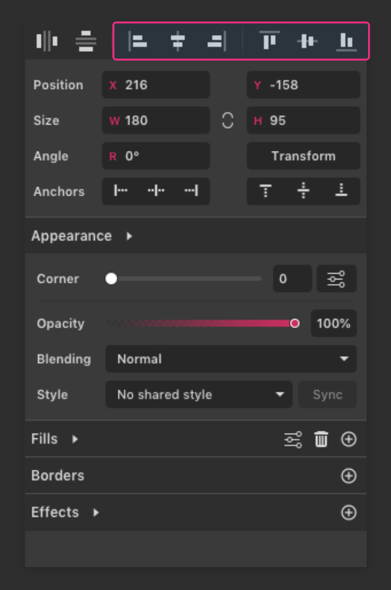
Align options will move all selected objects to align with one of the selected elements acting as a guideline for the others. For example, if you choose Align left, all objects will move to be aligned with the left-most object’s edge on the selection. The object that acts as a guideline does not move. If there are one or more locked objects selected they will be used as a “key object(s)”. And alignment will be relative to their boundaries.
If only one object is selected, the Align function uses the page limits as the alignment guide.
Align Left
Aligns all selected objects to the left side of the left-most object (left side of the selection bounding box)
Note: If there is a locked object selected it will be used as a “key object” and all others will be aligned to left part of the locked object. If there are several locked objects selected, the alignment will use the left side of the left-most locked object.
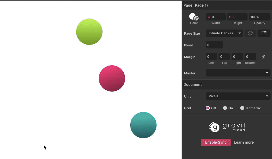
Align Center
Aligns all selected objects to the center of the selection bounding box..
Align Right
Aligns all selected objects to the right side of the right-most object (right side of the selection bounding box)
Align Top
Aligns all selected objects to the top side of the top-most object (top side of the selection bounding box)

Align Middle
Aligns all selected objects to the middle of the selection bounding box
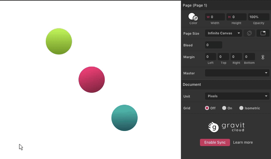
Align Bottom
Aligns all selected objects to the bottom side of the bottom-most object (bottom side of the selection bounding box)

Same width & height
Modify > Align > Same Width or Modify > Align > Same Height
Makes selected objects all the same width or the same height (the width/height of the selection bounding box)

Distribute
Menu equivalents under Modify > Align > Distribute Horizontally and Modify > Align > Distribute Vertically
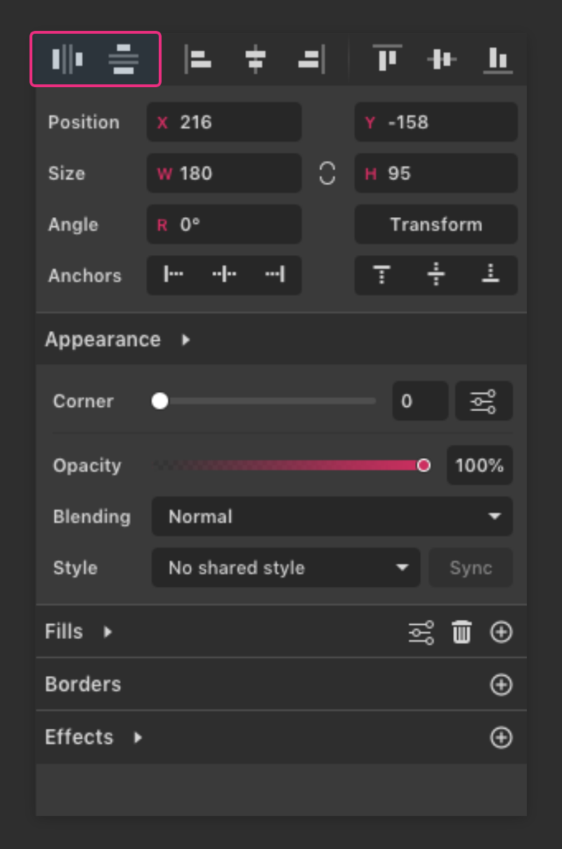
Distribute functions will move the selected objects so that the distance between them is equal. At least three objects must be selected to use this feature.
Note: Distributing objects can easily lead to sub pixel coordinates.
On Distribute Horizontally, the leftmost and rightmost objects do not move, providing the range along which the objects are aligned horizontally:

On Distribute Vertically, the top-most and bottom-most objects do not move, providing the range along which the objects are aligned vertically:
Stacking order
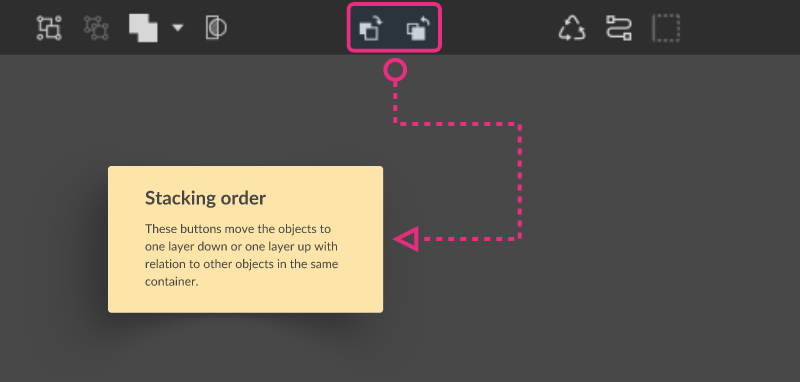
- Bring Forward - Shortcut: Ctrl/Cmd+up-arrow
- Send Backward - Shortcut: Ctrl/Cmd+down-arrow
Menu equivalent: Modify > Arrange > Bring Forward and Modify > Arrange > Send Backward
These buttons move elements one layer down or up in comparison to other elements on the canvas.

These operations will not move an object outside of the group, symbol, compound object, or layer group in which they are contained.
Note: You can skip several steps by using Shift+Ctrl+up-arrow or Shift+Ctrl+down-arrow to move the object directly to the top or bottom of the the group, symbol, compound object, or layer group in which they are contained.
Menu equivalents: Modify > Arrange > Bring to Front and Modify > Arrange > Send to Back.
Design Aids
Grid
Grids are design aids that allows you to manually snap/align objects and anchor points to a regular geometric structure. Making it easy to keep consistent positioning and sizing in your designs. Gravit Designer provides two types of grids - Rectangular and Isometric.
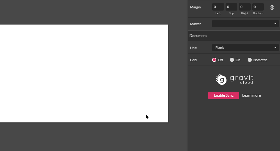
To use grids:
- Make sure the Grid is visible by pressing CTRL+ALT+G or go to View > Canvas > Show Grid ( Snap Grid option is available in the Snap submenu in the of the View menu)
- Click on the empty spot of your document (canvas) to deselect everything. Notice a Document Panel in the bottom part of the Inspector Panel.
Small note: To deselect everything use: Edit > Deselect All, or Shift+Ctrl/Command+A. - Head over to the Grid section of the Document Panel. Use radio buttons to bring up either Rectangular (radio button On) or Isometric ( radio button Isometric ) grid.
- Now you can tweak grid settings (horizontal and vertical spacing between divisions for Rectangular grid and Size and 2 angles for Isometric grid)
- Make sure that Snap to Grid is enabled in Snap dropdown in Toolbar
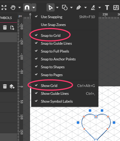
Note: Grids are only visible inside Gravit Designer viewport and will not be exported or printed.
Note: Snapping to grid only works when the Grid is visible
Here are some useful settings for Isometric grid settings:
- Isometric (30°, -30°)
- 1:2 Isometric (27°,-27°)
- Dimetric (15°,-15°)
- Oblique (45°, -45°)
- 2:1 Triangular (27°,-27°)
- Horizontal triangular (60°,-60°)
Some more info on isometric design in Gravit:
- Designer’s Guide to isometric Projection https://medium.com/gravitdesigner/designers-guide-to-isometric-projection-6bfd66934fc7
- Create an Isometric Illustration in Gravit Designer https://medium.com/gravitdesigner/create-an-isometric-illustration-in-gravit-designer-ef5effc0382f
- How to Design an Isometric Illustration In Gravit. https://www.youtube.com/watch?v=k6uWJ5ztjhc
- How to Design Isometric Building in Gravit. https://www.youtube.com/watch?v=yLg0Gl0EyGc
Rulers
Rulers are small bars on the top and left side of the viewport showing document coordinates. They are useful when you need to accurately place objects or guidelines on the canvas. Rulers are lined in chosen document units.
By default rulers are not visible. To toggle Ruler’s visibility go to View > Canvas > Show Rulers or use CTRL+ALT+R shortcut.
The point at the top-left corner of the canvas/page where 0 appears is called the ruler origin point.
Guides
Guides (guide lines) are design aids that allows you to snap/align objects and anchor points to a horizontal and vertical lines that are manually placed on canvas.
To place a guideline on canvas:
- Make sure that the rulers are visible: View > Canvas > Show Rulers or use CTRL+ALT+R shortcut to toggle ruler visibility
- Also toggle the guides visibility: View > Canvas > Show Guide Lines (CTRL+,)
- Click and Drag from the ruler towards canvas. Release the mouse when happy with the guide placement.
The guide coordinates will be shown while dragging to allow for precise placement.

To move the guides:
- Hover over the guideline in the viewport.
- When the cursor changes to a two-headed arrow, click and drag. selecting and dragging to a new location.
To remove a guideline:
- Select and drag the guideline exactly on top of the ruler.
- Release the mouse button. Please don’t go after the ruler because the guideline will be moved at the new location

You can double click on ruler to add a guideline to 0 coordinate.
Note: Keep in mind that the objects/anchor points can snap to guides even if they are hidden from view, but the Snap to Guides is enabled. The opposite is also true - Guides could be visible, but snapping can be disabled.
Distance guides
Gravit Designer allows you to view distance between every 2 objects measured in document units. To view Distance guides:
- Select an object
- Hold the ALT key while hovering your cursor over other objects
- The Distance guides will be shown with a precise distance between the 2 objects (or an object and a canvas/page boundary)
- You can move selected object with the Arrow keys while the Distance guides are shown to achieve exact distance

Smart guides
Smart guides are intelligent guides that temporally shown while creating or moving objects (or anchor points) to allow for a fast and precise alignment. They are automatically shown when Use Snapping option in enabled. What Smart guides are shown depends on what snapping options are enabled.
Note: Smart guides don’t work for objects outside of the page/canvas.
Note: Snapping of element inside a group is limited only to elements of that group. Same goes for elements inside of a Layer Group.
By default when creating/moving/resizing objects Gravit Designer will show guides to snap to any edge, or center of an object. As well as the distance to nearby objects. Smart guides are also shown when equal distances between objects are reached.
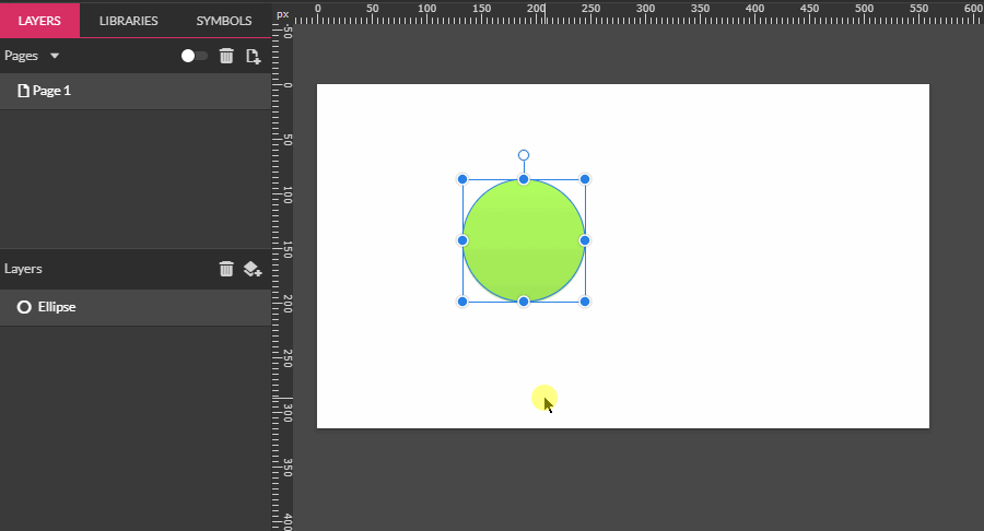
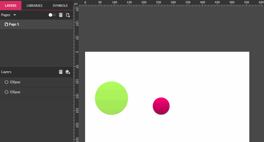
Snaping
Snapping is computer-assisted alignment.
When you drag an object, as you closely approach a position of alignment with another object or the page, the object will "snap" (jump) to the alignment position, and snapping guidelines will indicate the alignment position used.

Hold CTRL/CMD to temporarily disable all snapping except for Snaps to Full pixels. This allows to quickly move objects only on whole units keeping designs pixel perfect.
Note: Snapping of element inside a group is limited only to elements of that group. Same goes for elements inside of a Layer Group.
Snapping options
Clicking directly on the Snap icon in the Toolbar will toggle snapping on or off. Clicking on the small arrow beside the icon reveals a menu of snapping options.
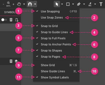
(1) Use Snapping - toggle snapping on/off
(2) Use Snap Zones - only snap to the edge(s) being dragged
(3) Snap to Grid - snap to the (optional) page grid, if visible
(4) Snap to Guide Lines - snap to guide lines, if created and visible
(5) Snap to Full Pixels - snap to avoid decimal pixel position
(6) Snap to Anchor Points - use anchor points of selected path for snapping
(7) Snap to Shapes - snap to shape bounding boxes and center
(8) Snap to Pages - snap to page edges and center
(9) Show Grid - show/hide grid
(10) Show Guide Lines - show/hide guide lines
(11) Show Symbol Labels - show labels on master symbols on the canvas
Use Snapping
Turn snapping off, or turn enabled snapping features on again. SHIFT+F10 or View > Snap to > Use Snapping
For example, if only grid snapping and shape snapping are enabled, only those options are turned off/on by Use Snapping.
Use Snap Zones
Will limit snapping to the nearest edge to the cursor (where the cursor is grabbing the object) and ignore other snapping possibilities.
For example if you want to snap the top edge of the object to the center of a Canvas (while Use Snap Zones is enabled) you can grab that object near the top and drag. It will show the Smart alignment guides only for that edge:

Note: When Use Snap Zones is enabled the Distance guides are not shown.
Here is a visual representation of a Snap zones:
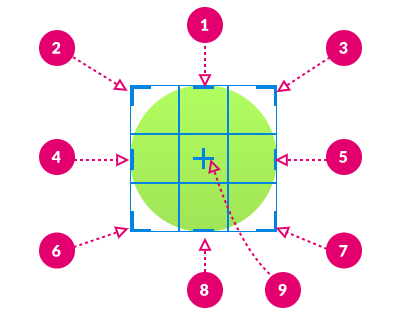
(1) Snap Top side only
(2) Snap Top-Left side only
(3) Snap Top-Right side only
(4) Snap Left side only
(5) Snap Right side only
(6) Snap Left-Bottom side only
(7) Snap Right-Bottom side only
(8) Snap Bottom side only
(9) Snap Center only
Snap to Grid
With this setting on, and the grid showing, objects, tools, and selections will snap to the grid lines.

Note: Even with this setting on, objects will not snap to the grid if it is not visible.
Snap to Guide Lines
With this setting on, objects and selections will snap to user-created vertical and horizontal guidelines.
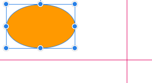
Snap to Full Pixels
With this setting on, creating, moving and resizing objects and selections will snap to full pixel units. This is especially useful in UI design.
Snap to Anchor Points
With this setting on, creating or moving Anchor points will snap to other Anchor points in the same object as well as straight point on other objects.
Snap to Shapes
With this setting on, creating, resizing or moving objects will snap to other shapes bounding boxes, as well as center of the sides and center of the objects.
.

Snap to Pages
With this setting on, creating, resizing or moving objects will snap to page boundaries, as well as center of the sides and center of the page.
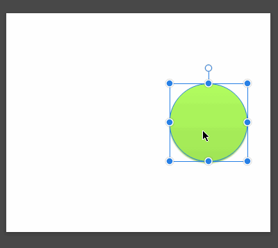
View aids
Fullscreen
ALT+Enter will toggle fullscreen view. It will hide/show all interface elements and leave only canvas visible. Alternatively you can use View > Toggle Fullscreen...
New view
Opens another tab with a new view of the current document, you can change this new view to a different zoom level and switch between tabs Access in menu View > New View or CTRL/CMD+ALT+N
That way you can work on tiny details and quickly switch to see how the whole composition will work.
Outline view
You can quickly remove every fill, border or effect and see only outlines of the objects on a canvas. View > Outline view
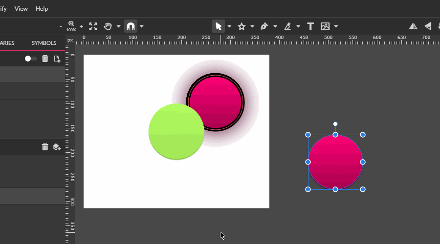
Clip content
Clip content toggle hides/shows objects that are outside of the current canvas/page. Useful if you want to see how the output result of your design will look. Clip content button is placed in page properties inspector next to page size dropdown. It is visible when nothing is selected on a canvas. Clip content is switched on by default.
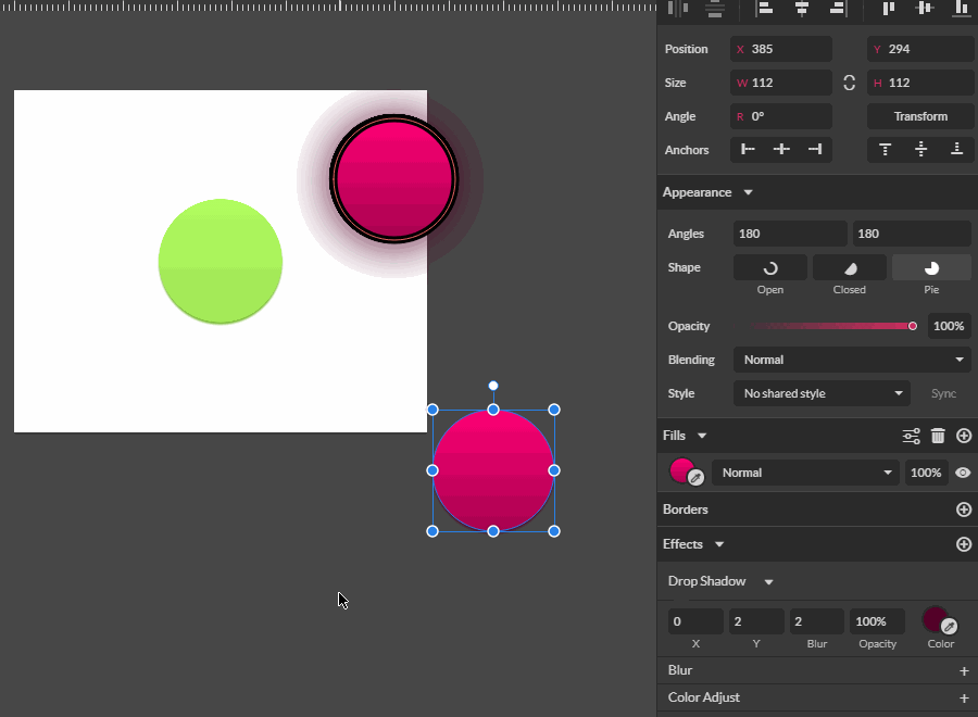
Anchor Panel and Responsive Design
Introduction
Anchor points control how you resize and position the content on the canvas. They provide an opportunity to create a responsive design on the fly or test your designs for different devices quickly and easily.
The Anchor Panel is located above the Appearance panel inside the Inspector Panel.
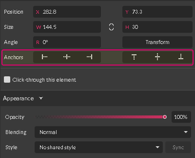
Interface
The system of anchors in Gravit Designer has an intuitive interface. Six icons are divided into two groups:

1. Horizontal anchors are helpful when you are scaling the width of the canvas.
2. Vertical anchors are useful when you are scaling the height of the canvas.
Click on the anchor to select it. The background of the selected anchor is lighter than the background of the deselected one if you are using the dark theme.
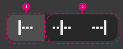
The opposite is true for the Light (Default) Theme.
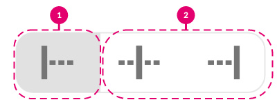
Use of Anchors
With anchors, you can tell whether an element should stick to the particular position on the canvas (or in a frame or a layer group) or stretch/shrink when you are resizing the canvas.
Note: Anchoring also works inside the Layer groups (in frame mode) and Groups (in frame mode), but for simplicity, we will use canvas as an example.
Horizontal anchors
Use the horizontal anchors to pin an element to one of the sides or the center of the canvas.
To pin an element to the left, select the left anchor.
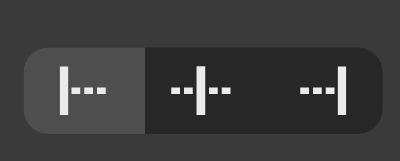
Select the middle one to pin to the center of the canvas.
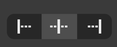
The right anchor pins an element to the right side of the canvas.
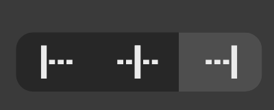
Select both right and left anchors to stretch/shrink an element horizontally.

Horizontal anchors in action
Imagine you are designing a list of options/controls.
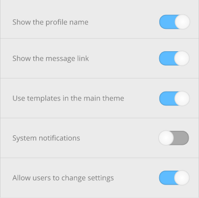
You want to present it to your client at three different sizes: 450px, 800px, 1200px. You can do it quickly by using Anchors.
- Pin the options (textual elements) to the left (1).
- Pin the controls (sliders) to the right (2).
- Select all the panels (backgrounds) and pin them to both left and right to stretch them.
- Click on the empty portion of the document to bring up the Page panel. Head over to the Width text field(1) and type a new size of the canvas, then click Enter.

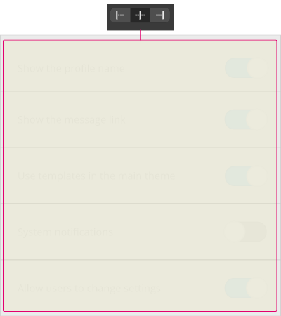
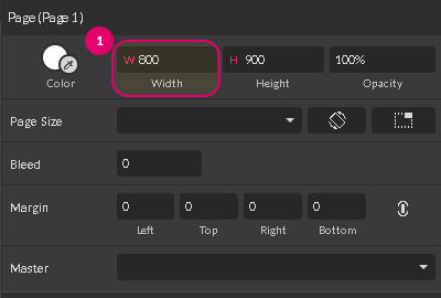
Notice how the elements respond to resizing.

Vertical Anchors
Use the vertical anchors to pin an element to the top, bottom or vertical center of the canvas.
To pin an element to the top, select the left anchor in the group.

Select the middle one to pin to the vertical center of the canvas.
Right one pins an element to the bottom of the canvas.
Select both right and left anchors to stretch/shrink an element vertically.

Vertical Anchors in Action
A typical website comprises of several pages:
- Homepage (Landing page)
- About
- Contact
- Maintenance/404 page
All of them have the same header and footer but different content, so the height of the main area may vary dramatically.
Let me show you how to design several pages with the same position of the footer and header, but a different height of the content area using Vertical Anchors in Gravit Designer.

- Pin the header to the top by clicking the Left anchor(1)
- Pin the footer to the bottom by clicking the Right anchor(3)
- Stretch the content area by selecting both Right and Left anchors(2) in Vertical Group.
- Click on the empty portion of the document to bring up the Page panel. Change the height of the canvas by typing inside Height field and click enter to foster the changes.

Notice how the elements respond to the different page height.
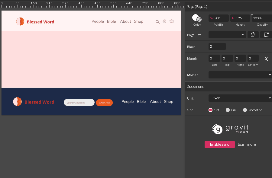
Tools
Shape tools
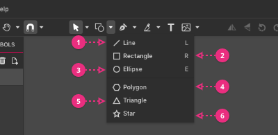
(1) Line - makes a single straight line
(2) Rectangle
(3) Ellipse
(4) Polygon
(5) Triangle - a convenience variation of the Polygon shape
(6) Star - a convenience variation of the Polygon shape
Selection tools
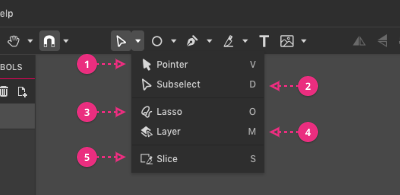
- Pointer tool - allows you to select and manipulate an entire object or group of objects
- Subselect tool - allows you to select and manipulate parts of an object
- Lasso tool - allows you to select custom set of anchor points within an object
- Layer tool - allows you to select all objects within particular Layer Group.
- Slice tool - allows you to select a custom area of your canvas. You can then export this area as .PNG, .JPEG, .SVG, or .PDF document
Pointer Tool
You can use the Pointer Tool (V) to select, drag, copy, rotate or resize an entire object or a group of objects.
Select an Object with the Pointer Tool
Move your cursor towards an object you want to select and click Left Mouse Button key.
By default, it brings up a bounding box with transform handles.
Note: if you want to select a particular anchor point use the Subselect Tool.
Select Multiple Objects with the Pointer Tool
Hold down SHIFT key on your keyboard to add more object to your selection.
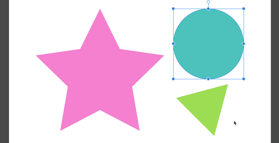
Small Tip: you can select multiple objects within particular area by holding Left Mouse Button key and drawing marquee around these objects.

Hold ALT/OPTION while drawing marquee to select only objects completely enclosed in the marquee.
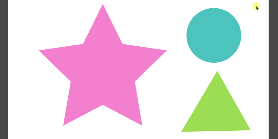
Move with the Pointer Tool
Hold Left Mouse Button key to drag an object or a group of objects.
Note: if you want to move an object to a specific distance use the Transform Panel instead.
Small Tip: hold SHIFT key to keep things perfectly straight down.

Copy an Object with the Pointer Tool
Hold ALT/OPTION key and drag an object to produce a copy.
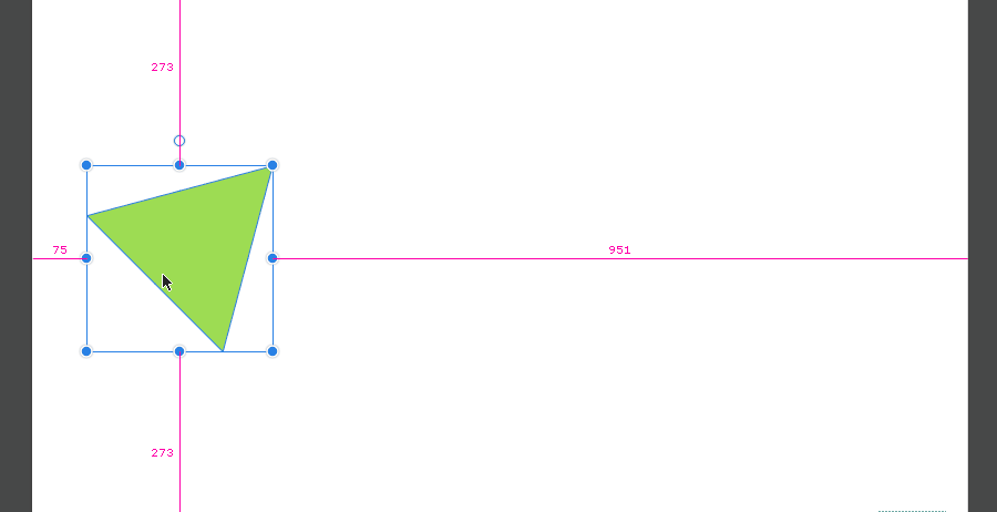
Rotate an Object With the Pointer Tool
- Select an object to bring up a bounding box.
- Head over to the small bullet point on top of it. Notice that cursor is changed to the rotation arrow.
- Hold Left Mouse Button key to rotate an object.

Small Tip: hold SHIFT to constrain the angle of the rotation to 15o . Use Transform Panel to set a custom angle or a reference point of transformation.

Scale an object with the Pointer Tool
- Select an object to bring up a bounding box.
- Head over to any of the blue bullet points (called Transform handles) within the bounding box. Notice that you cursor is changed to the double arrow.
- Hold Left Mouse Button key to scale an object.

Small Tip: hold Shift key to constrain the proportions between width and height.
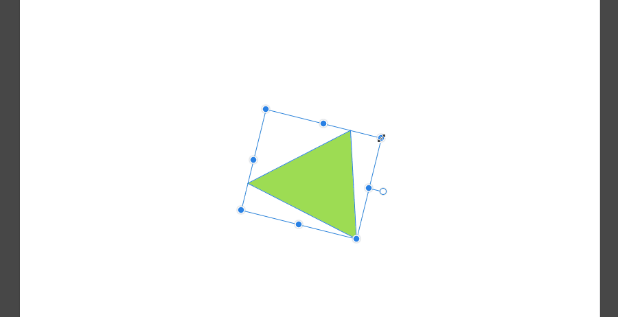
Subselect Tool
Use Subselect Tool (V) to select, edit, add and delete anchor points within the path.
Select Anchor Points with Subselect Tool
To select an anchor point follow two simple steps:
- Select the path to reveal all available anchor points. All anchor points are depicted by a white shape (rectangle, circle or diamond) with a blue outline.

- Click on the particular anchor point to select it. Notice, that selected anchor point is depicted with blue in Gravit Designer.

Note: to select anchor points within the basic shape, such as rectangle, ellipse or polygon, it should be first converted to path.
Select Multiple Anchor Points with the Subselect Tool
Hold Shift to add more anchor points to your selection.

Small Tip: to select multiple anchor points within a particular area hold Left Mouse Button key to draw a marquee around.

Small Tip: use the Lasso Tool for more complex selections.
Edit Anchor Points with the Subselect Tool
Holding Left Mouse Button key you can drag anchor point and reshape the path.

Click Delete key to get rid of selected anchor points.

Adding New Points to the Path with the Subselect Tool
To add an anchor point to the existing path, you need to follow these steps:
- Head over to the segment you want to add an anchor point to.
- Select the path. Notice a slight change in the cursor appearance. Now it has a small tilda in the right bottom corner.
- Click with the Left Mouse Button Key to add a new anchor point
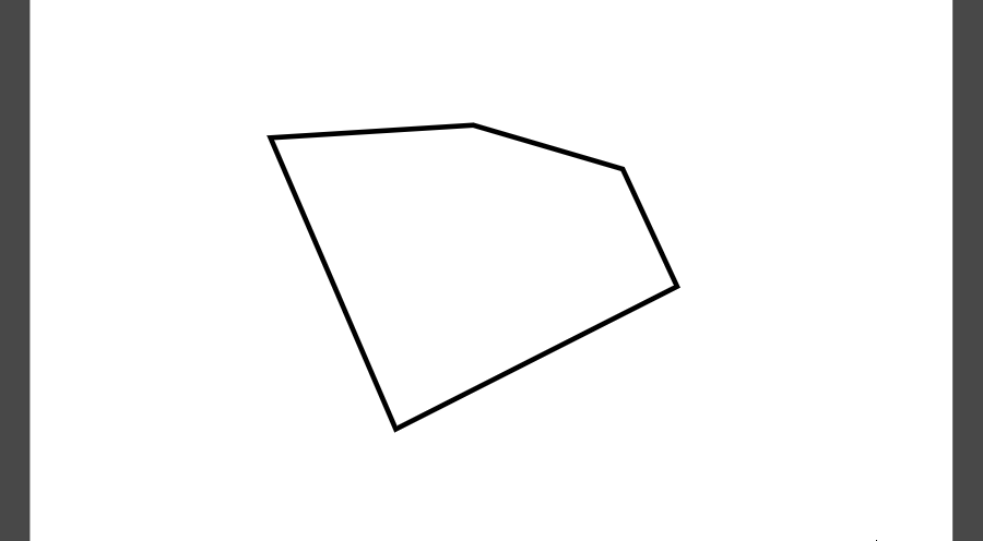
Note: you can also edit direction handles with the Subselect Tool. Please visit vector anatomy topic to learn more about anchor points and direction handles.
Small tip: you can edit a segment of the path directly with the Subselect Tool. Hold Left Mouse Button key to drag the segment in and out and create awesome curvy lines.
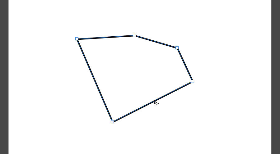
Lasso Tool
Use Lasso Tool (O) for freehand selection of objects or their parts.
To create a freehand selection hold Left Mouse Button key and draw an area around the objects.

Hold Shift key to add more objects to your selection.
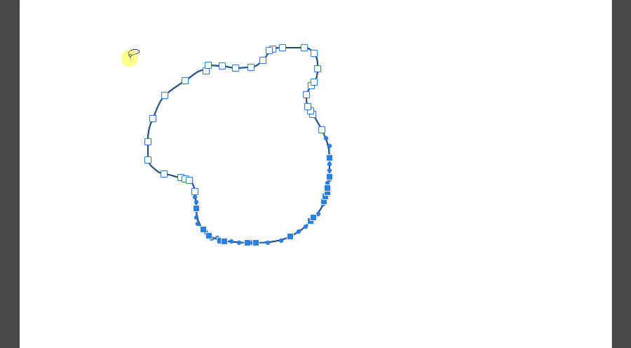
Small Tip: hold Shift key and draw an area within the selected object to exclude this portion from your selection.

Layer Tool
You can use Layer Tool (M) to select all objects within the Layer Group. Take a look in the image below to see a Layer Tool in action.
To learn more on how the Layer Groups work, please visit the Layer Group section within the Organizing your design topic.
Slice Tool
Use the Slice Tool (S) to define a specific area of your artwork for export in any of the supported formats.
To learn more about the supported file formats, please, visit Document section within the General topic.
To prepare and export the slice follow these simple steps.
- Grab the Slice Tool and holding Left Mouse Button key select the area for export.

- Click the tiny Plus icon opposite the Make Exportable in the lower left corner of the document.

- Select the format and dimensions of the slice. Type a suffix if you are planning to make more slices of the same area..

- Click the Export icon on the left of the Plus icon and give a name to your design.
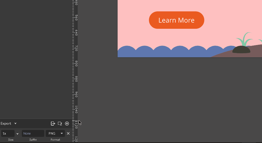
Knife Tool
Use the Knife Tool (K) to slice a vector object on pieces.
You can find it's icon (2) on the Tools Panel between the Pen Tool(1) and Text Tool(3) icons.
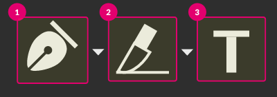
Basic Usage
You can slice an object in 3 easy steps:
- Grab the Knife Tool
- Holding the Left Mouse Button key draw a line to dissect an object
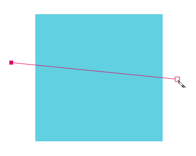
- Release the Left Mouse Button key to divide an object on two

Note: the Knife Tool is working only with vector objects such as a path or shape. Don't use it to divide a photo or any other raster image. To learn more about vector and raster images, please read the Vector vs Raster topic.
Small Tip: hold the Shift key to constrain the angle of the cutting line to 45.

Advanced Workflow
Multiple vs Single
To cut a particular object in a group or set, select this object first., then cross it with the Knife Tool.
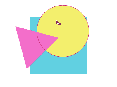
To cut several objects at once just move the cutting line across all of them (none of them should be selected).
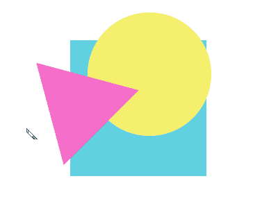
Cutting Curve
Hold Alt/Option to turn the cutting line into the curve. Notice that you are creating the direction handles first to define how curvy your line would be. Release the Alt/Option to draw the cutting curve. Cross an object and release the Left Mouse Button key.
Combine cutting lines
If the cutting line does not cross an object, it creates an incision.
Come up to it with another line to create more complex cutting lines.
Freehand Shaping Tool
Use the Freehand Shaping Tool to cut a free-hand piece from an object.

Note: if there is no object selected, the Freehand Shaping Tool would draw a freehand path just as a Freehand Tool.

Note: you couldn't subtract a piece from an opened path or a line.

Subtracting from raster images
You can subtract a free-hand piece from the raster image, such as a photo. You would end up with a vector path with no stroke and fill.

Zoom / Pan
Shortcuts, ALT + click on an object in layers panel (toggle between zoom to clicked object and fit all), Zoom with the mousewheel, Zoom in menus, Zoom tool in the toolbar, Fit All,
Note: On some Windows laptops, use Ctrl+; (Ctrl+semicolon) instead of Ctrl+- (Ctrl+minus)
You can also hover your mouse over an area you want to zoom, hold down the CTRL/CMD key and use the mouse wheel to change the zoom percentage setting. The zoom will be based on the location of your mouse cursor.
Zoom tool
If the Zoom tool is not visible, click the small arrow beside the Pan tool (hand icon),

Click once on the canvas to change to the next higher preset zoom level.
ALT+click to change to the next lower preset zoom level.
The zooming area will be based on the location of your mouse click.
Click and drag to zoom in on the bounded area.
Pan
Drag and move the visible portion of the canvas in the viewport. This doesn't change your design in any way just move what is in view right now.
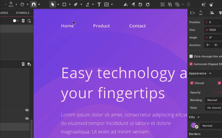
You can pan around in several different ways:
- with pan tool (H) (often referred to as Hand tool)
- by middle mouse button click & drag (on some Linux distros middle mouse button pastes clipboard content. Please see FAQ section for help )
- by pressing and holding a Spacebar key while left mouse click & drag
- to temporary switch to the Pan tool: Hold down H key rather than tapping it. Release the H key to revert to the tool you previously used

If the Pan tool is not visible, click the small arrow beside the Zoom tool
Mouse wheel scrolling pans vertically.
SHIFT+Mouse wheel pans horizontally.
Drawing Tools
Tools used to create a path in Gravit Designer are located under the Pen Tool drop-down in the Tools Panel.

Pen Tool
Pen Tool (P) (2) is an essential drawing tool in Gravit Designer that allows you to create precise lines/paths.

It’s icon is located between Shape Tools (1) and Knife Tool(3) icons.
To draw a path with the Pen Tool follow these steps:
- Grab the Pen Tool from the Tool Bar or click P on the keyboard
- Click to set your first anchor point, that defines the start of the path
- A second click on the empty spot of the canvas would give you a path
- Go on bringing up more anchor points, each of them will create a straight connecting line.
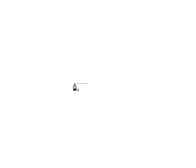

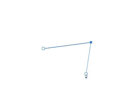
Hold SHIFT key to constrain the angle of the line to the 450.

Create a curved line
Click, hold Left Mouse Button key and drag to introduce the bezier handles to the anchor point and make a curved line.
Connect (close) a path
To close the path come up to the first anchor point. Notice a small circle near the cursor when you hover over the anchor. That means you are about to close your path.
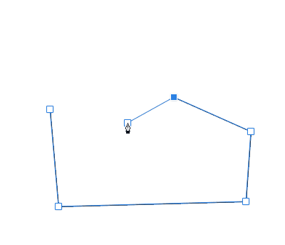
Delete an anchor point
If you want to delete an anchor point select the path with the Pointer Tool and hover over the anchor point with the Pen Tool.
Notice a small minus mark near the cursor, so you will delete this anchor point by clicking on it with the Left Mouse Button key.

Add an anchor point
Select the path and come up to its outline with the Pen Tool. Notice the small plus mark near the cursor. Now you can add an anchor point to the path by clicking the Left Mouse Button key.
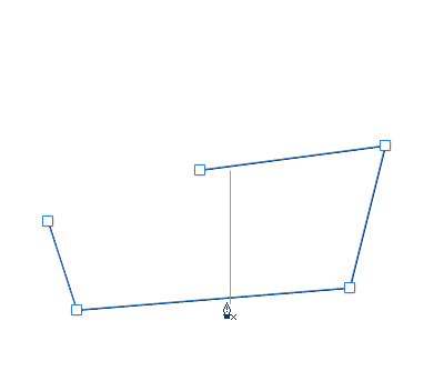
Pro tip: If you hold SHIFT the red dot will appear at the exact center of the path segment.
Note: to add an anchor point to a Preset shape, first, convert it to the path with Convert to Path function (CTRL/CMD+SHIFT+P).

Pro Tip: hold D key on the keyboard to temporarily switch between the Pen Tool and the Subselect Tool.
Bezigon Tool

The Bezigon Tool (B) (3) is similar to the Pen Tool(2) in many ways:
- You can draw a path by placing anchor points on the canvas with the Left Mouse Button click.
- You can add/delete anchor points by clicking on the selected path
- Holding SHIFT you can constrain the angle to 450.


The difference between the Pen and Bezigon Tool is subtle but indeed sublime. Oppose to the Pen Tool you cannot introduce the direction handles by holding Left Mouse Button key and dragging your mouse.
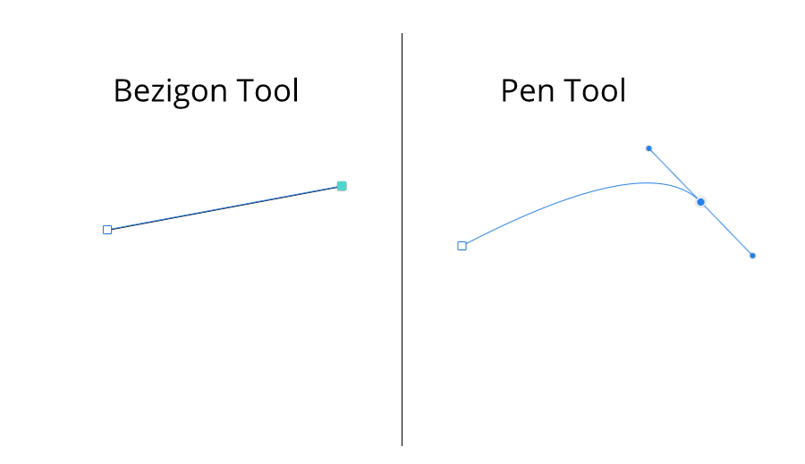
Instead, you can create a geometrically perfect curve by holding ALT/Option while placing an anchor.

This would give you a special anchor point with a diamond shape appearance.

To delete this anchor point you need to click twice:
- First to get rid of the direction handles
- Second to vanish the anchor point itself.
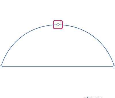
Freehand Tool
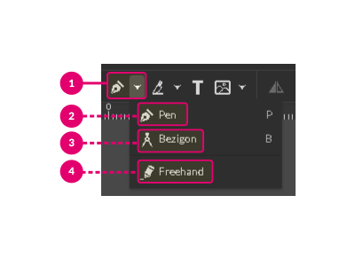
Use the Freehand Tool(4) to draw freeform paths as if you are drawing them on a paper.

Hold the Left Mouse Button key and drag the mouse to produce a path.

Although you have no control over the position of the anchor points while you are drawing with the Freehand Tool, you can reposition them lately.

Hold D key to temporarily switch to the Subselect Tool.
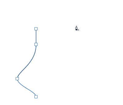
Library
The Libraries panel offers a range of clip-art vector content to use in your designs. Libraries include Shapes, Illustrations, Icons, Emojis, Stickers, Frames, and Lines.
Note: you need to be online to use the Libraries content.
Content in the Libraries can be added to your own personal or commercial work without charge or requirement for acknowledgement.
Click on a category icon to expand the items in that category, and click on the category icon again to hide the items.
Want to see items on a particular topic? There is a search box at the top of the Libraries panel for your convenience.
Drag any of the items directly onto your page. You can then edit them as any other object inside Gravit Designer.
You can toggle visibility of the Inspector panel in View > Show Libraries panel.
Import
Gravit Designer can open/import raster and vector file formats directly.
Besides Gravit’s own file format (.gvdesign), vectors can be brought as SVG files (.svg), EPS files (.eps), Adobe Illustrator (.ai), PDF files (.pdf) and Sketch files until version 49 (.sketch). Raster images can be imported as PNG files (.png) and JPEG files (.jpeg).
Note that importing AI and EPS files is an exclusive Gravit Designer PRO feature
To import a file while creating a new design on Gravit, use File>Open file…> [select a file format]. This will open your file extension while opening a new tab on Gravit.
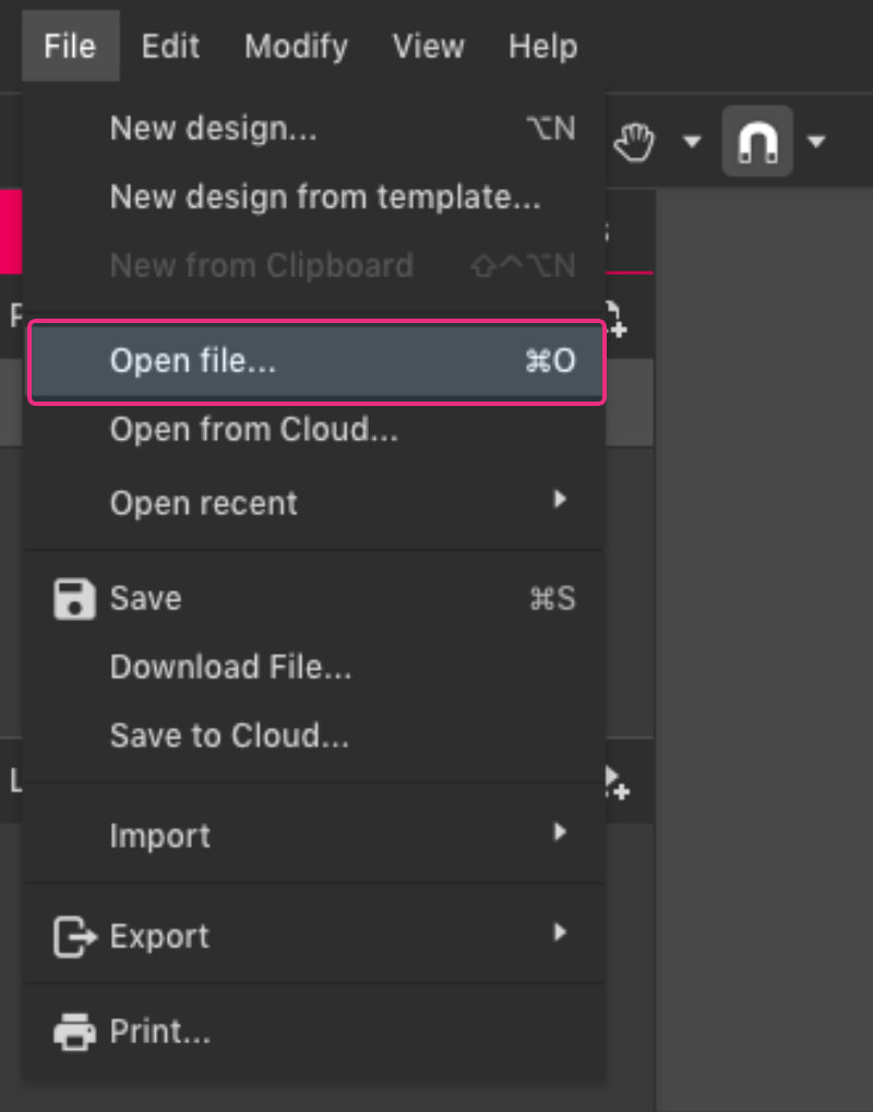
It is also possible to drag files directly from your computer into Gravit Designer. This method won’t create a new design, but open your selected file on the current opened tab.
You can also import fonts which will be in a separate section from System and Web.
Use the File menu > Import > [select a file format] for quick access to importing images and fonts.
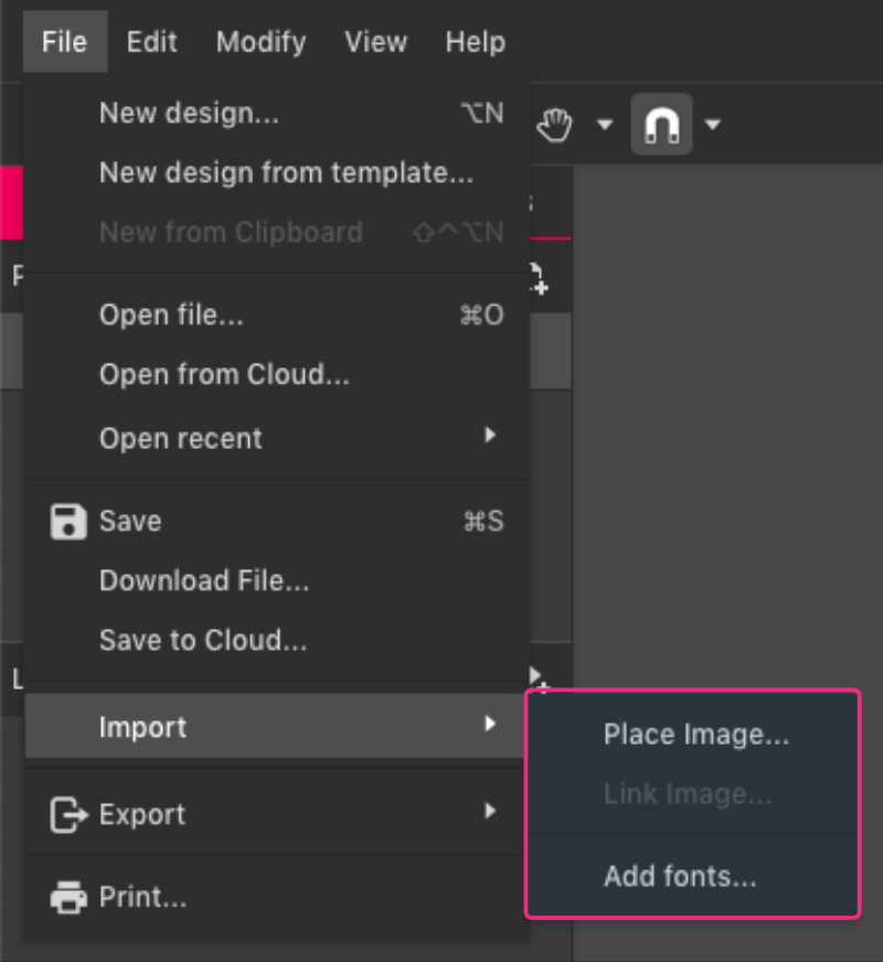
Export
You can share your creations in Gravit by exporting layers, groups, objects or slices of your design to different file formats and sizes. File formats supported for exporting include SVG (.svg), PDF (.pdf), PNG (.png) and JPEG (.jpeg).
Quick Exporting
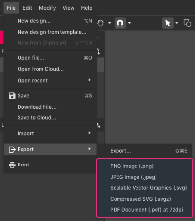
For quick export, go to File> Export> [select a file format]. This option will export the entire page with Gravit’s default settings:
- PNG - 1x, use page background, Compression: ZIP Deflate/Inflate, 32bit, RGB+alpha, Adaptive, Non-interlaced
- JPEG - 1x, use page background premultiplied on white if transparent, 100% quality, RGB, Not progressive, Sub-sampling: 2x2,1x1,1x1, 24bit, JPEG extension, Baseline DCT, Huffman coding,
- SVG - 1x, use page background, do not use id-s and classes, coordinate precision: 3 decimal places, do not export text as curves, do not preserve editing capabilities
- SVGZ - same settings as SVG, but compressed
- PDF - 1x, 72dpi, and 150dpi, use page background, use effects, do not export text as curves, RGB
These options will use the page size defined at the start of the project for the export size.
If there are multiple pages:
- PDF format will export a multi-page document
- All other formats will export the selected page as a single image.
Exporting with more options
To export with more controls and options, go to File > Export > Export (shortcut SHIFT+CTRL/CMD+E), or click the icon in the toolbar:
When clicking this option, the Exporting dialog will appear. On this dialog, you can set the options:
1. Export whole canvas, selection or assets
2. Format
3. Size
4. Background color
5. Retina display quality
6. Export all pages at once
7. Pages
For image formats that only support a single page (JPEG, PNG, SVG), exporting multiple pages will:
- Web app - produce a zip file containing each page as a separate image.
- Desktop app - ask you to select a folder - save each page as a separate image in that folder.
At this point you can deselect any pages you do not wish to export.

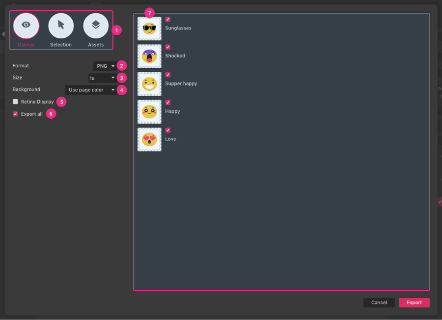
Export dialog options

- Size (DPI): The default DPI is 72dpi. use 96 dpi for online (web) images. See the section on professional printing if you are exporting to PDF for printing.
- Background
- Use page color - use the color defined in the design
- Use custom color - set your own color rather than the color defined in the design.
- Transparent - use a transparent background (PDF transparency is not supported by all programs)
- Color mode: Use RGB for online viewing, CMYK for print output.
- With effects: Effects will be included (as raster data). Untick this if you want all-vector output.
- Export all (only visible when there are multiple pages or objects to export) - checkbox for quickly selecting or deselecting all pages or objects. Individual pages or objects can still be selected or deselected after using this checkbox.
PNG

- Size - the following image size settings are available:
- Set a specific size (in pixels)
- 1920w will be 1920 pixels wide, height will be calculated automatically to preserve the design aspect ratio
- 1080h will be 1080 pixels high, the width will be calculated automatically to preserve the design aspect ratio
- 512x512 will be exactly 512x512 pixels - If the page does not fit exactly into that aspect ratio, symmetrical areas will be added to the output image.
- Set a proportionate size
- 3x will make your output image three times as large (3x) as the current design settings
- 0.5x will make your output image half as large (0.5x) as the current design settings
- Background:
- Use page color - use the color defined in the design
- Use custom color - set your own color rather than the color defined in the design.
- Transparent - use a transparent background
- Export all (only visible when there are multiple pages or objects to export) - checkbox for quickly selecting or deselecting all pages or objects. Individual pages or objects can still be selected or deselected after using this checkbox.
JPG

- Size: Same as PNG. See under PNG export options for details.
- Quality: Default is 100%. Lower quality will result in higher compression and smaller file sizes, achieved at the cost of data loss, lower quality output images, and possible compression artifacts. Note: even at 100% quality some data loss and compression artifacts can occur.
- Background:
- Use page color - use the color defined in the design
- Use custom colour - set your own color rather than the color defined in the design.
SVG

- Background
- Use page color - use the color defined in the design
- Use custom color - set your own color rather than the color defined in the design.
- Transparent - use a transparent background
- Decimal Places: number of decimal places that will define the precision of the SVG attribute numbers.
- Export text as curves: All text contained in the SVG will be exported as a path and no longer like text.
- Retain attributes and add IDs: All class and type attributes are retained and element names are added as IDs.
- Preserve editing capabilities for SVG files: This will ensure that SVGs exported from Gravit can be fully edited if imported back to Gravit, while retaining full fidelity. It is similar to saving as a .gvdesign file, but embedded inside the SVG.
Notes:
- Gravit Designer preset shapes are currently exported as SVG paths (rather than shapes) to ensure all features are preserved (some features in the preset shapes are not supported in SVG).
- The SVG format does not support all of the features (particularly effects) available in Gravit Designer, and might lose some editability.
- Some effects might be exported as an embedded image in an attempt to preserve the full appearance of your Gravit Designer project.
- Embedded images will not resize well and will increase the size of the output file.
Exporting the canvas
To export the whole canvas, go to the Export dialog (File> Export> Export, or the icon in the toolbar) and keep “Canvas” selected:
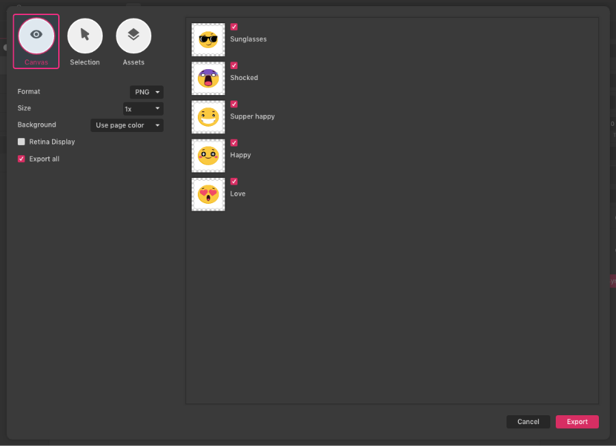
Exporting selected objects
Select the objects that you want to export, and on the Export dialog select “Selection”:
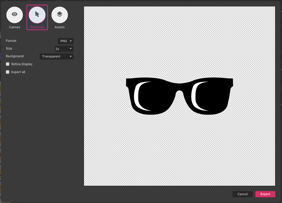
After clicking “Export”, if only a single object is selected, you will be asked for an image name.
If multiple objects are selected:
- PDF export: You will be asked for a file name. Each object will become a page in the output multi-page PDF
All other formats:
- You will be asked to pick a folder.
- Each object will export as a separate image in that folder.
- Object names (in the Layers panel) will be used for output file names, along with an incrementing number (for objects with the same name).
Warning: Exporting again to the same folder will overwrite previously exported files without warning.
Mass exporting: assets and slices
Different objects and areas of your design can be set as “assets”. You can export many assets at once, meaning that with only one export you can create multiple output images from the same file.
To create an asset, you first need to make your objects exportable.
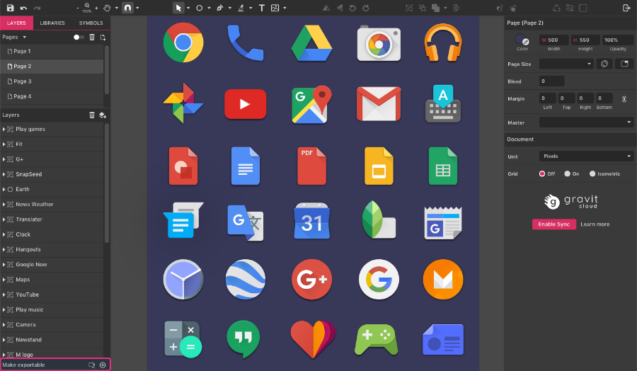
To set an object to exportable:
- Select the object
- Click the “+” icon on the Make Exportable section (left-bottom)
- Set the export options
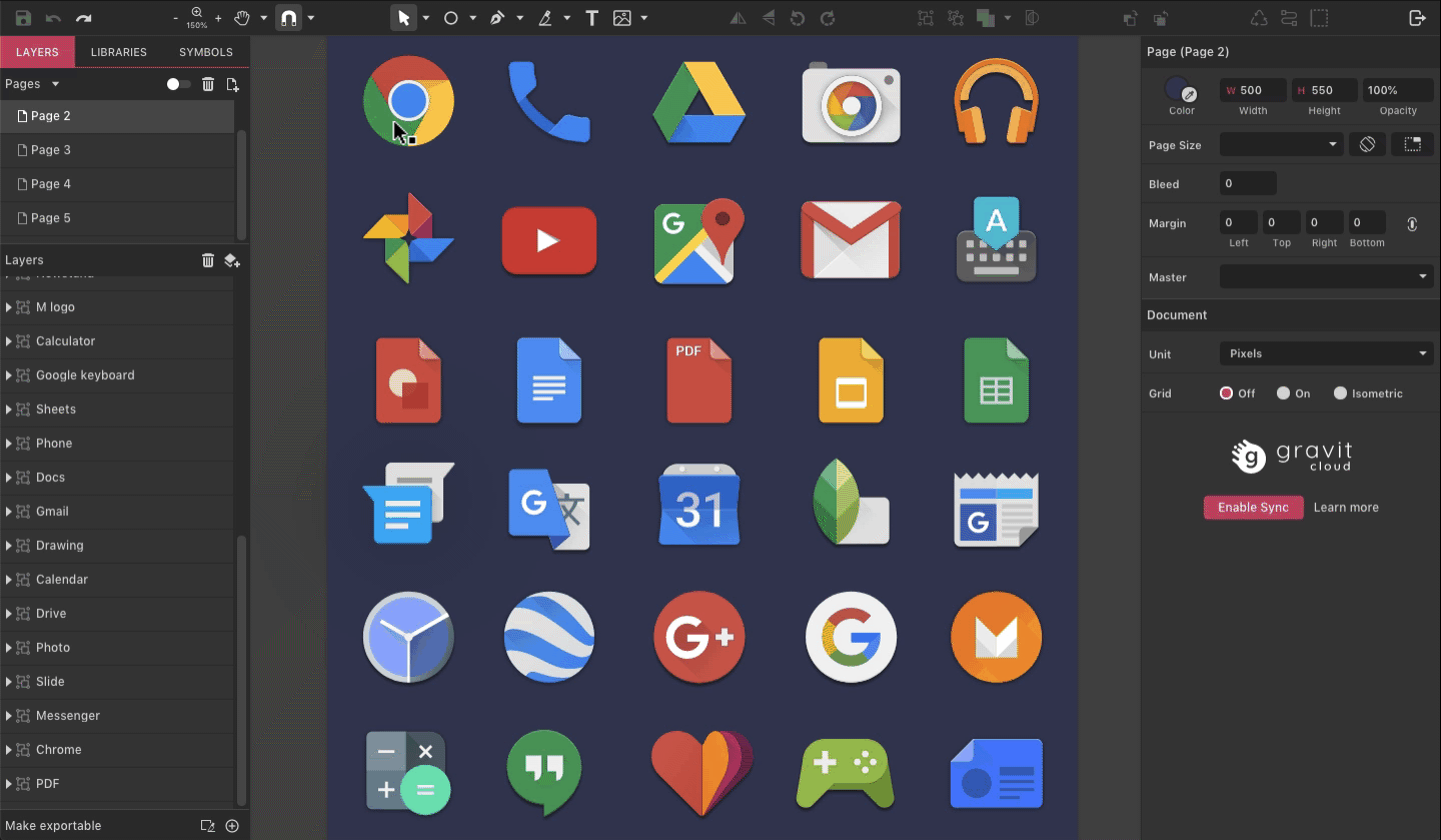
Your object is now an asset and ready to export.
Any object can be set to exportable - layer folder, slice, shape, path, compound shape, group. You can also repeat this on the same object to make it export at multiple sizes and/or multiple formats:
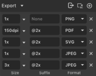
To export your assets, use either File > Export > Export or the Export icon in the toolbar. Once you’re in the Export dialog, select “Asset”:

This is a powerful feature for many different purposes:
- You can simultaneously support a layer folder as a PNG file for an email signature and an SVG file for a web page logo.
- You can export a group to multiple PNG files at several different sizes to create an multi-resolution icon
- You could define limbs, torso, head, multiple hands, multiple mouths, and export them all as separate PNG images for cut-out animation.
- If you are designing a web page or mobile app, you could define all the interface elements on one page, set them each as an exportable assets and export them all to separate images in one action.
Slices
A slice defines a rectangular area that can be used for exporting, something like a crop tool that is only used for defining export areas. You can have multiple slices in a document. Slices are treated as Assets during export.
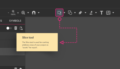
To create a Slice, select the Slice tool on the toolbar, click and drag:
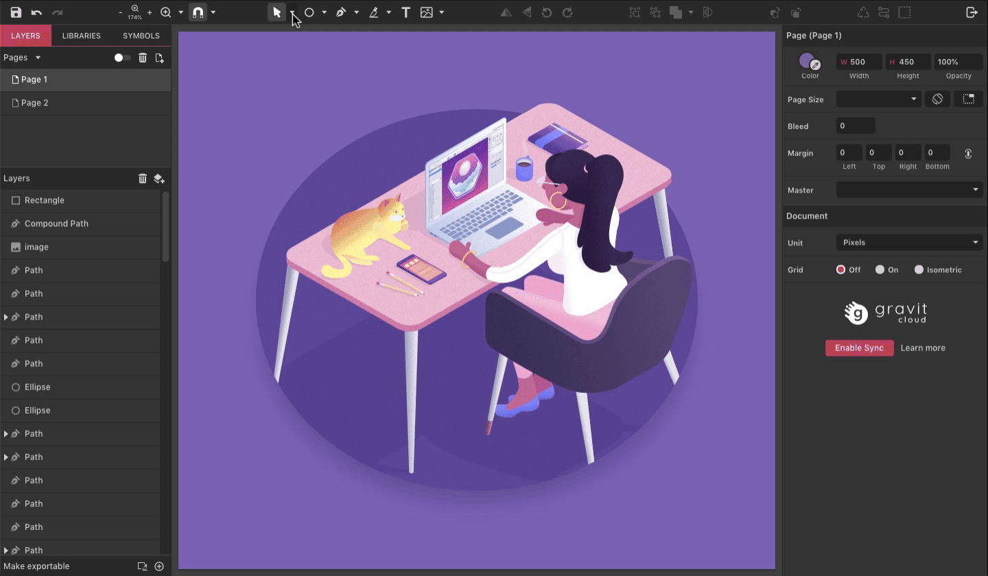
Alternatively, selected objects can be made into a slice using the slice icon at the bottom of the Layers panel:
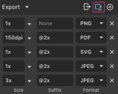
- Each page or canvas can have multiple slices.
- Each slice represents an output image.
- Slices can be hidden or revealed using the View menu > Hide Slices
- Corner anchor points will automatically scale the slice proportionally.
- Click and drag on a slice to move it around. The area that will be export will change to whatever is currently under the slice.
- Like any other asset, slices can be set to export as raster (PNG or JPEG) or vector (SVG and PDF)
Note:: The slice only defines the area. You must still make each slice exportable and set the export format(s), just like any other object.
Exporting with transparency
The formats that support transparency are:
- SVG: vector shapes with transparency and transparent background
- PNG: raster image with transparency
- PDF: vector and raster transparency
To export with transparency:
- Set the opacity of your background to 0%
- Select the “transparent” option on the Export dialog
Account
To use Gravit you must sign up for a Free account.
You can manage your account at the top-right corner of the interface.
PRO vs Free
Please read more about PRO version of Gravit Designer here https://offer.designer.io/faq
Menu Bar
One of the basic elements of Gravit Designer is the Menu Bar, located in the top of the document.
You can use it to open/close/save a document, start a new file, access editing tools, change your workspace, preview your design in different modes and learn more about Gravit Designer and its new features.
The Menu Bar contains of five menus:
- File(1)
- Edit(2)
- Modify(3)
- View(4)
- Help(5)
Each of those five has additional submenus for related options.
File Menu
The File Menu in Gravit Designer is a primary method for starting a new document, opening a file, saving files, importing the images, fonts, and printing.

- Click New Design…(1) to bring up a New Document Panel.
- New Design From Template…(2) brings up the same New Document Panel the active New From Template tab.
- New from Clipboard(3) starts a new document with an object you've copied.
- Choose Open File(4) to pick up a file from your desktop.
- Open From Cloud(5) allows you to pick up the file from the Cloud Storage.
- Open recent(6) brings up a drop-down of the recent files.
- Save(7) allows you to save the progress down the road.
- Save to file…(8) is a good option when you need to save your progress as a separate file.
- Save to Cloud…(9) saves the file to your cloud storage.
- Show Version History(10) gives you a Version History panel with current and previous versions of the file, that you can preview and restore.
- Import(11) has its own submenu:
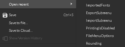
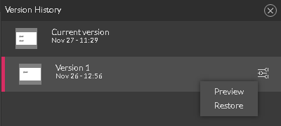

- Place Image…(1) embeds all bits of an image into the document.
- Link Image…(2) creates a link of an image in Gravit Designer. The image itself is located on the desktop. All third party changes would be reflected inside the Gravit Designer.
- Add Font…(3) is the way to place fonts into the Imported Fonts section. These fonts may or may not be installed into the system itself.

- Export(12) has its own submenu:

- Export…(1) brings up the "Export as" panel where you can select the export type, format, size and sundry options, related to the file format.
- PNG image(2) - exports in a .PNG file format
- JPEG image(3) - exports in a .JPEG file format
- Scalable Vector Graphics(4) - exports in an .SVG file format
- Compressed SVG(5) - exports in an .SVGZ file format
- PDF Document(6) (.pdf) at 72dpi - exports in a .PDF file format
- Print…(13) is currently unavailable.
Edit menu
Within the Edit Menu (1), you can find options to edit pretty much everything from objects to document settings.

Let's go over them very quickly:
- Undo (2)/Redo(3) recent action to go back in time and adjust your workflow
- Cut(4)/Copy(5) (Ctrl/Command+X and Ctrl/Command+V respectively) an object
- Paste(6) has its own submenu
- Paste(1) (Ctrl/Command+V)
- Paste in place(2) (Shift+Ctrl/Command+V)
- Paste inside selection(3) gives you a clipping mask of a pasted object
- Paste a style(4) (F4) allows you to copy appearance attributes, such as fill, stroke, and effects to the selected object.

- Duplicate (8) (Ctrl/Command+D) to create a copy of an object
- Delete(7) (Del) to get rid of an object
- Edit Selection(9) to bring up the Subselect Tool
- Select/Deselect all(10)(Ctrl/Command + A and Ctrl/Command+Shift+A respectively) and Invert Selection(11) (Ctr/Command +I) are pretty self explanatory
- Select by Font Type (12) selects all textual elements with the same typeface in the entire document
- Settings…(13) brings up the document settings panel where you can adjust global options

Settings
In the Settings Panel, you can change settings across all of the documents.

1. Highlight on hover (1). When this option is active, it gives you a red outline around an object you are hovering over with the Pointer, Subselect or Lasso Tool.
2. Auto expand layers(2). When this option is active it opens the Layer's folder on the layer panel every time you select an object or a group of objects within this layer.
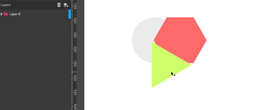
3. Change the Theme of Gravit Designer(3). This drop-down menu allows you to set a theme:
a) Light Theme ( default )
b) Dark Theme
4. Left-aligned icons in the toolbar(4). This option, when active, push the Toolbar(2) to the left close to the Save and Undo/Redo icons(1).

5. Save the Text layers as paths(5). If the font is missing on your system, Gravit would give two options :

a) Replace Fonts(1) with those available
b) Keep Font (2) to convert the font into the path (only if the option is active)
Latter helps to save the appearance(2) of the textual elements, but not the textual attributes, such as editability(1), font size, font weight, etc.

6. Rounding(6). This option, when active gives you a text field (1) to set a number of decimals in the object's position, size values, etc.
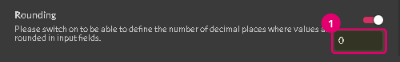
7. Disable warning messages of unsupported features(7). Not every effect produced by Gravit Designer could be exported to.SVG file format. Unsupported effects would be rasterized. You can disable working messages of the unsupported effects.
Modify menu
Within the Modify objects menu, you can find options that help you to align, distribute, arrange, transform objects, combine them in the groups and compounds, modify paths and symbols.
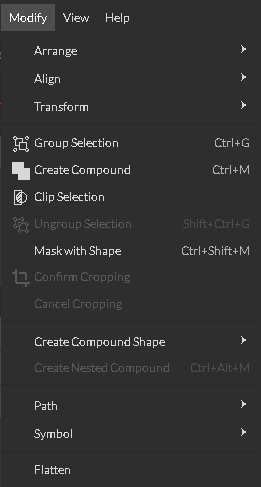
As you can see Modify menu became a roof for a broad spectrum of functions, so it is reasonable to split them into the topics.
Arrange, Align, and Distribute submenus
Arrange submenu allows you to change the position of an object or a group of objects within the layer panel:
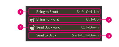
- Bring to Front(1) brings an object at the top of the layer panel
- Bring Forward(2) puts an object on the top of the neighbor
- Send Backward(3) puts an object below its neighbor
- Send to back(4) sends objects at the bottom of the layer
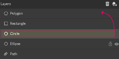

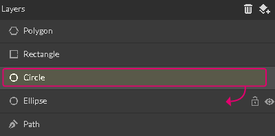
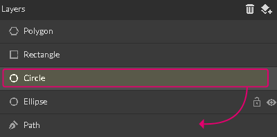
Align submenu is presented with various alignment options:
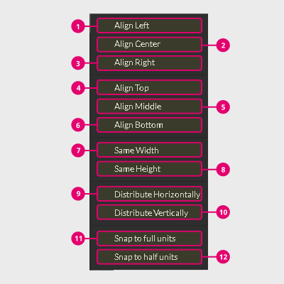
- Align left(1) pushes all selected objects to the left side of the bounding box that surrounds the group. A single object would be aligned to the left of the canvas
- Align center(2) put all selected objects in the center of the group. A single object would be aligned to the center of the canvas
- Align right(3) pushes all selected objects to the right side of the bounding box that surrounds the group. A single object would be aligned to the right of the canvas.
- Align Top(4) pushes all selected objects to the top of the bounding box, that surrounds the group. A single object would be aligned to the top of the canvas
- Align Middle(5) pushes all selected objects to the middle of the bounding box, that surrounds the group. A single object would be aligned to the middle of the canvas
- Align Bottom(6) pushes all selected objects to the bottom of the bounding box, that surrounds the group. A single object would be aligned to the bottom of the canvas.
- Same height(7) stretches all selected objects to fill the height of the bounding box around these objects.
- Same width(8) stretches all selected objects to fill the width of the bounding box around these objects
- Distribute horizontally(9) - scatter objects along horizontal axis with equal intervals between
- Distribute vertically(10) - scatter objects along vertical axis with equal intervals between.
- Snap to full units(11)
- Snap to half units(12)
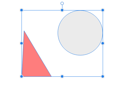

Transform submenu
Transform submenu contains of several predefined rotate functions and a couple of flipping functions.

- Rotate 450 Left(1)
- Rotate 900 Left(2)
- Rotate 1800 Left(3)
- Rotate 450 Right(4)
- Rotate 900 Right(5)
- Rotate 1800 Right(6)
- Flip Vertical(7) mirrors objects across the x-axis
- Flip Horizontal(8) mirrors objects across the y-axis

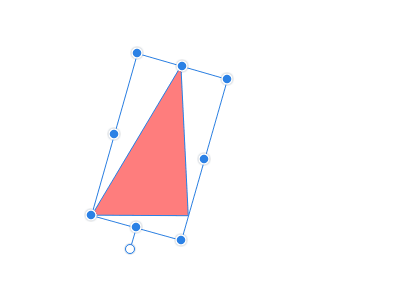
Grouping, Clipping, Masking menu items
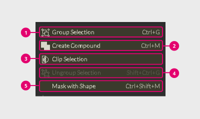
Group Selection(1) unites selected objects into a single group. All objects within the group preserve their own appearance attributes.
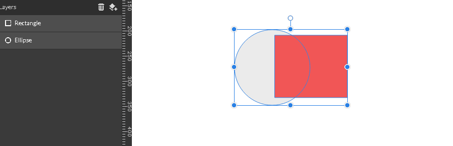
Ungroup Selection(2) splits the objects inside the group apart.

Create Compound(3) unites selected objects into the single compound shape with unified appearance inherited from the shape on the bottom.

Create Compound shape has its own menu:
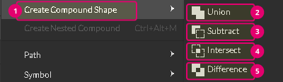
- Union(2) joins two objects into the single shape.
- Subtract(3) subtracts the top object from the rear one
- Intersect(4) leaves the part where two objects overlap
- Difference(5). Oppose to Intersect, it deletes the part where objects overlap


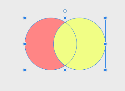
To learn more about Boolean Shape Operators and Compound shapes, please read related topics.
Create a nested compound puts a top compound shape inside the rear one. The rear compound shape, that plays a role of the container, defines the appearance attributes of the final shape.
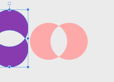
Clip Selection(4) masks selected objects inside the very bottom object in the selection.
Mask with shape(5) masks all the selected objects within the topmost object of this selection

Cropping and flatten
Raster images could be easily cropped in Gravit Designer. Modify menu has two items, that help streamline the process:
1. Confirm cropping to apply the changes of your cropping efforts
2. Cancel cropping to abandon them.
Flatten combines all the selected layers into the single image, filling any transparent pixels with the white color.
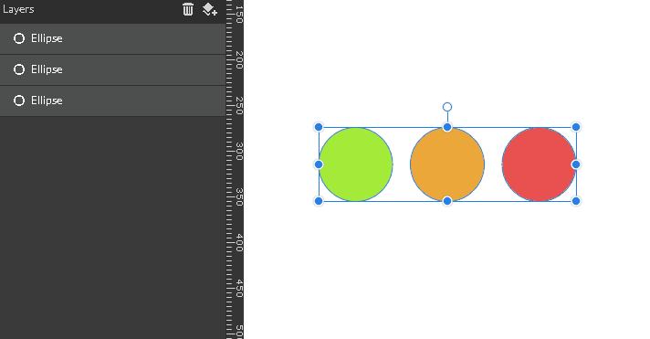
This option helps you to reduce the size of the file, no matter what export format is considered.
Note: flatten rasterize all the layers regardless whether it's a path, a shape or a textual element.

Path submenu

The path has its own submenu:
- Join Paths(1) creates a single compound path from the selection of objects.
- Split Path(2) is opposite to the first option.
- Convert to Path(3) transforms any shape into a path.
Note: this option also works with a Compound Shape, converting it into a Compound Path.

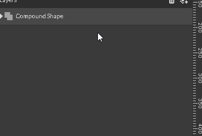
- Convert to Raw Path(4) is much the same as the previous option. The path, created with Convert to raw Path option doesn't inherit the text color from the text layer as a fill color of the path and doesn't support custom names of the layers.
- Convert to outline(5) brings up a dialog box to specify an offset number. Then click ok to extend an outline of an object.
- Expand/Shrink(6) offsets the path by the specified distance you set in the pop-up panel's text field

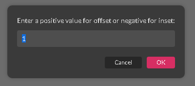
- Setting up the negative value you shrink an object.
- Setting up a positive value you expand an object.
- Vectorize border(7) converts borders into the outlines
- Vectorize image(8) converts a raster image, such as a photo to the scalable vector image. Read more about raster and vector images in the related topic.
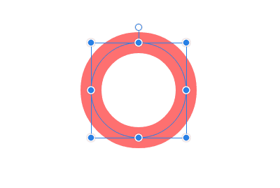
- Attach the text to path(9) puts a text layer on the outline of a path. Note: both a text and a path should be selected
- Detach the text from path(10) this the opposite to the previous function.
- Simplify path(11) helps you to delete of redundant anchor points on your paths. This option brings up the pop-up menu with the tolerance slider


:
The higher number you set, the simpler the path would be.

- Connect two anchor points(11) connects the first anchor point of the path on top of the layer panel with the last anchor points of the path on the bottom of the layer panel.

- Break curve(12). If you are willing to open the path at the particular node, you first need to break the curve.
It will introduce an additional anchor point at this node.
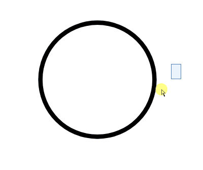
Now that you can open the path by deselecting the Close Path checkbox under the Appearance panel.
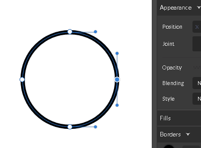
- Reverse order(13) changes the order of the anchor points in the path.
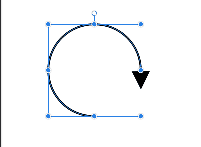
Symbol submenu

The symbol option has its own submenu:
- Create symbol(2) creates a new symbol from the selection.
- Detach symbol instance(3) breaks the link between a master symbol and the selected instance.
- Reset instance(4) cancels all the changes done to the selected instance giving it an appearance of the master symbol.

FAQ
What are minimum and recommended System requirements to run Gravit Designer?
Minimum system requirements:
- a desktop computer
- in Chrome, Firefox or Safari
- with at least 2 GB RAM (memory)
- with a CPU running at a speed of at least 2.2 GHz
- Graphic card that support WebGL for hardware acceleration
Supported operating system:
- macOS Sierra (10.12) or later
- Windows 7 or later
- Linux - Ubuntu 16 - 18 and Linux Mint are officially supported
- Chrome OS - Chrome v8 engine 5.5.372 or later
Recommended System specifications:
There are no specific optimal system requirements. The more powerful and new hardware you use the better Gravit Designer will work. Please keep in mind these suggestions:
- Always use the latest stable release of supported operating systems
- Gravit Designer will work best in the latest Chrome Web browser.
- The more than 8GB RAM
- Use modern SSD Hard drive
- Use best Graphic Card you can get
- Always use the latest Gravit Designer version as we continuously improve Gravit Designer performance
How long do updates to the Windows Store take?
They can take multiple days. Unfortunately, that’s not in our power.
Where can I download the latest version?
Please visit https://designer.io/#download You can also use it online at https://designer.gravit.io.
Where I can get support or report a bug?
Our support team can now be reached from the brand new support form. Linked it in Help > Contact us in the menu bar.
Open the developer tools and console
Desktop app: CTRL/CMD+ SHIST+ F12
Web app: CTRL/CMD+ SHIST + I or ALT + CMD + I on Mac (for opening Developers tools) and press Esc to show Console tab.
How to send console info to developers
To help solving bugs for the development team, you now have the option to Send developer details in the Help menu. It prepares the output of the application’s developer console to be sent to us.
How can I vectorize a photo?
That is possible via “Modify > Path > Vectorize Image“. If that doesn’t give you the desired result, you may want to use online tools like https://www.vectorizer.io/ or https://vectormagic.com.
Where can I change my user data?
You can change your details in Acount Settings screen inside Geavit Designer.
Click on your Profile picture at the top right corner of the app then click on Account settings button. Here you can change all your details (Profile picture, Name, Email or Password). As well as find all the information about your purchases (in any).
Here you can delete you account. Note all your files will be lost.
Alternatively, you can change our Name, Password or delete your account please go to https://cloud.gravit.io/ and choose profile in drop-down menu.
You can reset your password by visiting this link https://cloud.gravit.io/reset-password.
How to uninstall the Linux version
https://discuss.gravit.io/t/the-installer-do-not-replace-old-version/3344
How to Install snap package on Linux
sudo snap install gravit-designer
How to use Portable Windows version
Just unpack and run. Portable version can be used from a USB stick. It saves all settings in users directory on host machine.
Is there a mobile version of Gravit?
Gravit doesn’t offer full support for mobile and touch devices yet, but that’s definitely already on our Roadmap.
Does Gravit have Plugins
We plan to introduce plugins alongside a proper documentation, some examples and an environment to develop them, in a future version of Gravit Designer. For now, we have some information on [GitHub] https://github.com/Gravit-io/gravit-designer-plugin-starter
Can I use Asian or non-Latin fonts in Gravit Designer?
Gravit Designer currently doesn’t support Chinese or any other non-Latin text. A workaround for Asian text may be to use the Noto Sans CJK JP font from Google Fonts (https://www.google.com/get/noto/ ) and import it to Gravit Designer from File > Import > Add fonts... It can then be found in the “Imported fonts” tab. https://cl.ly/1a39b87d3e47
For a Serif font try PMingLiU.
Can I make commercial projects with free version of Gravit?
Yes it is free to use for everybody, no matter if for private or commercial projects. This also includes the libraries and web fonts. Of course we provide a more powerful version which will make your design process smoother. Check here for a full comparison.
Libraries, Webfonts or Templates do not work
Check your Internet connection? Web fonts, libraries and templates only work when you are online.
Advantages of the desktop app
- File integration with the system
- Can be used Offline - for example while on a plane This is an exclusive Gravit Designer PRO feature.
- Access to Fonts installed on your System (via system fonts tab)
Note Desktop app can be a bit slower than the web app due to Electron wrapper
Is there an iPhone/Android/Material UI kit?
No official yet, but meanwhile use this one: https://github.com/CristianDragos/gravit-material-ui-kit
How to make a video/screen capture
For quick and easy animated GIF captures, see programs like GifCam, LICEcap, or ScreenToGif.
For more extensive video capture, maybe something like ActivePresenter, or Jing, or Debut.
What are size restrictions for export?
4500 x 5400 @ 300 dpi
Unfortunately, this is a technical restriction. Based on the available memory of your computer, there are some limitations that don’t allow you to export images above a certain size at 300 dpi.
Other than that, I suppose you don’t need the design with these dimensions at all, only 1080 x 1296 at 300 dpi, which would result in an image with 4500 x 5400 pixels.
Dropdown menus are all black on Linux
See https://discuss.gravit.io/t/drop-down-menus-are-all-black/208/12
How to install the Chrome OS version
First, unzip the file you download to a directory on your hard-drive you remember. Then go to Google Chrome and open the Settings menu in the top-right, choose More Tools > Extensions. With the Extensions panel open you will find a Developer Mode checkbox, probably on the top-right corner, please enable it. Now you will see a new button called "Load unpacked" or "Load unpacked extension", please click on it and then choose the Gravit Designer folder that you unzipped earlier. Now you will see Gravit Designer in the list of extensions.
Are there a Copyright restriction about assets in Libraries
All assets found in Gravit Designer can be used for free both in private and commercial projects. However, for possibly copyrighted items, like the Youtube and 007 word-mark, it’s still your responsibility as a user to make sure that no copyrights are infringed when using such material in commercial work. We are only providing the means to design things with these graphics, what you are doing with them, in the end, is your responsibility.
How to cut out photos
https://www.youtube.com/watch?v=zO6TKGy72dA&app=desktop
Is Gravit similar/a substitute to Photoshop?
In Gravit you can make some basic photo manipulation (mainly with our Effects), but unlike Photoshop, it’s a vector tool, so it’s more similar to Illustrator, Affinity Designer and Inkscape, for example.
Middle mouse click pasting content instead panning on Linux
Please take a look at following tread in our forum. It contains several solutions you could try:
https://discuss.gravit.io/t/on-middle-mouse-click-gravit-paste-the-clipboard-content/5186/11
How can I use my own fonts?
You can import your own fonts from File > Import > Add fonts... in the menu bar. They are then available in the “Imported fonts” tab, when selecting a text layer and clicking on the font family field. Please see the following video: https://cl.ly/1U3J1w0H3Q37
Gravit Designer doesn’t work well on my Linux
Officially, we only support Ubuntu and Linux Mint, as there are too many Linux distributions to test on.
Gravit app goes blank/white on macOS
Please take a look at following tread in our forum for possible solutions https://discuss.gravit.io/t/app-crashes-on-a-mac/6631/26
How to hard-reload your browser
Please see this article: https://www.getfilecloud.com/blog/2015/03/tech-tip-how-to-do-hard-refresh-in-browsers/
Alt key not working on Chrome OS
This issue happens because chromeOS turns Left ALT + click into right-click, so the browser, OS and Gravit itself will read the event as right-click.
There’s nothing we can do here at the moment, but there are workarounds: https://discuss.gravit.io/t/slice-and-knife-functions/1835/16 https://discuss.gravit.io/t/bezigon-tool-does-not-produce-curves/194/24
How to crop an image to a shape
Please have a look at the following video, where I show different ways on how to manage that: https://cl.ly/7c4f0255746a
- Move the image over the shape and drag the image to the shape in the Layers list.
- Move the shape over the image, select both and pick “Mask with shape” after a right-click.
- Move the image over the shape, select both click on “Clip” in the toolbar.
Please note the layer order matters and the image needs to be above the shape in 1 and 3, and the shape needs to be above the image in 2.
Error message about wrong permissions on save
Depends on the system, usually saving in home directory should always work:
- /Users/[username] - OSX
- C:\Users\[username] - Windows
- /home/[username] - Linux
What is the fastest version of Gravit Designer?
The fastest version of Gravit Designer is the web app on Windows.
Select multiple elements in a EPS that has masks
Here’s an example: https://cl.ly/d19a6c89265a If you want to select all parts of this icon, you need to hold Shift + Ctrl/Cmd and click until all elements are selected. Only then you can move the entire logo at all. To simplify things after that, you can create a group of all selected elements with Ctrl/Cmd + G, which allows you to move everything together.
What version of Adobe Illustrator (AI) files are supported?
Files saved with the “Create PDF Compatible File” option can be opened in Gravit Designer. A message will be shown in case the file isn’t compatible.
Where is the Retina check from export dialog gone?
The check was removed. Please use 2x in the size dropdown for the exact same result. Retina label is misleading since even Apple devices have evolved and have a different resolutions now (up to 3x) and Android devices has even more (up to 4x). You can read more here (Apple) and here (Android)
Resources
Forum
On Gravit Discussion, not only you can leave your feedback and ask questions to the Gravit Designer team, but also interact with other users and check many answered topics with questions from other users that might help you with your own doubts.
You can access the forum at https://discuss.gravit.io/:
To search for topics with a subject similar to what you’re looking for, use the search bar with key words:
Changelog
On the Changelog page, you can see all Release Notes. Every Release Note contains all bug fixes, new features and improvements for that version.
You can access it at https://designer.io/changelog/:

Downloads
To download Gravit Designer’s desktop version, go to https://designer.io/#download:
On this page we have options for download to MacOS (Standalone app), Windows (Standalone and Portable), Linux (Standalone and Snap Package) and ChromeOS (Standalone and Chrome Store).
MacOS and Windows also have versions available on the App Store and Windows Store.
Youtube channel
On Gravit Designer’s Youtube channel, you can find many videos to walk you through specific features, explaining step by step how to use them.

You can access the channel here: https://www.youtube.com/channel/UCvm0VdNsl8SxOfujUEpbdug/feed
Medium blog
Besides all the other channels, Gravit also has a blog on Medium. There we share resources like tips, tutorials, work created by the users and important news. Users can also contribute writing their own tutorial articles.

You can access the blog here: https://medium.com/gravitdesigner
Facebook Page
On Gravit’s Facebook page you can check the latest news, as well as many tips and great design content:
You can access the page here: https://www.facebook.com/GravitDesigner/
Facebook User Group
Gravit Designer’s Facebook Group is a community with more than 2.600 members where you can share your work, interact with other users and ask any questions to the Gravit team:

You can ask to join the group here: https://www.facebook.com/groups/gravitdesigner
On Gravit’s Twitter you can share the work and also check what other users have been creating with Gravit. We also share news, tips and answer to any feedback from the users.

You can follow us here: https://twitter.com/GravitDesigner
On Gravit’s Instagram profile we share mainly the designs created by the users, but also some tips and news:
You can follow us here: https://www.instagram.com/gravitdesigner/
Productivity Hacks
A temporary switch to the Zoom tool
If you have another tool selected, holding down Z rather than tapping it will temporarily change to the Zoom tool while the key is held down, and will revert to the previous tool selected when you release the Z key.
Value numeric fields
In addition to typing in values, all number input boxes can be modified by clicking in the number input field and using the mouse wheel.
Normally the mouse wheel changes values in steps of 1 at a time, but hold the SHIFT key and the mouse wheel changes the number in steps of 10. Holding ALT will change values in steps of 0.1 at a time.
Gravit Designer User Guide Page