Material Design Codelab
Created: Jan 31, 2015
Last Updated: April 3, 2015
Author: Michael Yeung
Version: 1.1
As of 10/22/2015, OpenWeatherMap requires an API Key. This codelab HAS NOT been updated to reflect this change. The changes published by Udacity are documented here if you would like to make the changes.
Lesson 0 - Prerequisites and Setup
Lesson 1 - Adapting the app for Tablets
Phone Layout + Current Tablet Layout
Lesson 2 - Theming the app with Color and Typography
Lesson 3 - Using ToolBar in place of ActionBar
Lesson 4.1 - Implementing Responsive Touch Feedback
Lesson 4.2 - Animating Shared Elements between Master and Detail Activities
Lesson 4.3 - Animating Entry and Exit Transitions
Non-shared Transitions for Activity
Lesson 5.1 - Adding a Floating Action Button (FAB)
Lesson 5.2 - Animating the FAB
Lesson 6 - Using the Palette Library to theme the app
Using images to provide content
Lesson 7 - Maximizing Screen Real Estate with Quick-Return Pattern
Introduction
This codelab covers various aspects of building an app to that uses the 4 main Material Design Principles, i.e.
- Tangible Surfaces,
- Print-like Design,
- Authentic/Meaningful Motion, and
- Adaptive Design.
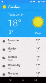
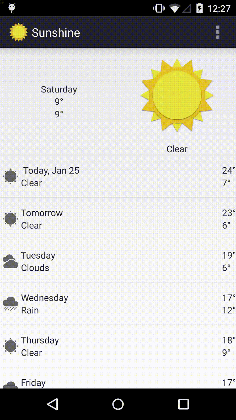
End Result (Phone)
End Result (Tablet)
Specifically, some of the features covered are:
- Adapting an app to respond to all screen sizes,,
- Enhancing the UI with keylines, contrasting colors, and themes,
- Use of animations to express meaningful motion
- Use of touch feedback and ripple effects to communicate interactive motion
- Use of shadows to communicate app level hierarchy
Quick Tips
- Display directory paths in your editor tabs when multiple files in your project have the same name:
Preferences… (Settings) -> Editor -> Editor tabs -> Check “Show directory in editor tabs for non-unique filenames”
- Auto import and organize classes as you add/remove code:
Preferences… (Settings) -> Editor -> Auto Import -> Check “Optimize imports on the fly” and “Add unambiguous imports on the fly” - Whenever you have to create a new folder, do this:
Right click on enclosing folder → New → Directory
Let’s get Coding !
Lesson 0 - Prerequisites and Setup
- To complete this codelab, you are strongly encouraged to have at least a phone and a tablet with Android 5.0 (Lollipop, API Level 21). If you do not have one, you can still test against an emulator that has Lollipop on it.
You can test with an Android device running Android 2.3.3 (Gingerbread, API Level 10) or higher, but will not be able to see some of the Material Design effects.
- Ensure you have Android Studio Beta v1.0.1 or higher installed and working. Download and install Android Studio, then check for updates to be updated to v1.0.1.
- Ensure you have the latest updates from Android SDK Manager. In particular, make sure that the support library, Google Play Services and the Android SDK Build-tools are up-to-date and you have the full Android 5.0.1 (API 21) platform installed.
- Pull down the codelab to your machine via git:
git clone https://github.com/micyeung/Sunshine.git
- Import into Android Studio:
File -> Import Project -> Choose Sunshine directory
- Check the import succeeded by compiling and deploying to your Android device (Run -> ‘app’).
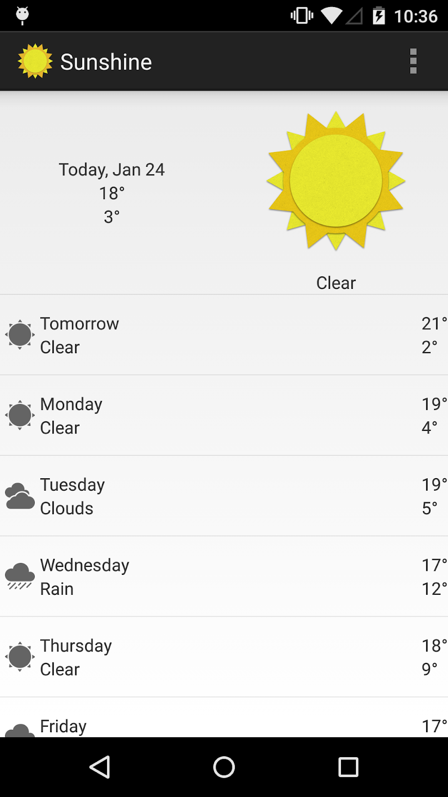
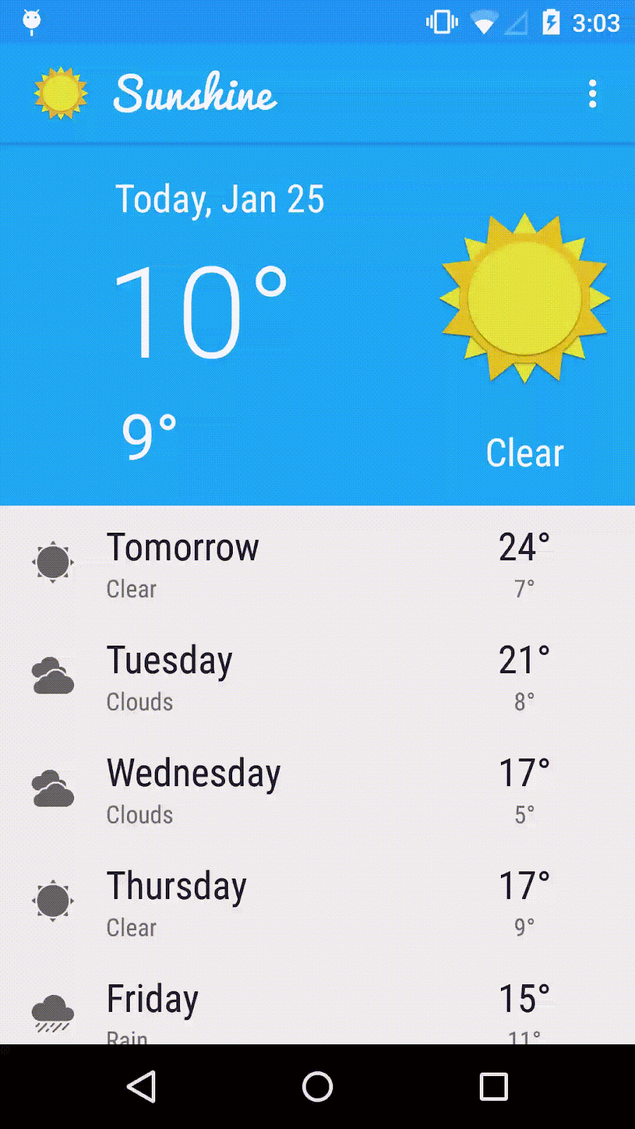
- You should see the app load successfully on your device. On both phone and tablet, both portrait and landscape, they should look the same, just like the following:
Tip: To jump straight to the code at this point, check out the 0-base branch. |
Lesson 1 - Adapting the app for Tablets
Material Design Principles covered:
|
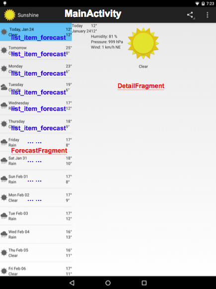
Phone Layout + Current Tablet Layout
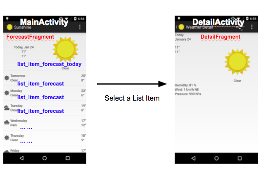
The current architecture of the app is as follows, and applies for both phones and tablet layouts:
- MainActivity contains ForecastFragment.
- ForecastFragment contains a ListView of items.
- The first item of this ListView follows a special layout, called list_item_forecast_today.
- All other items of this ListView follow another layout, called list_item_forecast.
- Clicking on any list item brings up DetailActivity.
- DetailActivity contains DetailFragment.
Phone Layout + Old Tablet Layout
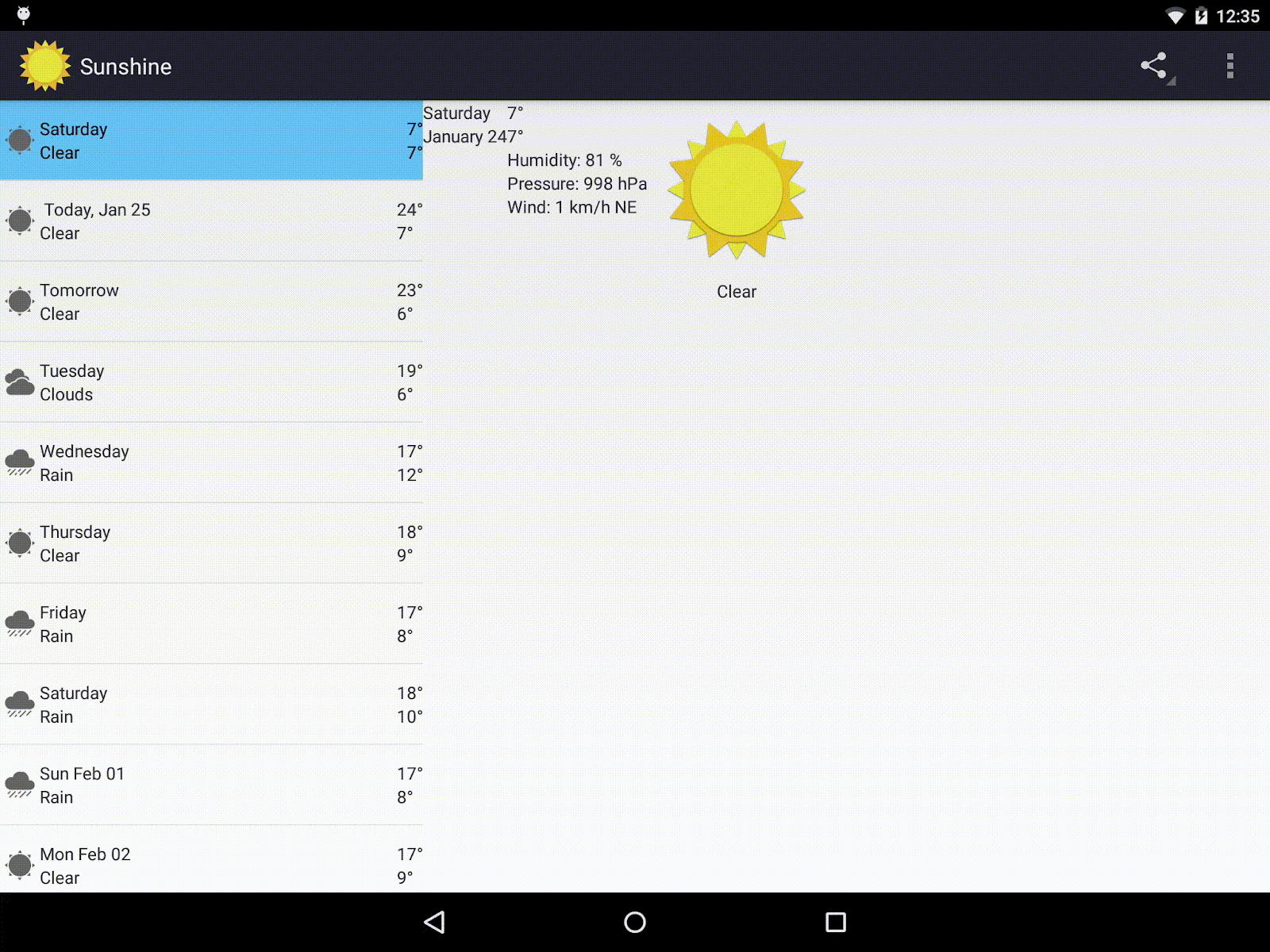
New Tablet Layout
We want to keep the phone layout as-is, but to adapt to the extra screen space on a tablet, we want to change tablet layout as follows:
- MainActivity contains both ForecastFragment and DetailFragment.
- Clicking on any list item in ForecastFragment reloads DetailFragment.
New Tablet Layout
Code
- Now, let’s get to actually defining the layout for the tablet. For this exercise, we define a tablet layout to be any screen size of at least 600dp. For tablet layout, we use a two-pane mode: master on the left, detail on the right. Create a res/layout-sw600dp folder, then create activity_main.xml as follows:
Files added:
res/layout-sw600dp/activity_main.xml
- Now, res/layout/activity_main.xml only applies for the one-pane (phone) mode. So, we replace it to contain only the Forecast Fragment.
Files changed:
res/layout/activity_main.xml
- Also, in two-pane mode, we want the ListView to be in singleChoice mode, so that only one list item can be selected. In one-pane mode, this does not matter. So, we define the a new file res/values-sw600dp/styles.xml which specifies the choice mode, and add a null style into res/values/styles.xml.
We then make ListView in ForecastFragment use this style by changing fragment_main.xml.
Files added:
res/values-sw600dp/styles.xml
Files changed:
res/values/styles.xml
res/layout/fragment_main.xml
- Let’s specify a new layout for the detailed view, depending on whether we have enough space. We define there to be “enough space” if we are in tablet mode, or if the phone is in landscape mode. Then, we simply point fragment_detail to use this layout in both tablet and landscape mode
Files added:
res/layout/fragment_detail_wide.xml
- Now, let’s implement the actual logic to handle two-pane mode and one-pane mode.
In ForecastFragment, we first define a Callback. This Callback function is to be implemented by the parent Activity to determine what action to take when an item is selected, depending on if it’s one-pane or two-pane mode.
Then, we change ForecastAdapter to take into account whether it’s one-pane mode or two-pane mode when figuring out which layout to use for the first item in the Forecast Fragment.
Then, we change MainActivity to do the right thing depending on whether the Callback says it’s one-pane or two-pane. We also have to pass the Date (representing the list item) that is selected to DetailActivity so that DetailActivity knows which date’s weather to display. In DetailActivity, create DetailFragment based on what Date is passed in to its arguments.
Then in DetailFragment, get the Date from arguments passed in, and load the correct content.
Files changed:
ForecastFragment.java
ForecastAdapter.java
MainActivity.java
DetailActivity.java
DetailFragment.java
- Finally, we want to make sure the app maintains the state on screen rotation.
In ForecastFragment, every time we rotate, we store and then retrieve the selected cursor position of the list.
Also, if the app is getting initialized, and it’s two-pane mode, automatically select the first item in the list.
In DetailFragment, every time we rotate, we store and then retrieve the location of the place we’re getting the weather forecast for.
Files changed:
ForecastFragment.java
DetailFragment.java
Well-done! The app now adapts responsively to different layouts for phone and tablet, as well as portrait and landscape.
Phone | Tablet |
Tip: To jump straight to the code at this point, check out the 1-tablet-ready branch. |
Lesson 2 - Theming the app with Color and Typography
Material Design Principles covered:
|
Defining Themes and Keylines
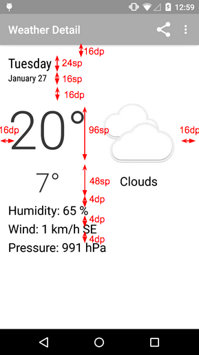
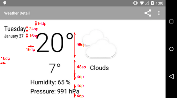
Material Design heavily emphasizes bright and bold use of color for branding and theming. Be sure to check out guidelines for theming the app with the color palette.
Also, be sure to first check out the Material Design guidelines for metrics and keylines. Let’s define some keylines about how we want our app to look based on the guidelines.
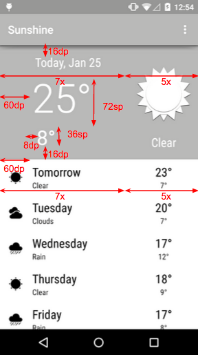
Layout: ForecastFragment
Layout: DetailFragment (Portrait) | Layout: DetailFragment (Landscape) |
Code
- First, we need to update our gradle file to use the newest v21 SDK. This allows us to use the latest AppCompat library.
Files changed:
build.gradle
- We define a primary color, a primary dark color, and an accent color here for the entire app in our styles.xml file. Note that all the colors have already been specified in the res/values/colors.xml file.
Files changed:
res/values/styles.xml
- Based on the keylines defined for the app, we can update the layout xml files as needed to align all the text and apply the appropriate padding. Note that all the dimensions have already been specified res/values/dimens.xml file.
We also define a special selector for the list_item_forecast_today element, since it looks different from all other list items.
Files added:
res/drawable/today_touch_selector.xml
Files changed:
res/layout/list_item_forecast.xml
res/layout/list_item_forecast_today.xml
res/layout/fragment_main.xml
res/layout/fragment_detail.xml
res/layout/fragment_detail_wide.xml
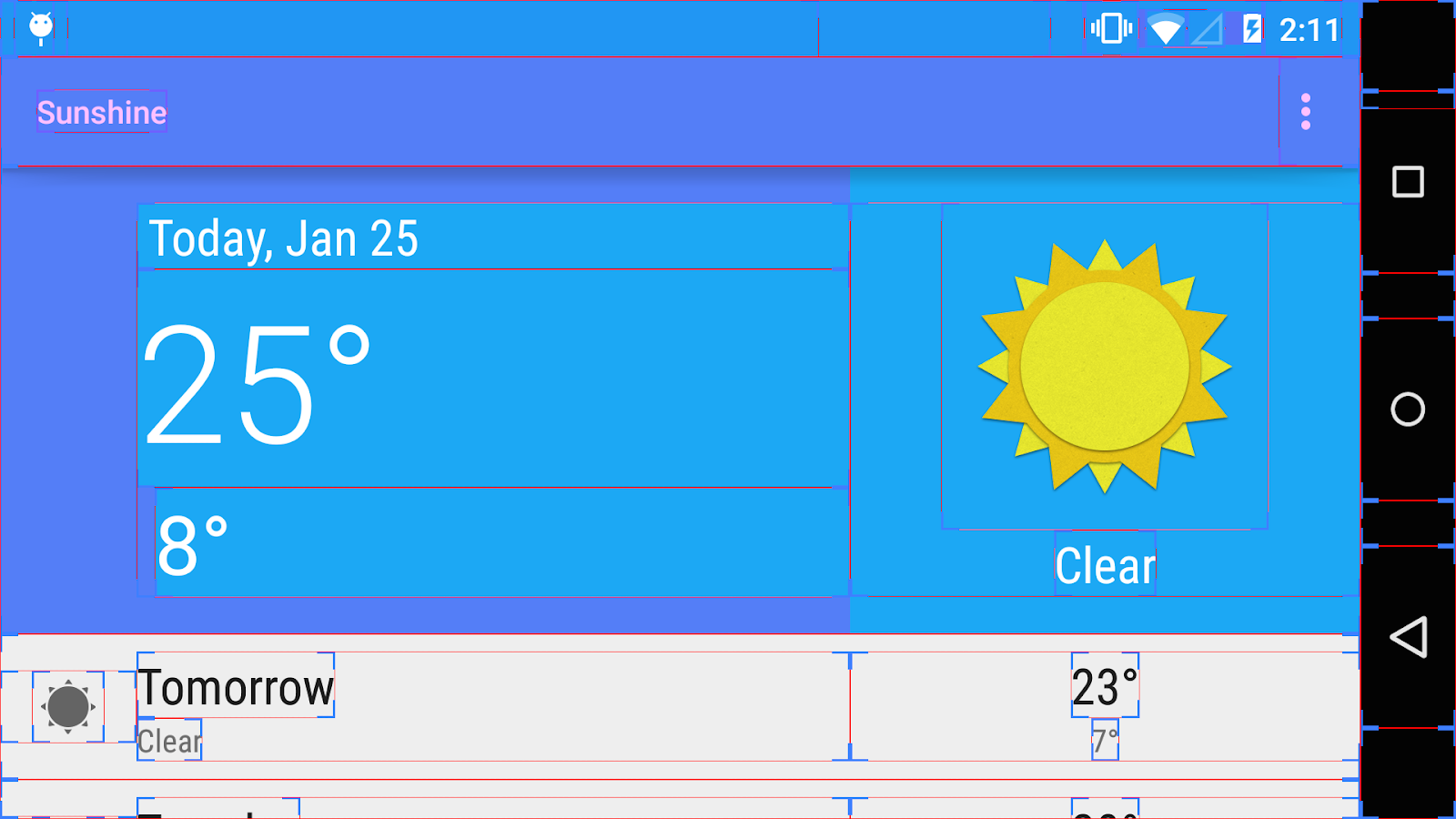
Tip: You can see layout bounds on your device by going to Settings → Developer Options → Show Layout Bounds → Check the box
App with new Theme and Layout, Landscape mode
(Layout Bounds shown)
Tip: To jump straight to the code at this point, check out the 2-enhance-UI branch. |
Lesson 3 - Using ToolBar in place of ActionBar
Material Design Principles covered:
|
Why use ToolBar at all?
In Lollipop, we can now define Toolbar widgets. The ToolBar is a generalization of the action bar pattern, providing similar functionality, but much more flexibility. Unlike the standard ActionBar, the ToolBar is a view in the view hierarchy just like any other, so we can place instances anywhere we like, and animate it and have it react to scroll events, and so on. Make sure to check out the guidelines for the ToolBar.
In this lesson, we will be replacing our ActionBar with the ToolBar. Also, we want our ToolBar/ActionBar to sit at a slightly higher elevation than other elements so that it casts a nice, faint shadow on elements of a lower elevation.
Code
- Since we’re technically not using an ActionBar anymore, we first set the AppTheme to be NoActionBar, and then define a new ToolbarTheme. We also define a Style for the Overflow Menu.
Files changed:
- We then include a ToolBar widget into each Activity layout that directly uses an ActionBar.
Files changed:
res/layout/activity_main.xml
res/layout-sw600dp/activity_main.xml
res/layout/activity_detail.xml
- In code, we programmatically set the ToolBar as the ActionBar of all ActionBarActivities.
Files changed:
MainActivity.java
DetailActivity.java
Your app is now using a ToolBar in place of the ActionBar. Good job!
You will not notice a difference in the UI at this point. When we get to Lesson 7, we will do some animations with the ToolBar that we otherwise could not have done with just a regular ActionBar.
Tip: To jump straight to the code at this point, check out the 3-use-ToolBar branch. |
Lesson 4.1 - Implementing Responsive Touch Feedback
Material Design Principles covered:
|
Responsive InteractionIn material design, apps are responsive to and eager for user input. Touch, voice, mouse and keyboard are all first-class input methods. Although UI elements appear tangible, they are locked behind a layer of glass (the computer or device’s screen). Visual and motion cues help bridge that gap by immediately acknowledging input and implying direct manipulation. In this lesson, we’re using ripple effects to convey this effect, but check out responsive interaction cues here. |
Ripple effects on touch feedback come with the Android 5.0 Lollipop framework. We can implement these on the list view items, which have the most user interaction. We clip the ripple effect to the bounds of the list view items.
Code
|
Tip: To jump straight to the code at this point, check out the 4.1-touch-feedback branch. |
Lesson 4.2 - Animating Shared Elements between Master and Detail Activities
Material Design Principles covered:
|
“Hero” Transitions
We can define elements that are “shared” between 2 Activities (or Fragments), and let the framework handle the transitioning of these elements for us. These transitions are often called “hero transitions”. These are great as delightful and meaningful interaction cues to the user. | “Hero Transition” in Google Play Music |

Code
- Let’s animate the icon and forecast text as a “hero transition” when the user selects a list item.
We need to know the exact list item that is being selected, since we need to know which list items’ icon we are animating. So, first we need to include the list item position in the Callback function that MainActivity makes to ForecastFragment.
Files changed:
ForecastFragment.java
- We then have to give a unique name for the shared (i.e. “hero”) element between 2 activities. This element will scale and move, and form the link between the master and detail activities. We choose the icon and the forecast text as our hero elements.
Files changed:
res/layout/list_item_forecast.xml
res/layout/list_item_forecast_today.xml
res/layout/fragment_detail.xml
res/layout/fragment_detail_wide.xml
- We have to define how the shared element transitions would move between the Master and Detail Activities. Since shared element transitions are only in Lollipop, we define this in a v21 styles.xml file.
Files added:
res/values-v21/styles.xml
- In one-pane mode, we now just have to start the DetailActivity intent with the scene transition animation parameters.
Files changed:
MainActivity.java
When it’s all said and done, you should have a delightful shared element transition like the following:
Shared Element Transition
Tip: To jump straight to the code at this point, check out the 4.2-master-to-detail-animation branch. |
Lesson 4.3 - Animating Entry and Exit Transitions
Material Design Principles covered:
|
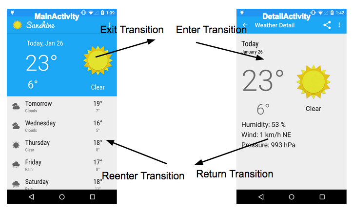
Non-shared Transitions for Activity
In addition to “hero transitions”, we can define transitions that happen as an Activity enters or exits. Once again, the framework handles the transitioning of these elements for us once we have set them up.
The following diagram shows the different transitions that an Activity can take up as it enters and exits. We can thus individually customize each Activity’s transitions as we please.
Code
- We set the Exit transition of MainActivity to be a nice split at where the list item is selected. List items which are above the selected list item slide up, while list items which are below the selected list item slide down. This creates a nice splitting effect.
We also set the Reentry transition to be a simple fade in. Notice how we explicitly exclude the Navigation Bar from all the transitions. This ensures that the Navigation Bar stays as an “anchor” when things are moving around.
Files changed:
MainActivity.java
- We then set both the Enter transition and Return transition of DetailActivity to be an explode animation.
However, we have to delay the Enter transition until after data in the DetailFragment has loaded, so that the framework knows where the animation will end up.
Note that we have to deliberately setAllowEnterTransitionOverlap as false; this ensures that the Exit Transition of MainActivity happens completely before the Enter Transition of DetailActivity begins, making the transition a lot more dramatic.
Files changed:
DetailActivity.java
DetailFragment.java
You should see a nice entry and exit animation now. Good job!
Tip: To jump straight to the code at this point, check out the 4.3-entry-exit-transitions branch. |
Lesson 5.1 - Adding a Floating Action Button (FAB)
Material Design Principles covered:
|
Code
- First, let’s define the FAB drawable. It’ll be round, colored with the accent color, and have ripple touch feedback on Lollipop devices.
Files added:
res/drawable/fab.xml
res/drawable-v21/fab.xml
- Let’s now make the FAB more delightful. We want to FAB to raise up (and cast a deeper shadow) when it’s pressed; this gives the FAB an even more prominent touch feedback.
Files added:
res/anim/fabraise.xml - Now, let’s actually put the FAB into our layout fragments. We wrap the existing layout in a RelativeLayout, and place the FAB relative to the screen margins.
Files changed:
res/layout/fragment_detail.xml
res/layout/fragment_detail_wide.xml
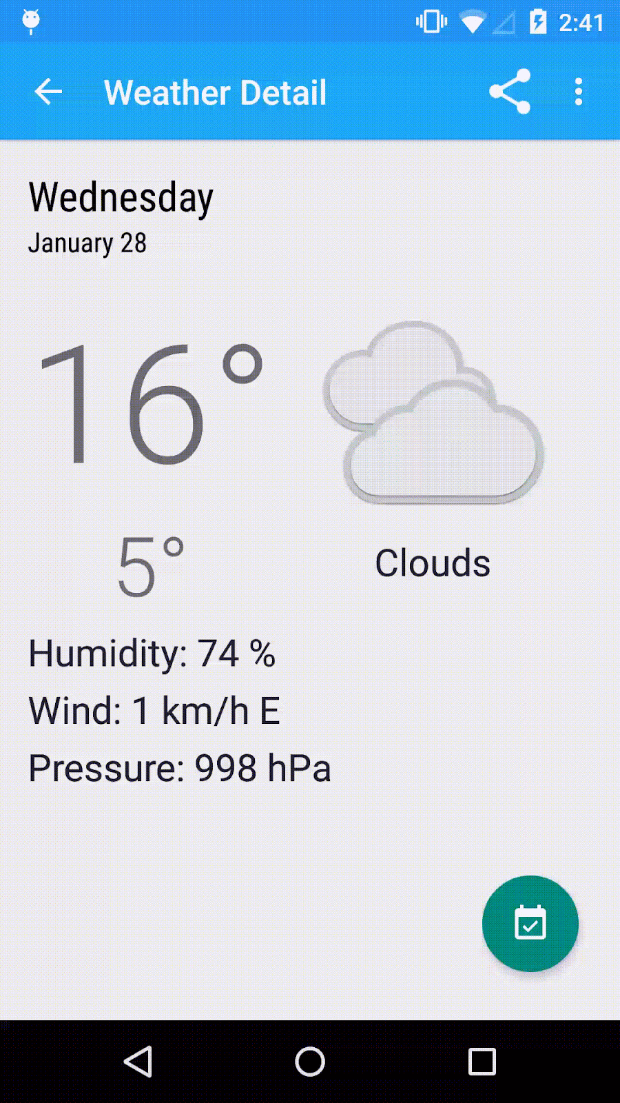
Here’s the FAB in our Detail Layout. Notice how the FAB, when pressed, rises to meet your finger and casts a deeper shadow.
Tip: To jump straight to the code at this point, check out the 5.1-implement-fab branch. |
Lesson 5.2 - Animating the FAB
Material Design Principles covered:
|
Code
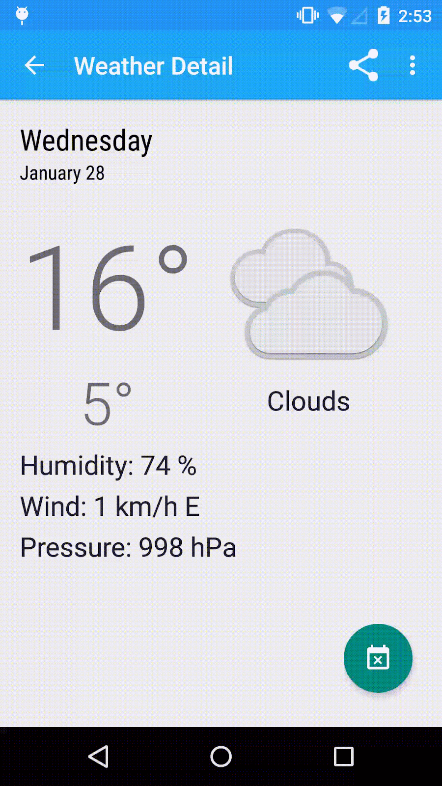
- When we touch the FAB, an action should be triggered. We can have the FAB respond by transitioning delightfully to another state when that happens. This can be done by Property Animation, i.e. animating the change in properties of the FAB from one state to another.
Since the FAB can now take on different states, we have to remember these states whenever the screen rotates so that we can redraw the FAB in the correct state after orientation change.
Files changed:
DetailFragment.java
Tip: To jump straight to the code at this point, check out the 5.2-animate-fab branch. |
Lesson 6 - Using the Palette Library to theme the app
Material Design Principles covered:
|
Using images to provide content
Material Design heavily emphasizes the use of color and images. Images themselves often can be used to provide content and convey specific information. In this lesson, we do the following: depending on what the icon image is, we theme the entire app with a related color (e.g. if it’s sunny, the app should be themed yellow; if it’s cloudy, the app should be themed grey). This can be achieved through the Palette library, which extracts prominent colors from an image.
Code
- First, we need to update our gradle file to use the Palette library.
Files changed:
build.gradle
- In the DetailFragment, after data has finished loading, we know what the icon image should be. At that point, let’s use the Palette library to grab the “best” color for theming, and pass this color back as a Callback. Since the color will be used to theme the Action Bar, we pick the “best” color as a color that is “sufficiently dark” based on its lightness, so that the white text on the Action Bar still stands out.
Files changed:
DetailFragment.java
- Once we have the color, we can immediately theme the app, but that would be too abrupt. It is far more delightful to have the color animate from the before-color to the after-color.
To do that, we first need to create a helper function that takes in a before-color and an after-color, and only does a nice transition between the 2 for the ActionBar and Status Bar if the colors are different. Let’s place this function into our Utility class.
Also, we create another helper function that can programmatically retrieve the primary color. This is useful so that we know what the initial before-color is.
We also want to keep the status bar color to be slightly darker than the ActionBar color, so we add a helper function that can programmatically generate darker variants of a color.
Files changed:
Utility.java
- There are 2 Activities which might contain DetailFragment; MainActivity (for two-pane mode) and DetailActivity (for one-pane mode). Both these Activities need to be themed.
It is also important that the state of the color is saved so that the color theme is preserved during screen rotation.
Files changed:
MainActivity.java
DetailActivity.java
Voilà! Enjoy the meaningful and delightful treat of a transition that you’ve just created!
Tablet
Tip: To jump straight to the code at this point, check out the 6-anim-theming-actionbar branch. |
Lesson 7 - Maximizing Screen Real Estate with Quick-Return Pattern
Material Design Principles covered:
|
Since real estate on phone screens is so precious, sometimes it is desirable to hide the Action Bar that might be taking up real estate when the user has no need for it (e.g. when the user is scrolling down a list and browsing), and to only show it when the user gives a cue (e.g. when the user scrolls up slightly). This is called the Quick-Return pattern. In this lesson, we implement a simplified variant of it that hides/shows the Action Bar whenever we scroll a list item off/on to the screen.
Code
- First, we need to make sure that the ActionBar always overlays other views in the non-wide Main Activity layout. This is important so that when the ActionBar hides itself on scrolling, the framework does not have to redraw other views, which would otherwise cause an annoying flickering.
Files changed:
res/layout/activity_main.xml
- Next, add a top padding that is equal to the height of the Action Bar to the today forecast list item. This ensures that the Action Bar overlay will not hide the top part of the list.
Files changed:
res/layout/list_item_forecast_today.xml
- Let’s handle the quick return pattern in MainActivity in one-pane mode. Whenever a user scrolls to the next list item, we animate the toolbar into/out of the screen as appropriate.
Files changed:
MainActivity.java
End Result (Phone)
Tip: To jump straight to the code at this point, check out the 7-quick-return-pattern branch. |
Congratulations! You have finished the code lab!