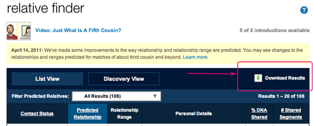
Step 1.
Download your Relative Finder results.
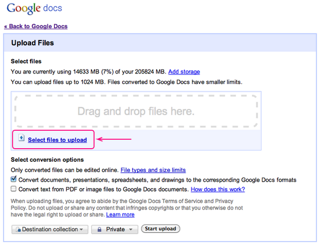
Step 2.
Upload your Relative Finder results to Google Docs (you’ll need a Google account for this).
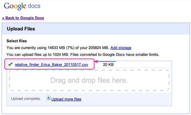
Step 3.
Open the file you just uploaded.
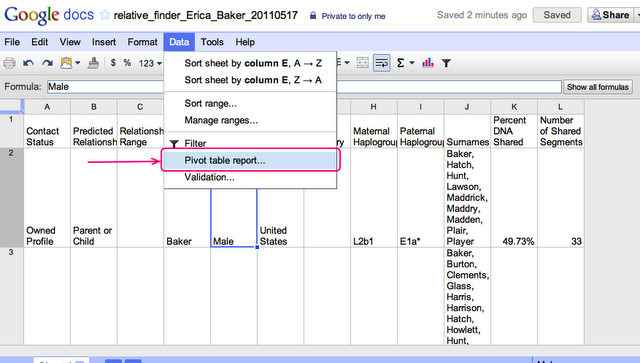
Step 4.
Click the Data menu and select the Pivot table report option.
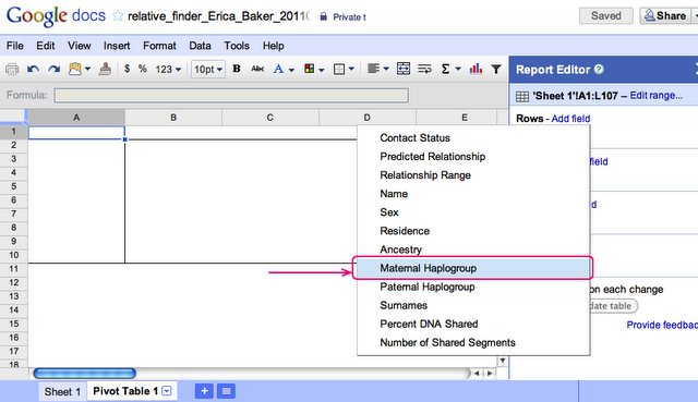
Step 5.
In the Pivot table sheet, look under the Report Editor section and select the Add Field option next to Rows, then choose Maternal Haplogroup. Uncheck the Show totals box.
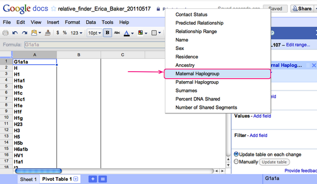
Step 6.
In the Pivot table sheet, look under the Report Editor section and select the Add Field option next to Values, then choose Maternal Haplogroup.
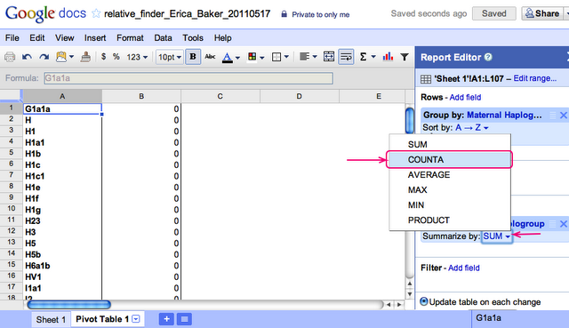
Step 7.
You should now see a Maternal Haplogroup section in Values. Click the Summarize by: dropdown and select COUNTA.
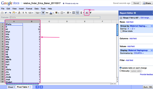
Step 8.
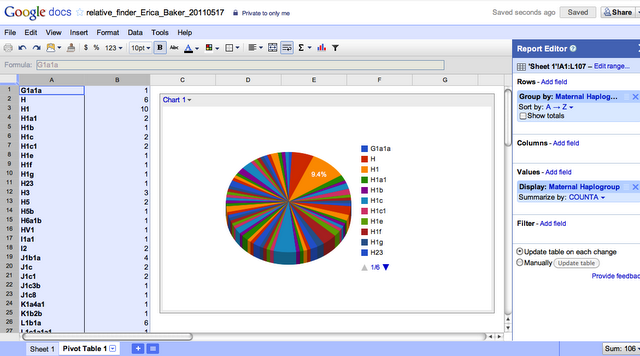
You should now have 2 columns in your Pivot Table, one listing different Haplogroups and another with the number of times that Haplogroup appears in your Relative Finder results. Select both columns then click the Insert Chart button.
Step 9.
A chart appears! You can choose the Customize tab then select the 3D option to make your chart look like the one below.
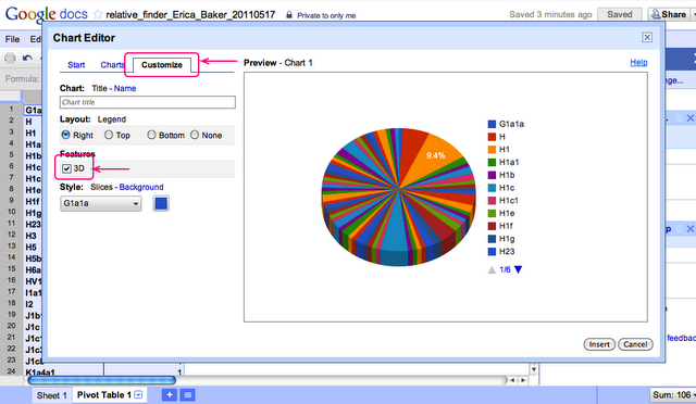
Step 10.
You now have a fancy schmancy chart that tells you interesting things about your Relative Finder data.
Epilogue
This should give you a basic understanding of what you can do with your RF data and Pivot Tables. You can do this with any CSV, not just Relative Finder results. Have fun!