Title: Mapping Mastery: Unleashing Your Creativity in QGIS
Description: Maps can help us tell stories and share information in ways that other visualizations simply cannot. QGIS has many tools and techniques to design maps. Hands-on exercises will show you how to use map-making tools within the software, and introduce common cartographic techniques. The session will discuss how to design maps for a variety of presentation formats using QGIS.
Pre Workshop:
Before the workshop please download the QGIS program to your computer using the following instructions:
- Go to the Download QGIS website by either clicking on the linked hypertext or type in the web address below.
Website (https://qgis.org/en/site/forusers/download.html)
- Locate your operating system in the list of download options
- Please download the latest long term release version of the program as it is the most stable at this time. By using this version of the program we will all see the same type of interface and there should be less confusion as we work through this workshop.
Workshop:
Scenario
For the purposes of this workshop we are going to use the following scenario as the backdrop for why we are creating this map. As part of a group dedicated to Florida outdoor activities we were asked to make a map that would help people identify many of the trails located within the Wekiwa Springs State Park.
Getting the Data
Downloading Data
First things first, we need to have data to work with. I have provided a link to all the data sources we will be using below for anyone who wants to look at the data portals and the descriptions. However, to save some time please use this link: https://drive.google.com/drive/folders/1pK6zogaR4fONucd9IAWBsxZ3u6IGrswC?usp=share_link to get all the data. This Google folder I have created to hold what we need. To download the files from the Google Folder:
- Go to the folder
- Right click on the Beach Access folder and select download from the menu.
- This will now download a zip file to your computer.
- Repeat for all of the folders in this Google Folder.
Unzipping a file
- Find the downloaded folders on your computer (most likely in your downloads folder)
- Right click on the folder and select “Extract All”
- Save the folder in a location you will remember where it is and by a name you can remember.
- I suggest creating a new folder every time you start a new GIS project where you can save data associated with the project.
Most of our data for this workshop and the Let’s Make a Map Workshop come from the Official State of Florida Geographic Data Portal: https://geodata.floridagio.gov/ .
We have download the full shape files for the following data sets:
- Florida State Park Points of Interest
- Florida State Park Trails
- Florida State Park Boundaries
We also will be using one file from the ArcGIS: https://www.arcgis.com/home/search.html
- Florida County Boundaries -- https://www.arcgis.com/home/item.html?id=ede3dd6934f5402ebc5463b941dc84f6
Unzipping a file
- Find the downloaded folders on your computer (most likely in your downloads folder)
- Right click on the folder and select “Extract All”
- Save the folder in a location you will remember where it is and by a name you can remember.
- I suggest creating a new folder every time you start a new GIS project where you can save data associated with the project.
Uploading Files to QGIS
Let's get our data into the program:
- Locate the Data Source Manager icon (hint we identified this icon in the last section). The window below should open up.

- Click on the three dots located to the right of the “Vector Dataset(s)” bar.

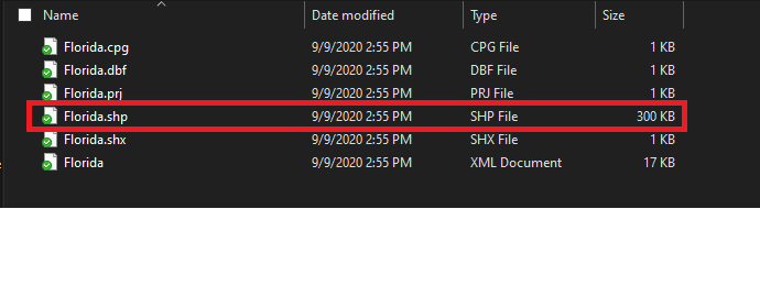
- Locate where you saved the 5 Florida shape files we extracted from the zip files earlier in this workshop. Select and open the Florida_State_Park_Trails.
- Double click on the Florida_State_Park_Trails.shp file where the file type is SHP.
- Click Add

We have added our first data layer to the program. We are going to add the rest of the Florida layers by repeating steps 1-5 to input the layers:
- Florida_State_Park_Points_of_Interest
- Florida_State_Park_Boundaries
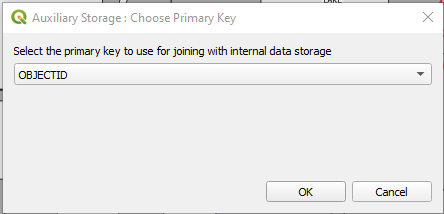
We are now going to put in the Florida County Boundaries file. Repeat steps 1-5. After you click Add a window that looks like the one below should pop up. This is because this file is using a different projection system than the other files. We were lucky that the other files were all done in the same projection. But fear not, we can still use this data; QGIS does the best it can to convert one of the files or both to a projection that will work for both sets of data. Click OK on this window.
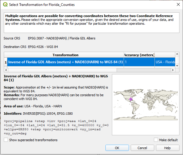
If you are interested in learning more about GIS projections here are some resources you can look at:
- Projection types—Help | ArcGIS for Desktop -- https://desktop.arcgis.com/en/arcmap/10.3/guide-books/map-projections/projection-types.htm
- Map Projections and Coordinate Systems -- http://maps.unomaha.edu/Peterson/gis/notes/MapProjCoord.html
Notice how the county layer now covers the majority of the rest of our map. As you put the different files into QGIS the program drew them one on top of the other. This is called the drawing order. Drawing order is important to map creation because the order that they are listed will determine what appears on top of each other when there are overlapping elements.
We are going to reorder the elements of the map so everything is more viewable. Click on click to highlight the Florida Counties layer and drag it so it sits right about the Florida layer in the list. Now it is common practice to have polygons on the bottom of the list, then lines, and points at the top of the layer list. Go ahead and rearrange your layer list so it looks like the one below:
Notice that the Trails layer is hidden on the majority of the map behind many of the points from the Points of Interests layer. We are going to work on changing the symbology of the layers so that will not be the case.
Before we jump right into creating a map for the Wekiwa Springs State Park Trails we are going to explore some ways we can play with symbology on the Florida map as a whole.
Changing Symbology
Now depending on how we choose to represent the layers in our map will guide which layer should be drawn on top. To help us make a decision we are going to play with some of our symbology options.
Florida_Counties Layer Symbology:
- Right click on the layer and select “Properties” from the list
- Select Symbology from the left hand menu if not already selected. You should have a window that looks something like this:
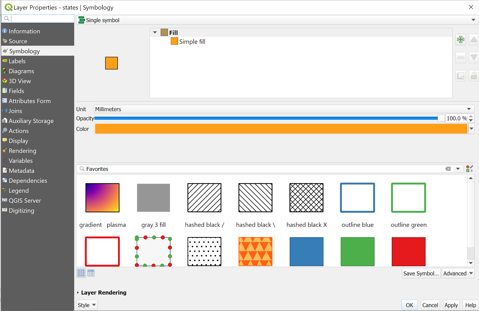
- Click on where it says “Simple Fill”. The window will change to allow us to make lots of changes to how this symbol will appear.
- Where it says “Symbol layer type” use the drop down menu to select “Outline: Simple Line”
- Accept the defaults at this time.
- Make sure the counties layer is above any of the other polygon layers in our layer panel so it can be seen.
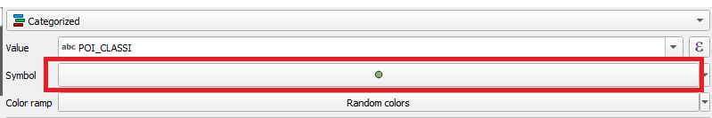
Florida_State_Park_Points_of_Interest Layer Symbology:
- Navigate to the symbology window for the Park Points of Interest layer.
- Where the drop menu says “single symbol” change it to categorized.

- Using the drop down menu change Value to POI_CLASSI
- Set Color Ramp to “Random colors”.
- Click the Classify button located toward the bottom of the window.
- At the bottom of the list there should be a symbol that says “all other values”. Highlight this symbol by clicking on it and then click the red minus button that is located to the left of the classify button.
- Click Ok
There are a lot of colors on the map. Can you tell the difference between all of them?
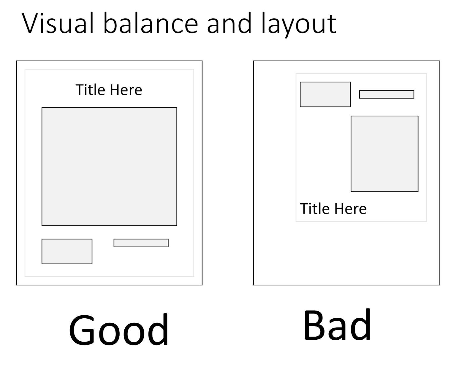
A general rule of thumb for map making is to not clutter the map with unnecessary information and to not distract the reader by having to constantly go back to view what a symbol is in the legend. We know that our mission for this map is to highlight where there are trails people can go out on in the state of Florida. With that in mind, let's edit what points of interests we want to display on the map. We can remove what points are displayed on the map without deleting any of the important underlying data.
Remove a Symbol:
- Expand the Value column in the symbology window so you can read them more clearly.
- Go down the left hand side of the list where there are boxes and uncheck anything that is not a trail.
- Click Apply
Notice the number of points on the map have gone down. Now time for a question? Did you leave the paddling trail and trailhead checked on your list? This is where maps can differ. As the map maker you have to decide what is important and what elements help you meet the purpose of the map.
Now let's see how we like it when the trails are shown as lines instead of points. In the layer window uncheck the Points of Interests layer…..
- Open the symbology window for the Trails layer
- Change the Width of the line to 0.4
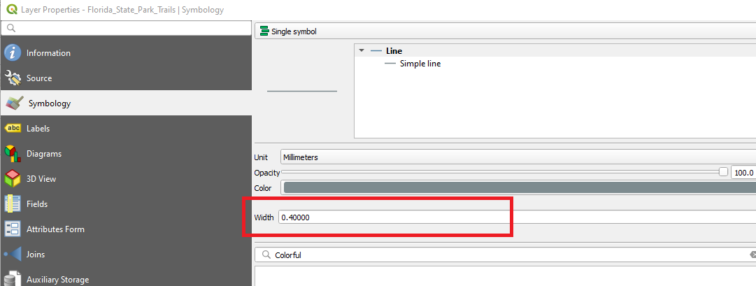
- Click Apply and close the window
How do these lines look? Do they cover up the Park Boundaries layer? Again as the map maker we have to decide what is going to be the best way we can display this information. Are points better to indicate where there are trails or are the lines better? Well we can explore drawing maps both ways to see what we prefer.
Previewing a Printable Map
We have been working on the map canvas this whole time and now is the time to turn all of our work into a tangible project that could be included in a report or in a presentation. First we are going to learn how to use a few of the features and tools with creating a map.
You can open the print layout two different ways either selecting “New Print Layout” from under the Project drop down menu or by clicking on the toolbar shortcut . A window (pictured below) asking for a print layout title will popup.

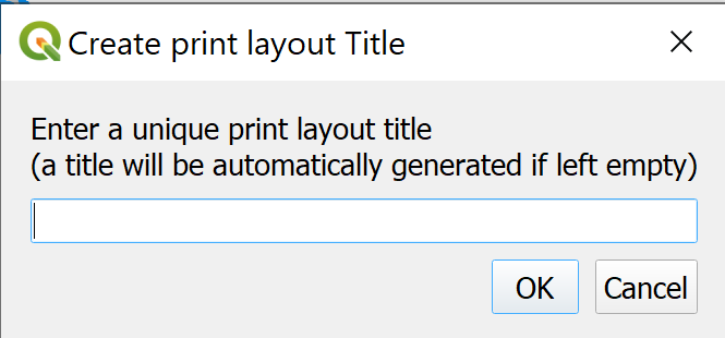
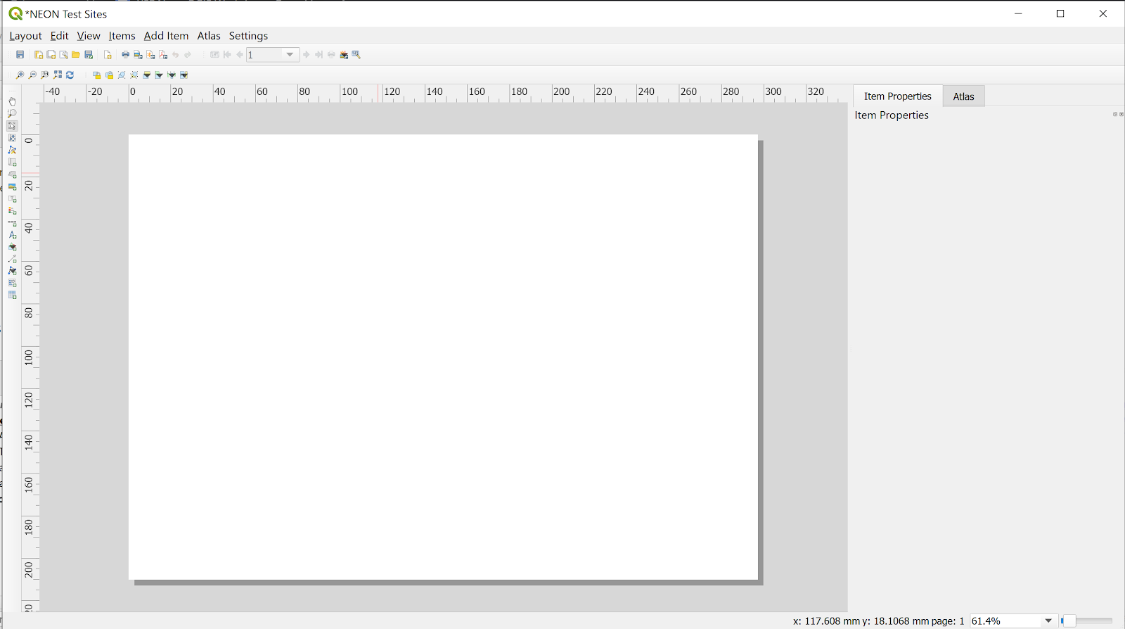
Title this layout “Florida Trails as Practice”. After you click “OK” a new working window will open up like the one below.
Adding Map Elements
These are some of the main tools used to quickly add and edit map elements.
Add a new map to the layout: this means that the whole map area can be added to the layout. You can add more than one map box to the layout as other tools will allow you to change the extent of the map shown in each box.

Move time content: This tool allows you to zoom in and out for the extent of the map, to move to different areas of the map. This is very helpful when you have multiple maps in one layout as you can then pick what to highlight in each box.

Adds a North arrow to the layout.
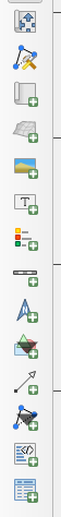
Adds a legend to the layout.

Adds a scale bar to the layout.

How you can add text to the layout. This is used for adding titles, annotations, or source details to your map.

Export the layout as an image in a SVG File

Export the layout as a PDF file

Create a map for the whole of Florida and add the legend
Click on the Add New Map to Layout icon and draw a large box on the paper. Make sure to leave a little room for the margins.
- Use the move item content tool to move the position of Florida so it is fully visible in the frame. Play with it a little and move the state to the left and right. Try zooming in and out in the frame with your mouse.
- Try playing with the number that appears in the scale box off to the right hand size. If you increase the size of the number does it increase the size of the map features?
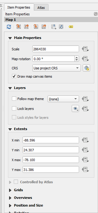
- Use the textbox icon to draw a box that we can type text into. Put the box at the top of the map (where you would put a title). Then in the panel on the right hand side (pictured below) type in some type of title.
- Now use the tools for drawing a North arrow, a scale bar and a legend. Draw them on the map and try moving them around so that they are visible and not covering up any of the map.
Making the Wekiwa Springs State Park Map
Return to the main QGIS workspace so we can get to work on creating the map we were asked to:
The first thing we need to do is find the Wekiwa Springs State Park
- Open the attribute table for the Park Boundaries layer.
- Click on the column header called Site_Name so that the parks are listed in alphabetical order (click twice if you want the parks in reverse alphabetical order.
- Locate Wekiwa Springs State Park in the list and highlight the row.
- In the attribute table menu click on the icon that looks like . This will zoom the map to that part of the map.
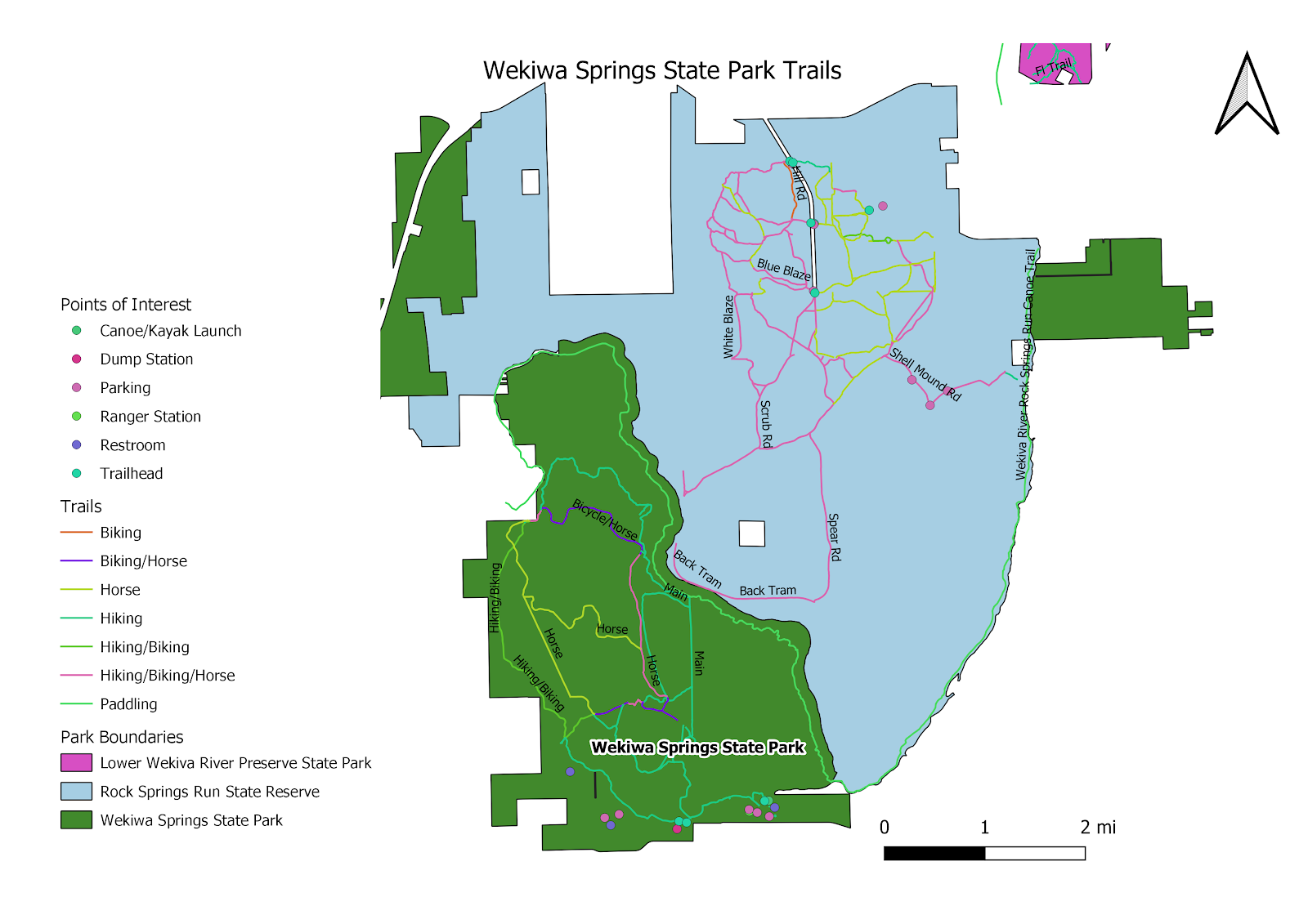
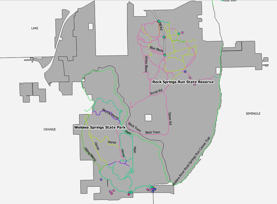
- Close the window and the highlighted parts are all the parts of the Wekiwa Springs State Park. Your view should be something like this:

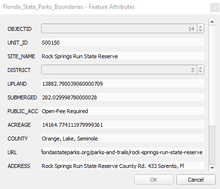
- The non-highlight portion of the state park is actually the RockSprings Run State Reserve. You can learn this by click on the icon and then clicking in the polygon that is not highlighted. A window like the one below will open up telling about the polygon.

- To unselect the Wekiwa Springs State Park click on the .

Now that we are zoomed to the park we want to change the symbols to match the scale of the map.
- Change the symbology for the Trails so that the lines are:
- Of 0.4 thickness
- Are categories based on use (be sure to remove the all other values symbol that is automatically generated at the end of the list)
- If you want to change the color of a specific line you can double click on it in the symbology window to change it.
- Turn on the symbol for points of the following values:
- Bathhouse
- Canoe/Kayak Launch
- Concession
- Dump Station
- Parking
- Picnic Area
- Ranger Station
- Restroom
- Shower Station
- Trailhead
- Also change the size of the symbol to a 1.5 by clicking the symbol box.
- Change the fill color of the Counties layer so that it is a light gray outlined in thin black lines
- Change the fill color to the Park boundaries layer so that it is distinguishable from the Counties layer but does not distract from the trail line colors.
Labels:
I like to add some labels to this map to help people know what trails there are and where in Florida they are located.
To start adding and editing labels:
- Right click on the Counties layer and select Properties
- From the left hand menu select “Labels” and a window like below will pop up.

- From the drop down menu select “Single Labels”
- Set Value to “Name”
- Click Ok
Repeat these steps for the Park boundaries layer, using Site Name as the label and then again for the trails using Name for the label.
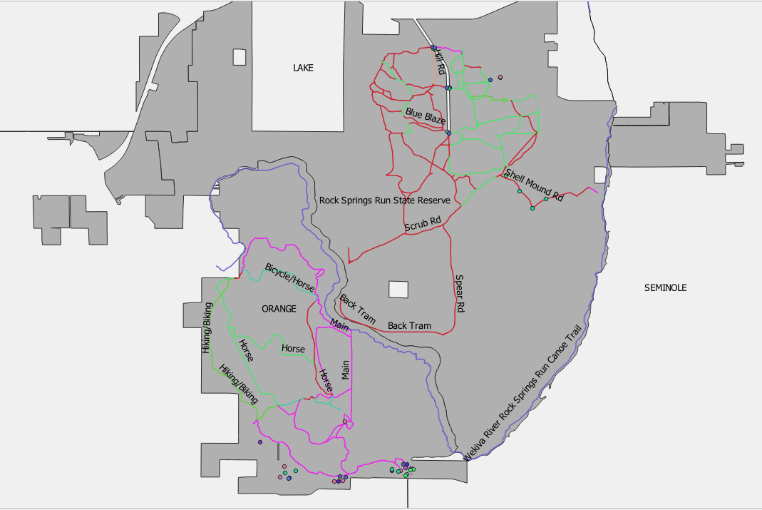
Look at the labels on your map. Your map should look something like this
We need to edit the labels so we can see all of the labels clearly without covering up any
important data or miss labeling something.
- Reopen the Label window for the Counties layer by going to the properties
- Change the font size to 8
- Select Buffer in the Label pane
- Check the “Draw text buffer” box
- Click Ok
We still need to move some of the labels, but we can use a different tool for that. On the Toolbar there are a series of Label shortcuts. Look for the “Moves label or diagram” button . This tool will allow us to move labels around the map canvas one at a time in order to best position each label in the optimal place.

- Click directly on the label “Orange” with the cross hair. A green box will appear displaying the size of the textbox.
- When the pop up box shown below comes up just click ok
- Move the label to the left in the lighter gray area.
Open the label properties for the Park Boundaries and:
- Under the text tab change Style to Bold
- Draw a buffer around the label
Now reduce the size of the Trail labels to an 8 as well.
If you think the labels need to move please take a few minutes to do so, while making sure you do not miss label any features or cover up important information. It should look something like this now.
Now open up a new print view window and we can start creating a printable map.
- Open a New Print Layout.
- Title it Wekiwa Springs State Park
Click on the Add New Map to Layout icon and draw a large box on the paper. Make sure to leave a little room for the margins. The new map you just drew should only show the extent of the parks we were just in. You should not be seeing all of Florida.
- Go ahead and play with the positioning of the park so it is fairly centered on the page. If you like you can zoom in or out to your liking, just remember we want to be able to see the trails and points of interests.
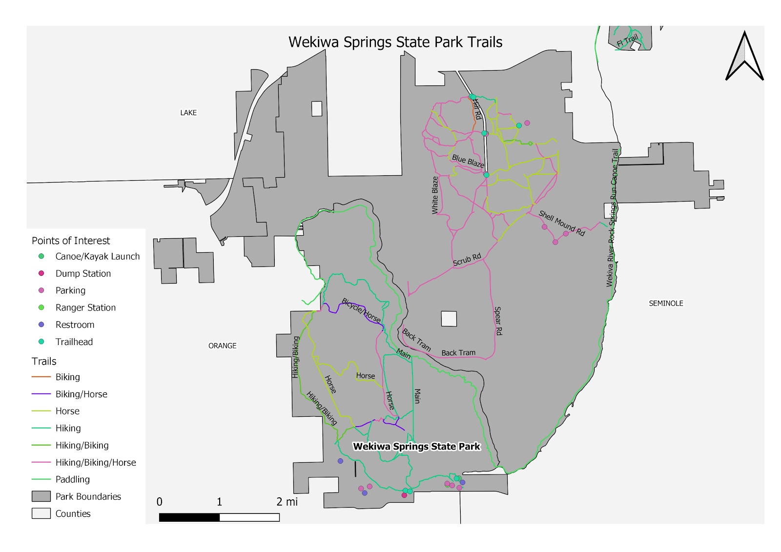
- Click on the legend icon and draw a box in the lower left hand corner.
- Now when you draw it probably has all of the points and trails labeled in the legend. But most of those are not on our map. In the right hand side panel check the box that says “Only show items inside the linked map”.
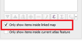
- The list has become a lot shorter. It is still pretty big however.
- We can edit the legend to better fit what we want:
- In the right-hand menu double click the layer that says Florida_State_Park_Points_of_Interest under Legend Items. A new window should pop up where you can change the text. Change it to Points of Interest.
- Do this again for all of the layers so that they now read
- Trails
- Park Boundaries
- Counties
- Still in the right-hand menu scroll down to Fonts and Text Formatting and expand that option.
- Using the drop down menu change Subgroup Font to a size 11
- Change the item font to a 10
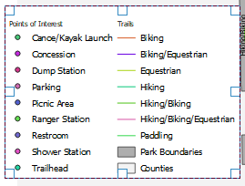
- Now scroll down to Columns and change the count to 2. Your new Legend should look something like this:
- While the legend is smaller now it still covers up some of our map. This is where the map maker can make some decisions. You can play with more of the legend setting like we did with steps 5-7. You can try moving the legend to different areas of the map. Or you can remove some of the symbols from the map. If you choose the last step here are a few quick tips.
- Pick the elements that you deem less important, perhaps not showing where the Concession, shower station, and picnic areas are.
- Leaving the print view window open; go back to the workspace. Expand the points of interest layer and uncheck the points you do not want.
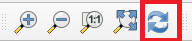
- Go back to the print view window and click on the refresh button in the toolbar at the top of the page.
- The points you unchecked should now be gone from the legend.
- Now draw a scale bar and put it somewhere toward the bottom of the map page.
- In the right hand side menu change the units to miles or some other appropriate unit measurement.
- Place a North Arrow toward the top right hand corner of the map.
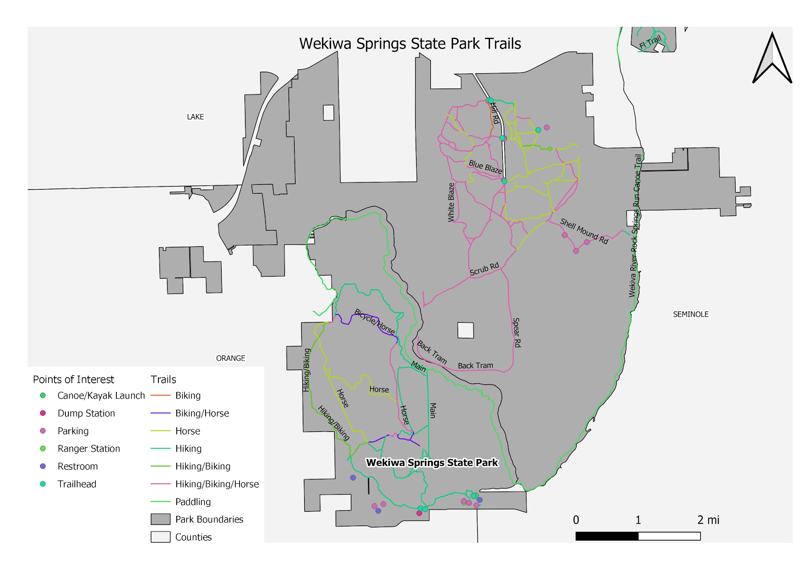
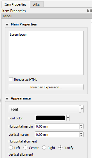
- Use the text box icon to draw a box so we can title our map. In the right hand menu bar give it the title “Wekiwa Springs State Park Trails”. Then under Appearance choose to center the horizontal alignment and middle for the vertical alignment. Change the font size to 16. Do your best to center the box at the top of the map.
Play with the features in map creation and create your own map. You will find that as you display various map features you may need to go back to the map canvas and change symbology, the way labels appear, and so on.
Some Guidelines and Tips for Creating a Good Map
Print and Save your map
- Click on “Layout” in the menu bar.
- From here you can choose to save the map, or export you map as PDF or image if you like.
I have included a few sample maps where I changed some of the features. Just to give you an idea of what you can do.