Crown.tech evaluation 15 november 2017
Abstract
Crown recently conducted a small survey about Crown.tech. In total, 36 participants answered the questionnaire. From the survey, it is clear that the information and theme of the website can be improved upon. Possibly minor tweaks and changes can make all the difference here.
We will look into the feedback and work on improving the website - which may take some time, due to other priorities and limited capacity to do so.
To quote one of the respondents - who probably covers the aim of this survey well:
“I might be extremely critical with my comments, but exactly this is what makes Crown so damn unique: listening to its community and actually doing something with that feedback. While there's still a lot of things that could be improved upon, I must say that Crown is an amazing project. If you guys keep up this pace, I think within half a year, Crown is a vast contender in the top 50 on Coinmarketcap. Keep up the fantastic work on Crown and good luck with whatever there's to come. Cheers, big Crown fan!”
- Introduction
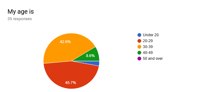
About 94% of all respondents were male. About 79% of all respondents were also Crown holders. The site is known by almost all respondents (n = 36, known for 97%). The age distribution:
The top three uses of the Crown.tech site for new members:
- Information about what Crown is (n = 27, 75%)
- Information about Master/System nodes (n = 17, 47%)
- News (n = 8, 22%)
The top three uses for recurrent members:
- Information about Master/System nodes (n = 23, 64%)
- Information about what Crown is (n = 17, 47%)
- Direct others to the project (n = 14, 28%)
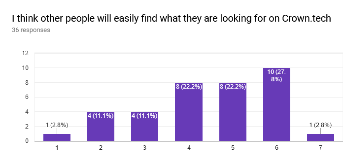
From the 33 collected responses on the question “I could find an answer to all of my questions”, only 60% said Yes. This means that not everything is clear for about 40% of the visitors.
- Information
Missing information was indicated to be,
- The Meetup information was not findable
- Clear instructions on how to buy CRW were missing
- Systemnodes setup
- Setting up a wallet
- And the Crown Atomic papers were good, but too hard to understand
- Navigation
Navigation of the website scores 5 out of 7 on a scale from 1: very difficult to 7: very easy, possibly reflecting the struggle to find some information - but overall a good score.
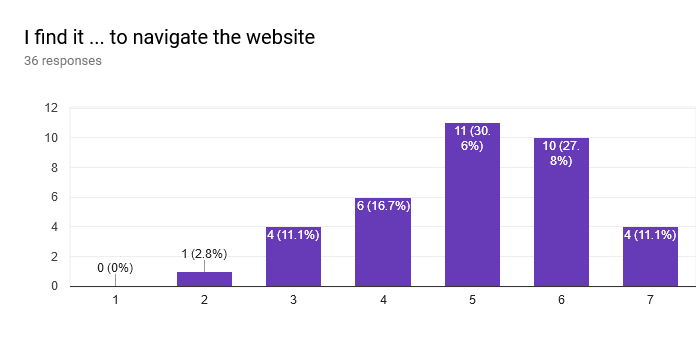
Which does however mean there is probably some room for improvement. People like the information & the graphics, but comments were made that it lacks the intuitive nature of other projects. And that multiple designers worked on it, making it feel unfinished / unpolished.
- Appearance
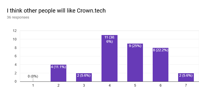
Most people feel crown is Unique (scoring 6 out of 7), however - when asked if they liked the looks, this score dropped to 5 out of 7. And when asked what they think other people will think of Crown (a question that tries to eliminate user bias and evoke a more neutral response) this were the results:
- Feedback & suggestions
On the contrary, when asked what can be improved, people indicate that the graphics, information and style could.
Style suggestions:
- make it less dark (for instance https://getmonero.org/),
- Menu structure / better use of titles to indicate where to download the wallet, where to buy crown, masternodes, systemnodes.
- In general, the user experience can be tweaked more.
Graphic suggestions
- Less flashy
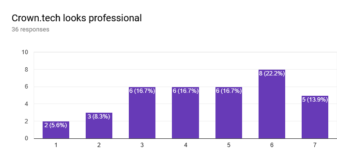
- The value of having a knights theme is not properly understood, and make it feel like a kid project / hard to take seriously as an innovative blockchain project. This was reflected in the responses “Crown.tech looks professional”:
Information suggestions:
- The information is of high quality, but the flow and dosage is not
- Too much jargon, and not enough basic terminology for brand new people to the space. Maybe more videos
- Crown atomic should be explained better. Maybe using an interactive diagram, highlighting its different features
- Conclusion
Extracting the overall gist, the user experience can be enhanced. A focus on the information (explain what Crown is, and what atomic is - but also keep news more centralized, for instance info on the Amsterdam meeting) the information flow (menu structure), and used language (API & co) as well as a more neutral approach to styling (less dark, less game/knight oriented) should solve most of the concerns raised in this questionnaire.