Emails, Scott Moody, senior fellow, Illinois Policy Institute, CEO, State Budget Solutions, Town of Haverhill, N.H., Feb. 19, 2015
10:35 a.m.
Here is the website I mentioned which does all 50 state comparisons of government workforce data.: http://www.keypolicydata.com/government-workforce-data/
I'm happy to answer any questions you may have about this.
Best,
Scott
|
10:41 a.m.
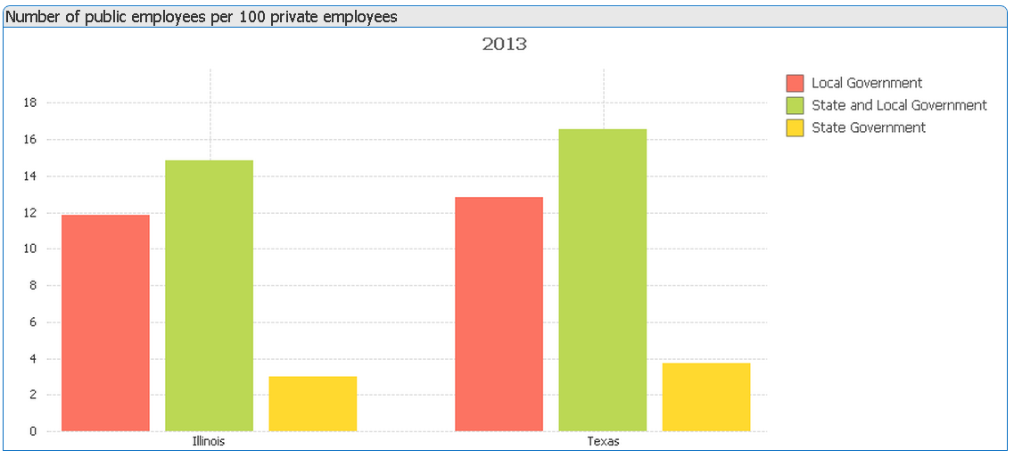
When comparing IL to TX specifically, you can see in the graph below (taken from Key Policy Data) that TX has more state and local government workers than Illinois (16.5 per 100 private sector workers vs. 14.8). This is important because using the combined state and local numbers controls for differences in responsibilities between the state and local governments.
That said, Texas also have more state workers than Illinois and local government workers than Illinois--so the difference exists at both levels of government.
Best,
Scott
10:54 a.m.
This data is drawn from the Bureau of Economic Analysis and includes full- and part-time employment. It is based on "per 100 private sector workers" not on a per capita basis.
On Thu, Feb 19, 2015 at 12:01 PM, Selby, Gardner (CMG-Austin) <wgselby@statesman.com> wrote:
Why did the bureau or you decide to compare to private sector workers in the ratios?
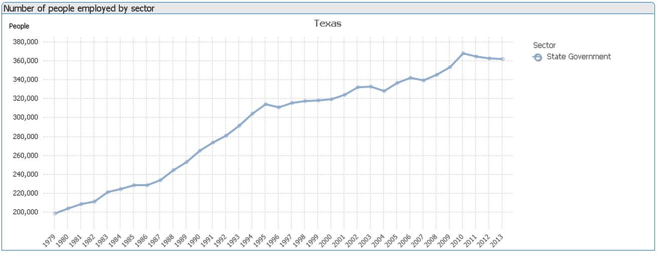
Also, it looks to me from this chart on your site like Texas has seen its ratio of stat workers to private sector workers plummet the past few years. Am I reading this right? I’m a little confused by mention of local government employment in the title line.
11:10 a.m.
The generally accepted basis of comparison is to compare the size of the government workforce with the size of the private sector workforce because they both draw from the pool of labor. In the very short-term, hiring more government workers reduces the pool of labor for the private and vice-versa. This is an important dynamic that is lost in per capita comparisons.
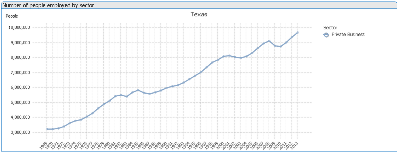
The titles in the KPD charts are fixed so we use the broadest descriptions. To be sure of your selection criteria, always reference the legend so you are looking at just state government workers. So TX has seen a significant drop in their state governemnt employment ratio. I will look into the details to see why, but don't forget you also need to know what's going in the private sector as well . . . TX did quite well during the tech boom of the late 1990's.
Scott
11:22 a.m.
Looking at the kPD data shows that the drop in the state government employment ration in the late 1990's was due to both a flat-lining in the growth of state government employment and a surge in private sector employment (likely a result of the tech boom).