How to Add a Component
Ellen Spertus
Reviewed and updated: October 2, 2019
This document describes how to design and add a new component to App Inventor.
2b. Principles Specific to App Inventor
Organize functionality in a way that makes sense to the user
Hiding a property defined in a superclass
4g. Managing the Activity life cycle
4h. Including external libraries
Using the library in your component
Unit tests of instantiated components
5. Ordering components within a palette category
1. Background
1a. Android
It is assumed that readers of this document know how to write Android programs using the Java SDK. If you don’t, the Android Developers site has some good information on Building Your First App and Managing the Activity Lifecycle.
One aspect of Android worth highlighting and reading about is the Android UI thread, which is responsible for responding to UI interactions (such as button presses) and updating the UI. All user code and most component library code runs in the UI thread. (Later, we discuss creating threads as a result of user actions.) This gives a simple execution model for users: An App Inventor procedure will never be interrupted by an event handler, or vice versa; nor will one event handler be interrupted by another. This is illustrated in Figure 1.
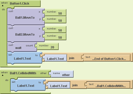
Figure 1: Sample program demonstrating serial semantics. When Button1.Click is executed, the two Balls are placed in the same position, causing the event handler Ball1.CollidedWith to be added to the scheduling queue. It is not executed, however, until the first handler has completed, no matter how long the unshown user procedure wait takes.
The final label display is always: “...End of Button1.Click......Ball1.CollidedWith...”.
1b. The Class Hierarchy
All components fit within a class/interface hierarchy, a subset of which is shown in Figure 2. All components implement the Component interface, which consists mostly of useful constants. Every component extends either the VisibleComponent or AndroidNonvisibleComponent abstract classes, and some also implement the ComponentContainer interface. Every application has a Form (displayed to the user as “Screen”), which holds zero or more instances of AndroidViewComponent, the superclass of most visible components. Exceptions include Sprite (and its concrete subclasses Ball and ImageSprite) which can be contained only in a Canvas.

Figure 2: An incomplete subset of the component class/interface hierarchy.
Interfaces and abstract methods are shown in italics.
1c. Yail
The intermediate representation for apps during compilation is YAIL [Young Android Intermediate Language[1]] (often written “Yail” or “yail”, and pronounced “Yale”). YAIL programs consist of s-expressions that can be translated by a Scheme compiler or interpreter with the appropriate macros and procedures, defined in runtime.scm.
1d. Naming
The names of components and their properties, methods, and events are all capitalized as UpperCamelCase.
1e. Types
Table 1 shows the types in the App Inventor language, their correspondence to Yail compile-time and Scheme run-time types, and sample properties of those types. Translation between Java and Yail types occurs within ComponentProcessor.javaTypeToYailType().
Java types | Yail types (compile-time) | Scheme types | sample property |
boolean | boolean | boolean | Button.Enabled |
String | text | string | Label.Text |
int short long float double | number | number | Label.FontSize Pedometer.ElapsedTime Sprite.Heading LocationSensor.Longitude |
java.util.Calendar | InstantInTime | java.util.Calendar | |
any Java type, including primitive types and Object types. | any | any Java type, including primitive types and Object types. | |
Component | component | Component | |
YailList | list | yail-list | ListPicker.Elements BluetoothClient.AddressesAndNames |
Table 1: Correspondences between Java and Yail types.
The Yail types in the first three rows (boolean, text, and number) are built-in Scheme types. The runtime types for the next three rows (Calendar, Object, and Component) are simply their Java types, which are accessible through the kawa Scheme implementation we use. The Scheme name yail-list is used to refer to the Java type YailList, which is a subclass of the kawa type gnu.list.Pair.
Global variables are untyped. Static type checking is performed only when the inputs to a block are literals, or when we know for sure the relevant types. For example, the Blocks Editor will not allow a text literal to be an input to the numeric plus operation and you can't plug a numeric function into the test socket of an IF block.
1f. Properties
Properties correspond to attributes/fields/instance variables in Java objects.
In the past, properties were divided into the categories “Behavior”, “Appearance”, and “Deprecated” for documentation purposes. For example, Sprite.Enabled was in the “Behavior” category, while Sprite.Visible was in the “Appearance” category. This distinction is no longer used and should not be made in new code.
Java types
Properties can be of any of the types shown in Table 1. While there are properties of type float, double is preferred. Similarly, int should be preferred over short.
Property editors
In addition to its Java type, each property has an editor type that controls what values can be specified in the Designer and how they are specified. For example, the Java type of Label.TextAlignment is int, but its editor type is PropertyTypeConstants.PROPERTY_TYPE_TEXTALIGMENT, which enables it to be set to one of three integers corresponding to “left”, “center”, or “right” through a drop-down menu as shown:

(The strings are defined in OdeMessages.java and can be easily replaced with translations.) Table 1 shows abbreviated information about existing property editor types (which are specified in PropertyTypeConstants and YoungAndroidPalettePanel.java). The separate document How to Add a Property to a Component describes how to create a new PropertyEditor if no existing one meets your needs.
Name | Values | Sample use |
ASSET | the set of uploaded assets (media files) | Sound.Source |
BLUETOOTHCLIENT | the set of BluetoothClient components in this project | LegoMindstormsNxtBase. |
BOOLEAN | {true, false} | Button.Enabled |
BUTTON_SHAPE |
| Button.Shape |
COLOR | {“Black”, “Blue”, etc.} | Label.FontColor |
COMPONENT | the set of components in this project | not directly used |
FLOAT | floating-point values | Sprite.Speed |
INTEGER | integer values | not used |
LEGO_NXT_SENSOR_PORT | {“1”, “2”, “3”, “4”} | NxtColorSensor.SensorPort |
NON_NEGATIVE_FLOAT | non-negative floating-point values | Label.FontSize |
NON_NEGATIVE_INTEGER | non-negative integer values | Sound.MinimumInterval |
SCREEN_ORIENTATION | {“unspecified”, “portrait”, “landscape”} | Form.ScreenOrientation |
STRING | StringPropertyEditor | ButtonBase.String |
TEXT | TextPropertyEditor | not used |
TEXTALIGNMENT | {“left”, “center”, “right”} | Label.TextAlignment |
TYPEFACE | {“default”, “san serif”, “serif”, “monospace”} | Label.FontTypeface |
Table 1: Different types of PropertyEditors.
The prefix “PROPERTY_TYPE_” has been omitted from all entries in the “Name” column.
Inheritance
In general, if a class has the annotation @SimpleObject, its subclasses inherit its properties, but it is possible to suppress this. For example, even though (as shown in Figure 1), Ball is an indirect subclass of VisibleComponent, which has the properties Height and Width, Ball does not. Instead, it has Radius. How to suppress inheritance will be discussed in the implementation section.
It is not possible to change the Java type of an inherited property, although it should be possible to change the editor type.
Access
While most properties can be read and written in both the Designer and Blocks Editor, there are some exceptions. Table 2 gives some examples.
Component | Property | Designer | Blocks Editor |
Label | Text | read/write | read/write |
TableArrangement | Rows | read/write | -- |
LocationSensor | Latitude | -- | read-only |
ListPicker | ElementsFromString | write-only | write-only |
AndroidViewComponent | Row, Column | write indirectly | -- |
Table 2: Visibility of properties in Designer and Blocks Editor.
As shown in Table 1, the properties Row and Column, which belong to all components that extend AndroidViewComponent, such as Button and Label, can only be set indirectly. They are only set when the component is placed within a HorizontalArrangement, TableArrangement, or VerticalArrangement and specify the relative position of the component, which is set indirectly by dragging the component within the Designer. For an example, see Figure 3.
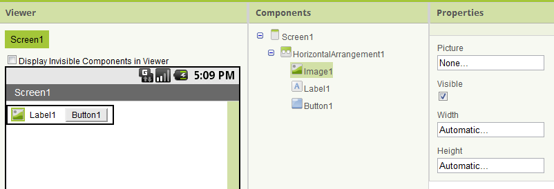
Figure 3: A HorizontalArrangement containing three other components.
Although not visible in the Properties panel, the three interior components have Column and Row properties indicating their positions.
Appearance in Designer
Properties are listed alphabetically in the Designer except that Width and Height always appear at the bottom of the Properties pane for visible components, as shown in Figure 3. (They are explicitly added to the list of properties in MockVisibleComponent.addWidthHeightProperties().)
Appearance in Blocks Editor
A component’s properties are displayed in alphabetical order in the Blocks Editor. There is no way to give properties a different ordering or change the color scheme.
Texting example
The properties defined for the Texting component (an arbitrary example) are shown in Table 3.
Name | Java type | editor type |
PhoneNumber | String | PROPERTY_TYPE_STRING |
Message | String | PROPERTY_TYPE_STRING |
ReceivingEnabled | boolean | PROPERTY_TYPE_BOOLEAN |
Table 3: Properties defined for the Texting component.
All can be both read and written in both the Designer and Blocks Editor.
1g. Methods
Methods are simpler than properties. They are visible only in the Blocks Editor, not in the Designer. They can be inherited, although they are usually only defined for components that are not themselves subclasses. (An exception is Sprite.CollidingWith(), which is inherited by ImageSprite and Ball.)
Arguments
Methods may have zero or more arguments of any Java type shown in Table 1. In addition to the Java primitives boolean, int, float, double, and long, there are methods that take arguments of the following types:
- void Speak(String message)
- void Web.BuildPostData(YailList list)
- long Clock.GetMillis(java.util.Calendar instant)
- boolean Sprite.CollidingWith(Sprite other)
Return types
Similarly, return types may be any Java type shown in Table 1 (or void). Here are examples of methods with different return types:
- void Sound.Play()
- boolean Sprite.CollidingWith(Sprite other)
- int Canvas.GetPixelColor(int x, int y)
- double LocationSensor.LatitudeFromAddress(String locationName)
- long Clock.SystemTime()
- List<Integer> BluetoothConnectionBase.ReceiveSignedBytes(int numberOfBytes)
- String Clock.FormatTime(Calendar instant)
- java.util.Calendar Clock.Now()
1h. Events
Like methods, events are visible only in the Blocks Editor. They may have arguments of any Java type shown in Table 1, but their return type is always void.
2. Interface Design
2a. General Principles
Josh Bloch has compiled and presented some excellent principles of API design, including (quoted verbatim):
- APIs should be self-documenting: It should rarely require documentation to read code written to a good API. [Consider the simplicity of the blocks in HelloPurr.]
- Early drafts of APIs should be short, typically one page with class and method signatures and one-line descriptions. This makes it easy to restructure the API when you don't get it right the first time.
- Code the use-cases against your API before you implement it, even before you specify it properly. This will save you from implementing, or even specifying, a fundamentally broken API.
- Example code should be exemplary. If an API is used widely, its examples will be the archetypes for thousands of programs. Any mistakes will come back to haunt you a thousand fold.
- API design is not a solitary activity. Show your design to as many people as you can, and take their feedback seriously.
- Obey the principle of least astonishment. Every method should do the least surprising thing it could, given its name. If a method doesn't do what users think it will, bugs will result.
- Don't make the client do anything the library could do. Violating this rule leads to boilerplate code in the client, which is annoying and error-prone. [We initially made this mistake by not providing a built-in block for constructing an arbitrary color from alpha-red-green-blue component values, requiring the user to do ugly bit-shifting.]
- When in doubt, leave it out. If there is a fundamental theorem of API design, this is it.... You can always add things later, but you can't take them away. [We violated this by creating three media playback components (Player, Sound, and VideoPlayer) with overlapping functionality. We can never remove any of them without breaking user code.]
2b. Principles Specific to App Inventor
The previously unwritten App Inventor design principles (which we have not always been successful at following) are:
Make it easy for the beginner
We chose to have the offset of the first element in a list be 1, rather than 0, because 1 is what a naive user would expect. While this might make the transition to conventional programming languages a little harder, we’re more concerned with helping people discover the joy of computing rather than the details that don’t make sense until you’ve taken several classes. Follow the Principle of Least Astonishment. If you have to decide between astonishing a beginner or an experienced computer scientist, astonish the latter.
It is not always obvious what is easiest for the user. Consider the numeric argument to the Sound component’s vibrate method. We chose to make it milliseconds, which enables people to use whole numbers (500 milliseconds) rather than fractions (.5). On the other hand, someone who doesn’t read the manual or doesn’t know what milliseconds are would probably start their experimenting with an argument of 1, which would cause an imperceptible vibration.
Organize functionality in a way that makes sense to the user
Continuing our discussion of the vibrate method, a physicist might know to look for it in the Sound component, but most users would not. Unfortunately, I don’t have a better suggestion of where the vibrate functionality should be, short of having a dedicated component.
An example of good organization is having Camera, ImagePicker, and VideoPlayer all within the Media category. Their implementations are totally different, but, to the user, it makes sense for them to be together.
Mobile ≮ Desktop
Mobile devices should not be considered to be desktop (or laptop) computers with small displays. Focus less on functionality that works better on a large screen than a small screen, and focus more on functionality that takes advantage of mobile devices’ unique features, such as portability, connectivity (SMS, BlueTooth, NFC, etc.), sensors (acceleration, location, environment sensors, etc.), and recorders (audio, photographs, videos). This principle suggests it would be better to develop components for data collection, taking advantage of all of these features of mobile devices, than to develop, for example, the capacity to display multiple videos on a single screen, which could be done less well on (most) mobile devices than on larger displays.
Provide default values
Users should not have to understand all of a component’s properties in order to use it. For example, new Labels have reasonable default values for all of their properties except for Text (which has the self-explanatory initial value “Text for Label1”). This enables someone to begin using a component quickly and look at other properties only when dissatisfied with the default behavior (such as a label being hard to read on their chosen Screen background image). By not requiring the user to understand properties until they are needed, this makes them a solution rather than a problem.
Similarly, reasonable default values should be provided for built-in blocks. The parameter to the “make color” block is a list that must contain elements with the values of the red, green, and blue components and may optionally contain a fourth element with an alpha level, something that most users will never need. (The downside of taking a single list parameter instead of one parameter for each numeric input is that the socket labels are less meaningful.)
3. Making Proposals
Before writing any component code, discuss with other App Inventor developers (and, ideally, users) what the associated properties, methods, and events should be. Ideally, your discussions should include both naive and sophisticated users. For example, when Trevor Adams was designing the Instrument component, he spoke at length with both Ellen Spertus, who didn’t understand what a note or synthesizer was, and Chris Brown, a pioneering professor of electronic music.
The proposal should include:
- the name and a brief description of the component
- the location in the class hierarchy
- properties (name, brief description, type, and default value)
- methods (name, parameter and return types, brief descriptions of the methods and their parameters)
- events (name, parameter types, brief descriptions of the events and their parameters)
- any required libraries, including their sizes and licenses
- use cases
The brief descriptions should be similar to those in the reference documentation. Type information includes not just Java types (e.g., int) but any limitations on the domain or range (e.g., integers between 0 and 255, inclusive).
4. Implementation
Whenever a new component is created or modified, a new copy of the Companion app has to be created too. For information on how to push a new Companion to your device, see The App Inventor Companion app section of How to Build App Inventor from the MIT Sources, a document you should bookmark. please check this section in the how to build from sources document.
Your Java file should begin with the following lines (substituting the appropriate year):
// -*- mode: java; c-basic-offset: 2; -*-
// Copyright 2019 MIT, All rights reserved
// Released under the Apache License, Version 2.0
// http://www.apache.org/licenses/LICENSE-2.0
Two blank lines should separate the copyright statement from the package statement.
4a. Creating an Icon
Each image should have a 16x16 icon in png format in the directory appengine/src/com/google/appinventor/images. The name of the file should be in lowerCamelCase with a lower-case extension For example, the name of the icon for the ImageSprite component is “imageSprite.png”. The image must be freely distributable without attribution. Some useful tools are X-Icon Editor and convertico.com.
References to the icon must be made in several files. For the Twitter component, the following lines were added to Images:
/**
* Designer palette item:
*/
@Source("com/google/appinventor/images/twitter.png")
ImageResource twitterComponent()
The following line was added to SimpleComponentDescriptor:
bundledImages.put("images/twitter.png", images.twitterComponent());
4b. Mocking the component
In addition to the real component code that runs on the device, each component is represented by a “mock” component in the Designer. For example, Figure 3 shows a MockLabel and MockButton corresponding to the Label and Button created by the user. The mock components, which are indirect subclasses of MockComponent, should have an appearance as close as possible to the real component they represent. For example, changing the Image, Text, or TextColor properties of a Button in the Designer should cause the corresponding changes in the MockButton. This is trivial for non-visible components, which are all represented by MockNonVisibleComponent. A “gotcha” when mocking visible components is making sure the appearance is correct in all browsers (Chrome, Firefox, Internet Explorer, and Safari).
A discussion of how to make a mock component reflect its attribute values is in How to Add a Property to a Component. If you need to create a new MockComponent, you should generally subclass an existing MockComponent (generally the mock corresponding to the superclass of your component).
Once you have selected or created a MockComponent to represent your component, you will need to add a case to the method SimpleComponentDescriptor.createMockComponent().
4c. Declaring the Class
Each component is implemented as a class, which should be located in the com.google.appinventor.component.runtime package. Every component must be a subclass (possibly indirect) of AndroidNonVisibleComponent or AndroidViewComponent. Components classes must use the following annotations, which are used to generate information for other parts of the system about components and their properties.
SimpleObject annotation
The annotation SimpleObject must precede the definition of any class that either defines or is a superclass of a component.
DesignerComponent annotation
The DesignerComponent annotation must precede the definition of any component that should appear in the Designer. There are seven elements:
- int version: the version number of the component. This should be incremented whenever a user-visible change is made (typically the addition of a property, method, or event) [read more].
- ComponentCategory category: the section of the Designer palette in which the component should appear (e.g., ComponentCategory.Media).
- String description: the user-level HTML description that appears in the reference documentation and when the user clicks on the question mark next to a component name in the Designer. (If this is omitted -- which it should not be -- the description in the Javadoc is used in its place.) The description should be similar to a Javadoc description of a class, except it is only for the user-visible aspects of the component. The first sentence should provide a summary description, and subsequent sentences or paragraphs should explain how it is used. Some good examples of component descriptions are those for Canvas, ListPicker, TinyDB, PhoneCall, and AccelerometerSensor.
- String iconName: the last part of the path to the image used in the Designer’s palette and to be used in the automatically generated reference documentation. For example, for Clock, the value is “images/clock.png”.
- boolean nonVisible: by default false, this should be set to true for components that are not visible on the device screen, such as the Clock or LocationSensor components.
- boolean showOnPalette: by default true, this should be set to false for experimental components under development when doing a publicly-visible build.
Figure 4 shows the complete annotations for the LocationSensor component, beginning with DesignerComponent.
UsesPermissions annotation
The UsesPermissions annotation has a single element, permissionNames, a comma-delimited String with constant permission strings from Android.manifest.Permission, such as “android.permission.CAMERA”. A longer example is shown in Figure 4. This may be omitted for components that do not require any special permissions, such as Clock.
4d. Properties
Each property has a getter and/or setter with the same name. Figure 5 shows the declarations and partial implementation of the Canvas component’s PaintColor property. Some points to note:
- Getters and setters should be present only if the user should be able to read and write the property value, respectively, in either the Designer or Blocks Editor. While most properties can be both read and written, LocationSensor.Latitude, for example, is read-only, so only has a getter. ListPicker.ElementsFromString is write-only, so only has a setter. You may wish to review the earlier discussion of property access.
- The names of the getters and setters violate the ordinary Java style guidelines that method names be in lowerCamelCase and be verbs. Instead, the method names should be the UpperCamelCase property names.
- Usually, property values are backed by a private instance variable. The getter (if present) simply returns this value. The setter (if present) sets the backing variable and may have additional logic to change the component’s appearance (e.g., Label.Text), internal state (e.g., Canvas.PaintColor), or behavior (e.g., Timer.Enabled).
SimpleProperty annotation
Every property getter and setter should be preceded by a SimpleProperty annotation, as shown in Figure 5.
The first of the annotation’s three elements, category, is no longer used. In the past, properties were divided into the categories “Behavior”, “Appearance”, and “Deprecated” for documentation purposes. For example, Sprite.Enabled was in the “Behavior” category, while Sprite.Visible was in the “Appearance” category. We have dropped this distinction, partly because not all properties fit cleanly into such categories.
The description element is used in the reference documentation and in tool tips within the Designer (Figure 6). The description is for the property itself, as opposed to having separate ones for the getter and setter. The description may be included in the annotation before the getter or setter but should not be in both. (While doing so does no harm, it may lead to unexpected results, if the two descriptions differ, and increases maintenance.)
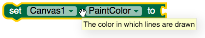
Figure 6: A tool tip within the Designer.
This comes from the code in Figure 4.
The userVisible element, which by default is true, specifies whether the property is accessible in the Blocks Editor. This element (and the ability to set it to false) was added to support the Row and Column properties, so they could be indirectly set in the Designer but not accessed in the Blocks Editor. Some other properties that can be set in the Designer have userVisible values of false, such as Canvas.TextAlignment, to prevent the user from setting it to an illegal value (anything other than “left”, “right”, or “center”).
DesignerProperty annotation
While every property getter and setter should have the SimpleProperty annotation, the DesignerProperty annotation should be used only for the setter of properties visible in the Designer. Some examples or properties not visible in the Designer are Row, Column, and LocationSensor.Latitude.
The first of DesignerProperty’s two elements is defaultValue, a String that gives the initial value of the property. (If not specified, it is the empty string.) For Canvas.PaintColor (Figure 5), the default value is Component.DEFAULT_VALUE_COLOR_BLACK, one of many useful constants defined in Component.
The second of DesignerProperty’s two elements is editorType, which specifies the PropertyEditor used for entering the property value within the Designer. (See the earlier discussion of property editors.) For Canvas.PaintColor, the PropertyEditor is YoungAndroidColorChoicePropertyEditor, which lets the user choose among a set of predefined colors, as shown in Figure 7. (Additional colors can be specified programmatically in the Blocks Editor.)
The separate document How to Add a Property to a Component describes how to create a new PropertyEditor if no existing one (Table 1) meets your needs.
Hiding a property defined in a superclass
Occasionally, it is desirable to hide a property defined in a superclass. For example, as an indirect subclass of VisibleComponent, Ball inherits the Height and Width properties. We do not want to expose these to the user, since the more appropriate abstraction is the Radius property, which guarantees that the Ball’s height and width are identical. To hide Height and Width from the user, they are overridden in Ball.java but not annotated with SimpleProperty and DesignerProperty, as shown in Figure 8. This same trick should work to hide methods and events.
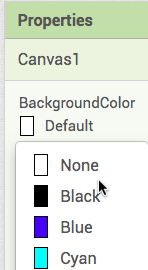
Figure 7: Setting Canvas.BackgroundColor with YoungAndroidColorChoicePropertyEditor.
4e. Methods
Figure 9 shows an example of a method: Canvas.GetBackgroundPixelColor(). Overloading is not permitted. The indirect way to support a variable number of arguments is to take a List as an argument, since the length of the List is not part of the type specification.
SimpleFunction annotation
The SimpleFunction annotation has two elements: description and userVisible, whose meanings parallel those for SimpleProperty. A description, used for tootips and reference documentation, should always be provided. The default value of userVisible is true. It is typically only false for deprecated methods (such as VideoPlayer.VideoPlayerError()) or ones under internal development.
Launching threads
All user code and most component code runs in the Android UI thread, as discussed above. The exceptions are components such as Twitter, Web, and TinyWebDB, which perform actions (sending web requests) that need not and should not (for performance reasons) run in the UI thread. Figure 10 shows part of the implementation of the Get method of the Web component, which makes use of our utility class AsynchUtil, which launches a Runnable (e.g., a request to fetch a certain web page) in a new non-UI thread. Figure 11 shows how the event handler GotText is launched in the UI thread after the response has been received.
/** * response.<br> // asynchronously. Figure 10: The Get method of the Web component. It creates a Runnable that calls the method performRequest() (Figure 11) do the real work of opening the HTTP connection, generating and sending the request headers and cookies, and waiting for the response. The call to AsynchUtil.runAsynchronously() causes these actions to occur in a new non-UI thread. |
private void performRequest(final CapturedProperties webProps, byte[] postData, String postFile) throws IOException { HttpURLConnection connection = openConnect(webProps); [:] try { [:] responseContent); [:] } Figure 11: The portion of Web.performRequest() that launches the user GetText event handler after the response has been received. The method call activity.runOnUiThread() causes the event handler code to run in the UI thread. |
4f. Events
Figure 12 shows an example of an event: Clock.Timer(). Events are ordinary methods that generally trigger calls to the user-written event handler by calling EventDispatcher.dispatchEvent(). The event dispatcher makes sure that the user-written event handlers do not interrupt each other or other user code.
SimpleEvent annotation
The SimpleEvent annotation has the same two elements as SimpleFunction: description and userVisible, which has a default value of true.
4g. Managing the Activity life cycle
A single App Inventor app can consistent of multiple Activity instances, some of them dynamic. While Form is the only component to subclass Activity, many components launch an Activity, including:
- ActivityStarter, which launches a user-specified Activity.
- BarcodeScanner, which launches an Activity that can handle the SCAN intent.
- Form (Screen), which launches an Activity when the user switches screens.
- ListPicker, which creates and launches a new Activity when opened.
Some components need to take into account the Activity life cycle in order to behave properly or avoid excessive CPU or battery usage. For example, OrientationSensor stops responding to changes in the phone’s position when the associated Activity is paused and restarts when it is removed. We provide the following interfaces to respond to life cycle changes.
- OnPauseListener: The onPause() method is called right before either (1) a different Activity is resumed or (2) the device’s display is turned off.
- OnResumeListener: The onResume() method is guaranteed to be called when the component’s Activity is resumed after being paused. It also may be called early in the component’s life before onPause() has ever been called.
- OnStopListener: The onStop() method is called when the component is no longer visible to the user, such as when a ListPicker opens in front of it, or the Home button is pressed.
- OnDestroyListener: The onDestroy() method is called when its Activity is about to be destroyed.
A single action can cause more than one of these methods to be called. For example, when the user presses the Home button, the onPause() and onStop() methods are called. Assuming the OS doesn’t need the memory and destroy the app, returning to it (whether through the phone’s launcher, the Back button, or the Recent Apps button) causes the onResume() method to be called.
As an example of how the methods are used, consider Sound, which has the following methods:
- onStop(), which pauses whatever sound is being played.
- onResume(), which resumes any sound that was paused.
- onDestroy(), which removes application-related resources from the SoundPool.
In order to receive the method calls, a component must register itself with its container, usually a Form. Figure 13 shows some relevant code from Sound.
An analogous interface and method, Deleteable.onDelete() exists for components that need to do something when they are dynamically deleted (usually through the interpreter). Such components do not need to register themselves. If they are declared as implementing Deleteable, they will be deleted by Form.deleteComponent().
4h. Including external libraries
Some components, such as Twitter, require external libraries (twitter4j.jar). Here is how to add a jar file referenced by your component source file.
Adding to appinventor/lib
The appinventor/lib directory contains one subdirectory for each external library. For example, there is a subdirectory appinventor/lib/twitter. Each of these subdirectories should contain the following files:
- LICENSE: a text file with the license under which the library was made available.
- README: a text file detailing where the library was downloaded from and/or how it was built.
- one or more jar files
- If you are using an .aar file, you should extract the classes.jar file from the .aar file and remove the corresponding entry from the .aar file. Name the jar file the same as the aar file, and add two entries in the build.xml, one for the jar and one for the aar.
Adding to build.xml
The path to the new library should be added to the components/build.xml file in the CopyComponentLibraries target.
The format for this <copy> entry should be the following:
<copy toFile=”${public.deps.dir}/simplifiedNameForJARFile.jar”
file=”${lib.dir}/subfolderNameFromStep1/nameOfJARFileToAdd.jar” />
If you included an aar file, include an additional copy for the aar:
<copy toFile=”${public.deps.dir}/simplifiedNameForAARFile.aar”
file=”${lib.dir}/subfolderNameFromStep1/nameOfAARFileToAdd.aar” />
Note: in each <copy> tag, the file attribute refers to the path at which you placed your jar file in appinventor/lib. The “${lib.dir}” equates to “appinventor/lib”. The toFile attribute states the path into which the file will be copied during the ant build process. The “${public.deps.dir}” refers to the path “appinventor/build/components/deps”. Other targets will reference this directory to build a classpath for further compilation steps. After the ant script finishes executing ant, you should be able to navigate to appinventor/build/components/deps and verify that your jar file did indeed get copied.
Note that all these changes are necessary to use the ant build system in the command line. If you use an IDE such as Eclipse, you will also need to add the new jar files in the Build Path or your project.
Using the library in your component
Your component should contain a “@UsesLibraries” annotation, for example:
@UsesLibraries(libraries = "library1.jar," + “library2.jar,” + … + “libraryN.jar”)https://github.com/mit-cml/appinventor-sources/blob/master/appinventor/components/src/com/google/appinventor/components/runtime/Twitter.java
Place the annotation before the class definition. See Twitter.java or FusiontablesControl.java in the com.google.appinventor.components.runtime package.
Using Native Libraries
In some occasions you might want to use Native libraries as opposed to jar packaged ones. The following annotation can be used for that purpose.
@UsesNativeLibraries(libraries = "library1.so," + “library2.so,” + … + “libraryN.so”)
The files themselves will also need to be added to the lib folder, and taken care of in the build.xml files. For a complete example look at the instructions in this closed pull request.
4i. Updating YaVersion
See Update Version Numbers in How to Add a Property to a Component.
4j. Tips
When debugging, you can output to the console by using com.google.appinventor.client.Ode.CLog(String).
4k. Testing
Browser tests
If you did anything nontrivial when adding your mock component, you should test their behavior in current and previous major releases of all of the browsers we support: Chrome, Firefox, Internet Explorer, and Safari. We neglected to do this when adding the Shape property to Buttons, causing incorrect displays in Firefox and Internet Explorer.
Unit tests of static methods
We are strong advocates of unit testing and make use of JUnit 4, EasyMock and PowerMock, which are included among our external libraries.
The easiest types of tests to perform are of static methods. See ClockTest, WebTest, and most of the files in the utils subdirectory for examples. We use the annotation @VisibleForTesting in code being tested when we loosen visibility restrictions to enhance testability.
Unit tests of instantiated components
More difficult but extremely valuable are tests of instantiated components. One example is BuletoothConnectionBaseTest, which instantiates an anonymous subclass of BluetoothConnectionBase overriding certain methods that would not be testable without an actual bluetooth connection (and thus not suitable for unit testing).
Ordinarily, one cannot fully mock objects with static, final, or private methods; however, it is possible with PowerMock. SpriteTest uses this functionality to create “nice” mocks of a number of classes, including android.os.Handler and android.view.View. (Whereas a strict mock throws exceptions when unimplemented methods are called, nice mocks come with default methods that do nothing except return “empty” values, such as 0, false, or the empty string.)
The challenge in testing Sprite is that each instance has a Canvas (which is passed to the constructor), which acts as a container for the Sprite, and an android.os.Handler (which is instantiated in the constructor), to which requests are posted. To test Sprite, an alternate version of the constructor was created, in which both the Canvas and Handler are parameters (enabling mocks to be used). We did not wish to test these latter classes but only to have them provide the methods called by the parts of Sprite under test. Figure 14 provides an excerpt from SpriteTest.java showing how the mocks are created and giving an example of their use to verify that it detects a collision between a pair of Sprites.
System tests
You should also have at least two sample applications using your new component and manually test that you can build, compile, and run them using your development server.
5. Ordering components within a palette category
To be written (Andrew)
6. Documentation
As of September 2019, it is necessary to manually update the appropriate HTML file in /appinventor/docs/reference/components, which depends on the component's category. While you can manually edit the file, we recommend a semi-automated, approach:
- In the directory appinventor/components, execute "ant ComponentDocumentation".
- Open in a text editor the generated file appinventor/components/build/classes/ComponentDocumentation/component-doc.html
- In a second window, open the appropriate HTML file for the component's category in /appinventor/docs/reference/components.
For the light sensor, the file name is "sensors.html". - Copy the list item referencing the new component from the first window to the appropriate place in the second window (in alphabetical order). It should look something like this:
<li><a href="#LightSensor">LightSensor</a></li>
- Copy the section of the first document describing the component into the second window, again respecting alphabetical order. The start should look something like this:
<h2 id="LightSensor">LightSensor</h2> - View the second file in a web browser to make sure the documentation for your new sensor appears correctly.
7. Internationalization
Names of methods, events, and properties need to be internationalized so that they can appear in several languages. This is accomplished by an annotation processor called ComponentTranslationsGenerator that produces two files: AutogeneratedOdeMessages.java and ComponentTranslations.java. Do not edit entries in AutogeneratedOdeMessages.java. This file is regenerated when building the system and your changes will be lost. Instead, if you need to override the text for an English description, add an entry in OdeMessage.java (or preferably, update it in the components module). Descriptions for components, events, methods, and properties are taken from the description field in the corresponding annotation (@DesignerComponent, etc.), or from the Javadoc if a description has not been provided. Translations for languages other than English are added by placing entries into the corresponding language file named OdeMessages_<language>.properties. Entries take one of the following forms:
componentNameComponentPallette[2] = Translated component name
ComponentNameHelpStringComponentPallette = Translated component description as shown in the palette panel
EventNameEvents = Translated event name
EventNameEventDescriptions = Translated description of event (block tooltip)
paramParams = Translated parameter name
MethodNameMethods = Translated event name
MethodNameMethodDescriptions = Translated description of method (block tooltip)
PropertyNameProperties = Translated property name
PropertyNamePropertyDescriptions = Translated description of property (block tooltip)
Note that properties files have certain restrictions on the text that can be included on the right side of the equals sign. Mainly, Unicode characters can be included by \uxxxx notation, carriage return, newline, tab, and backslash characters are represented by \r, \n, \t, and \\, respectively, and breaking an entry over multiple lines must be done by ending each line with a \, which ignores leading whitespace on the following line.[3]
8. Supporting legacy devices
Everyone always likes to have the newest phone, but many App Inventor users, especially schools, have older devices. According to the Android Distribution dashboard, as of September 2019, about 0.3% of App Inventor users are using App Inventor with phones running Android system 2.3 (Gingerbread) or older. When you build components, you should design them so that they run on system 2.3 (API level 9). Of course, that is not always possible: many modern Android features require higher API levels, so you should make sure your components give good error messages or fail gracefully on older phones, and there are various approaches for doing this.
When you use a new feature, you should check the Android developer documentation to see the API level where it was introduced. If it is later than 9, your component should test the API level of the device it is running on, and act appropriately. You can use SDKLevel.getLevel() to check the operating system of the device.
One thing you might do if the device it too old to do some operation is to simply alert the end user that the feature won’t work. This is done in FusiontablesControl.java:
if (SdkLevel.getLevel() < SdkLevel.LEVEL_ECLAIR) { showNoticeAndDie( "Sorry. The Fusiontables component is not compatible with this phone.", "This application must exit.", "Rats!"); } |
Another method is to create alternative versions of the operation for running on older phones. Here is an example from BluetoothClient.java:
if (!secure && SdkLevel.getLevel() >= SdkLevel.LEVEL_GINGERBREAD_MR1) { // createInsecureRfcommSocketToServiceRecord was introduced in level 10 bluetoothSocket = BluetoothReflection.createInsecureRfcommSocketToServiceRecord( bluetoothDevice, uuid); } else { bluetoothSocket = BluetoothReflection.createRfcommSocketToServiceRecord( bluetoothDevice, uuid); } |
Whatever approach you use, you should test your work on system 2.3 (or even earlier!) before submitting it for review. If you don’t have an old phone, you can use the Android SDK manager to create emulators running older Android versions.
[1] An alternate expansion is “Yet Another Intermediate Language”.
[2] For historical reasons, the component name starts with a lowercase letter despite the fact that the class name is capitalized.